I initiated and led the global redesign project to reconnect Lebara’s identity with its challenger ambition, creating one distinctive visual system to be used across 5 European markets.
Lebara Global Digital Launch:
Bringing the new brand to every screen.
I led the translation of the Brand Design Refresh into Lebara’s digital experience: six redesigned page types, around 70 reusable components and a reskin of 6,000+ pages across all markets.
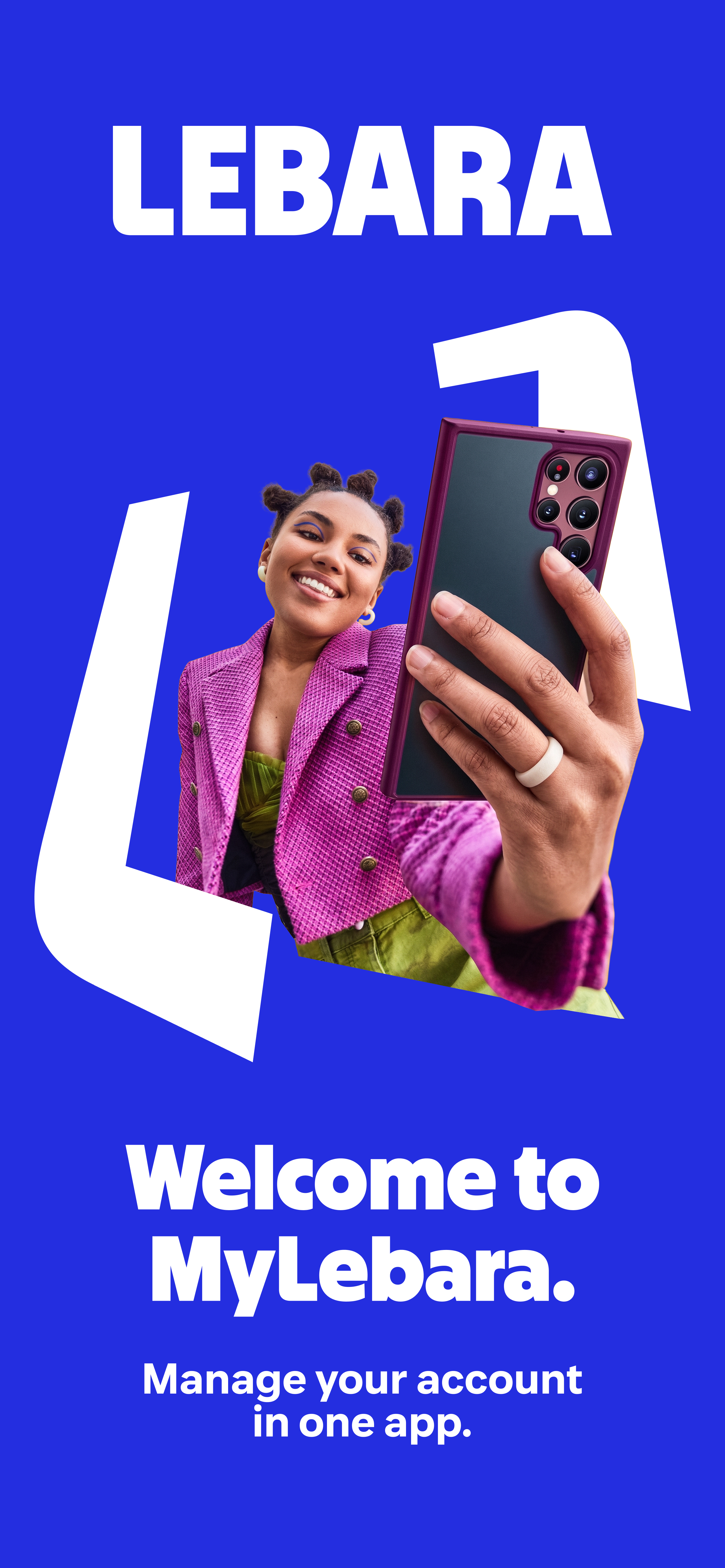
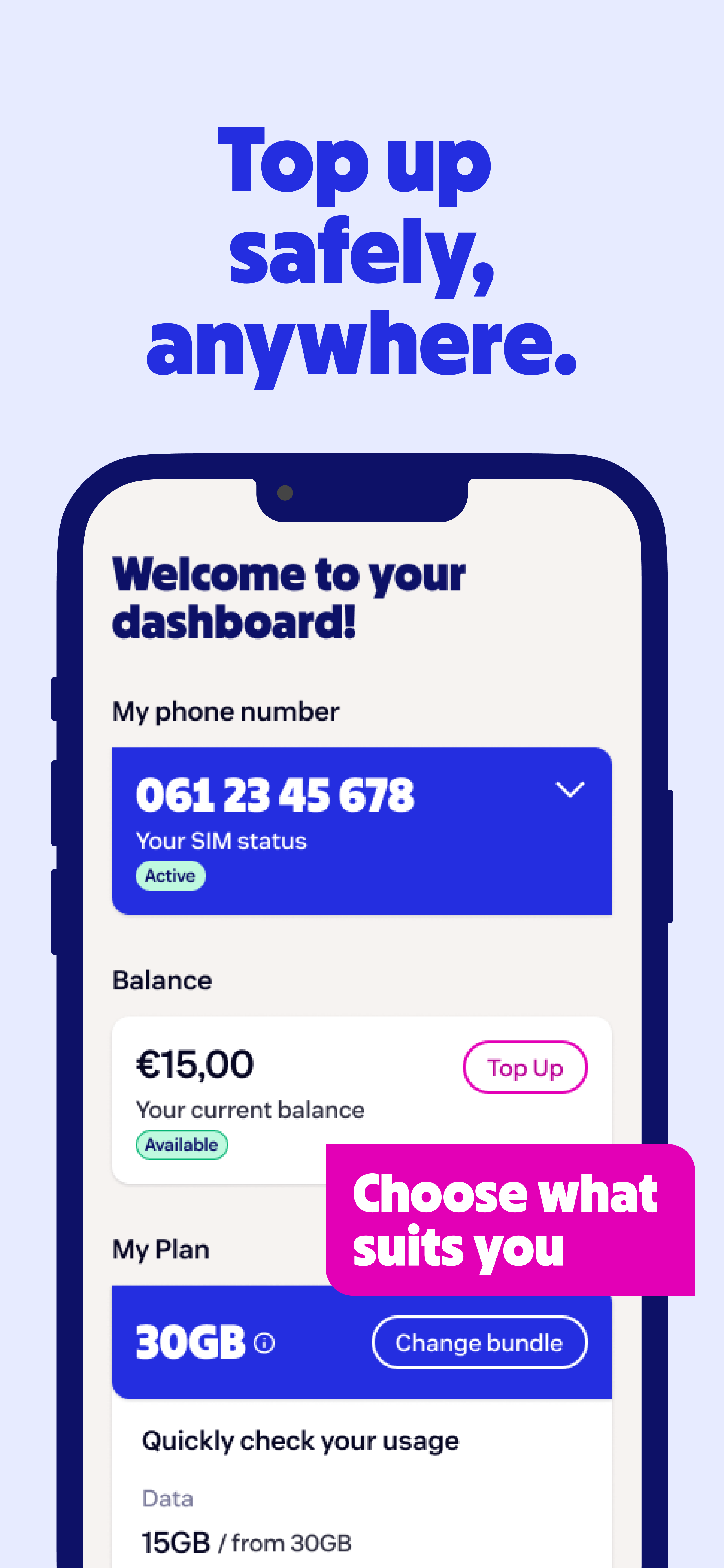
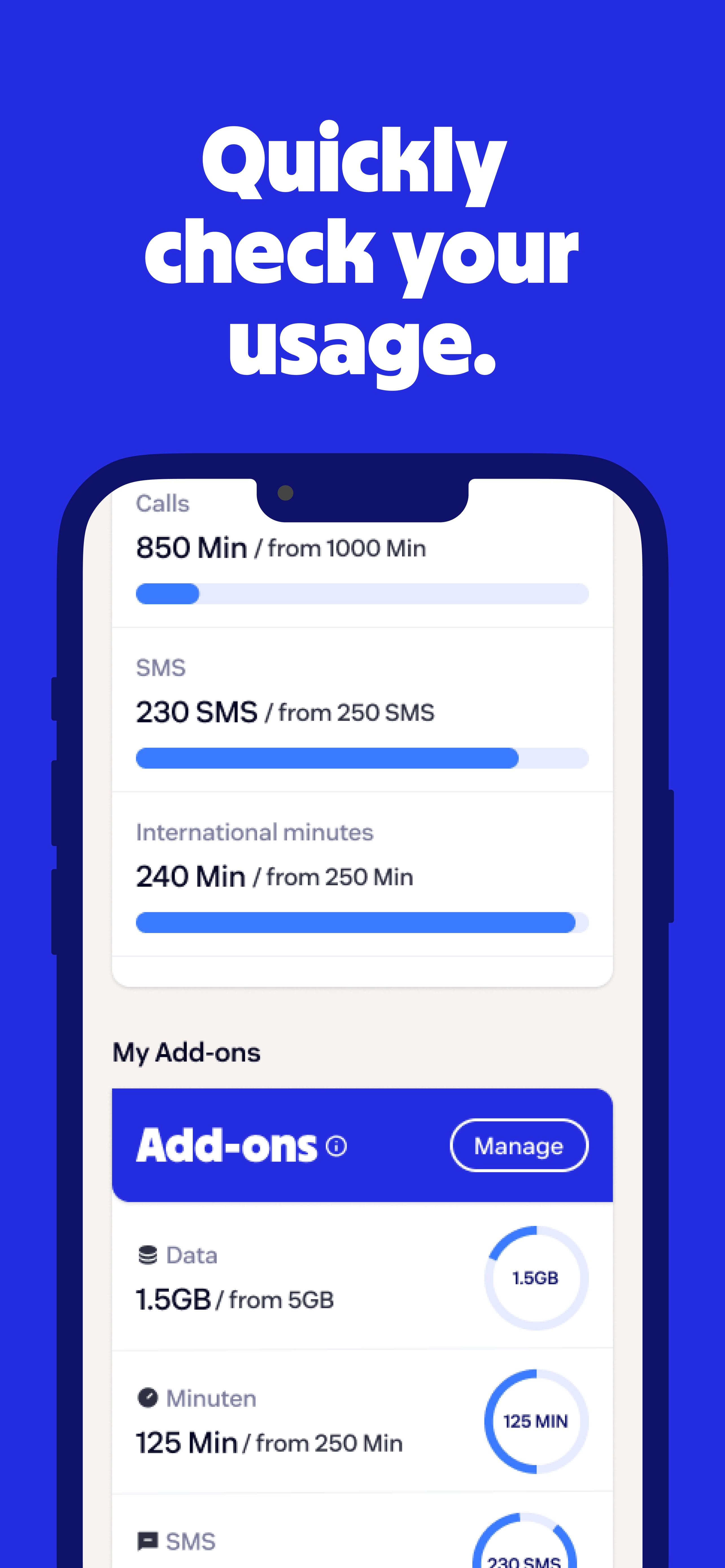
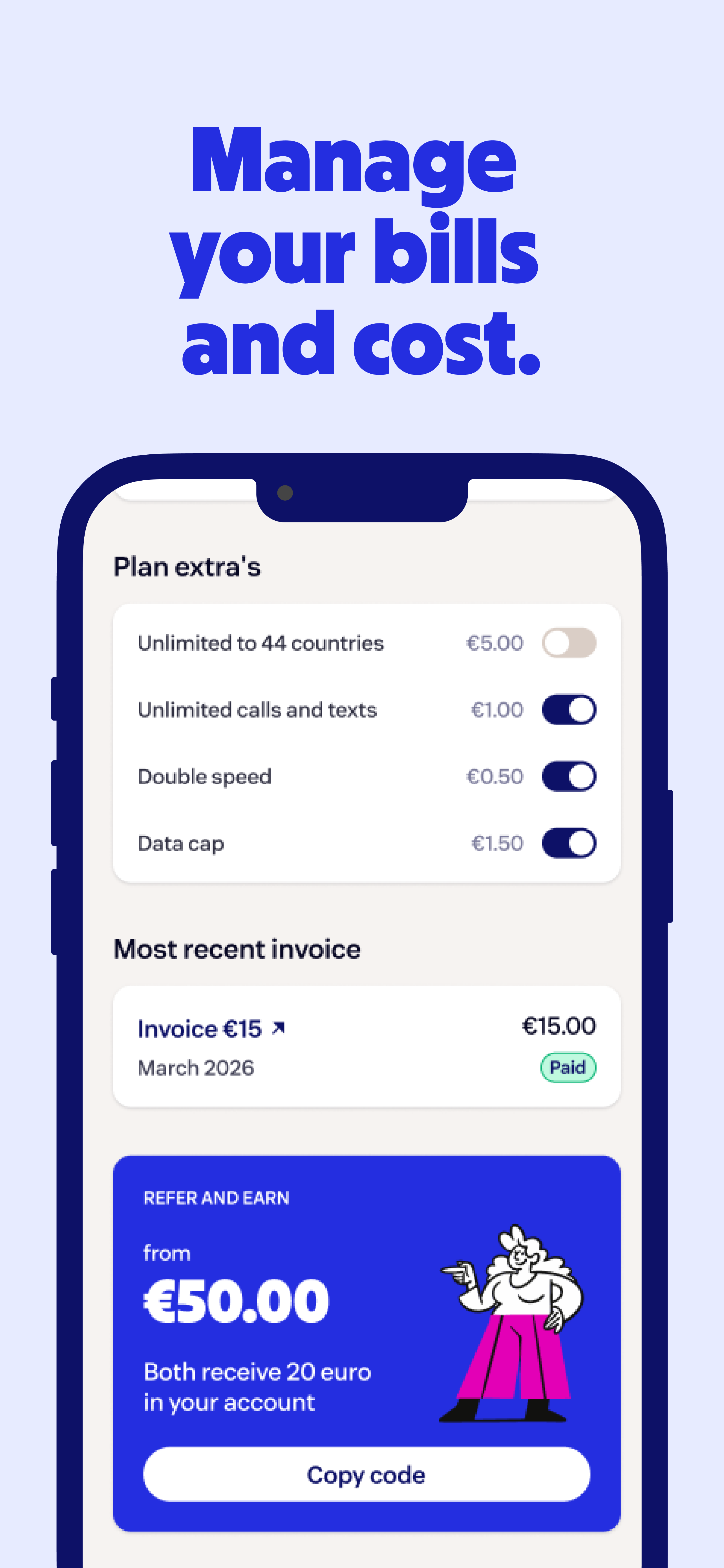
Lebara app on the App Store and Google Play
Lebara Enterprise AI-ready Design System:
One logic behind every page or screen.
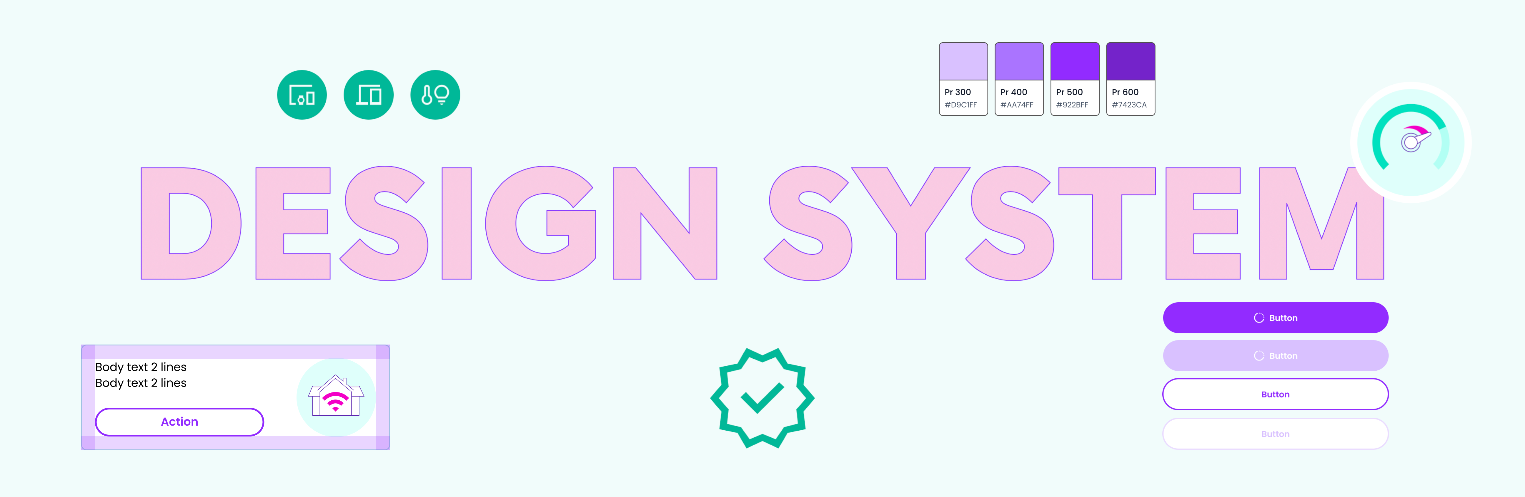
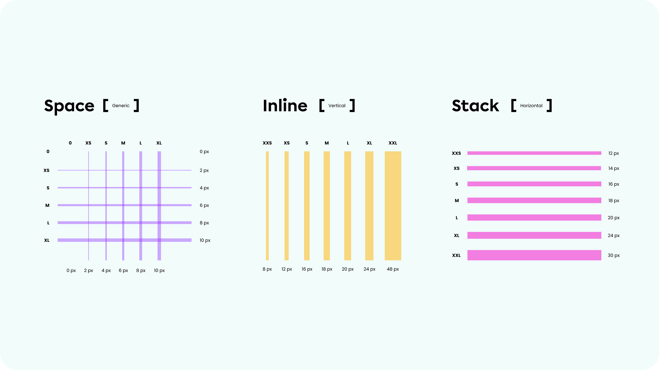
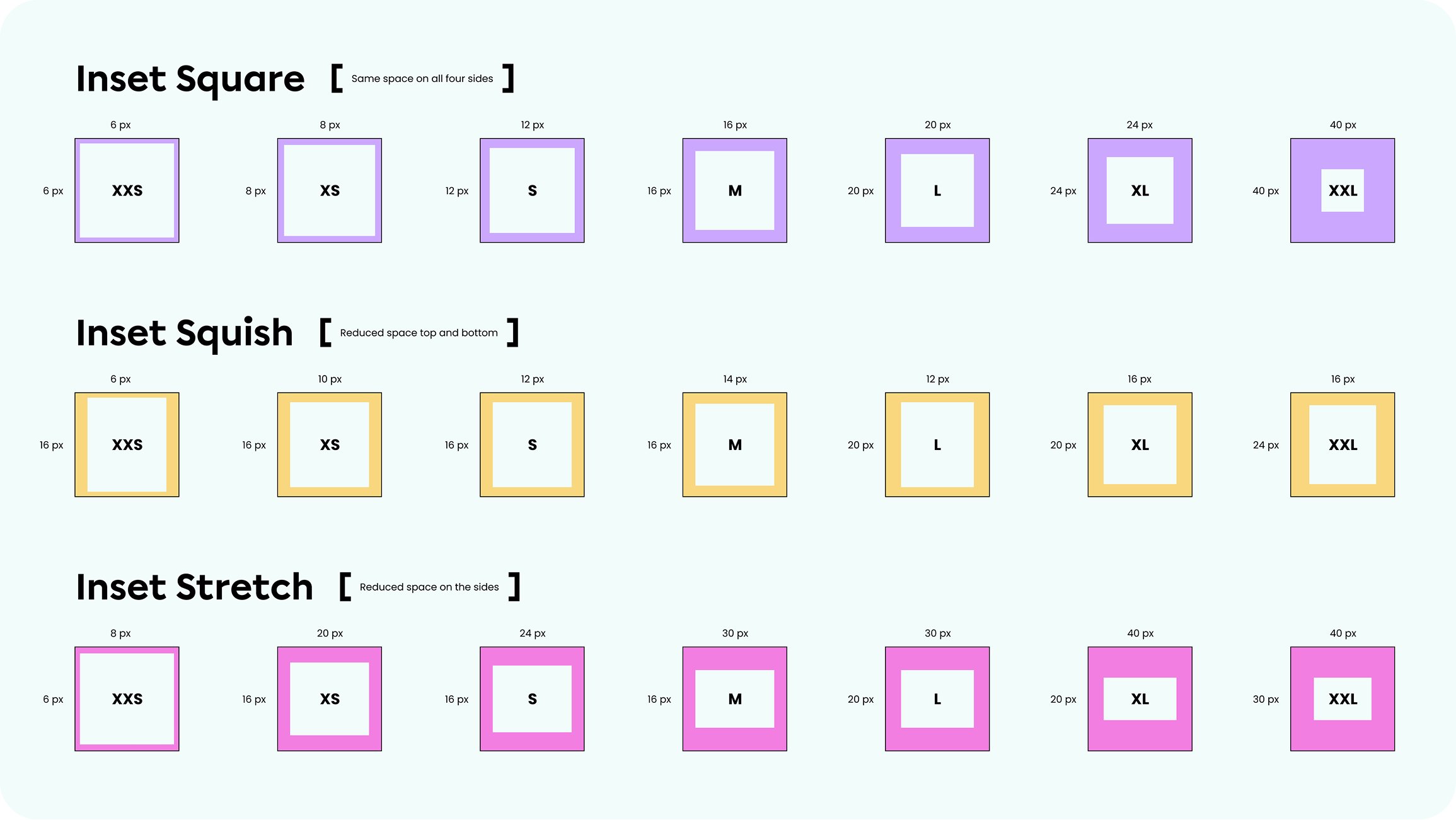
I built and led the team behind the creation of an atomic, token-driven UI library that connects Brand, Product and Engineering, so that every digital design in every market is built from the same source of truth, or simply prompted by describing a user / business need.
A mature Design System lets teams build faster from ready-made components, keeps the user experience consistent across every market, builds accessibility in, and turns a single token update into a change across the whole digital infrastructure.
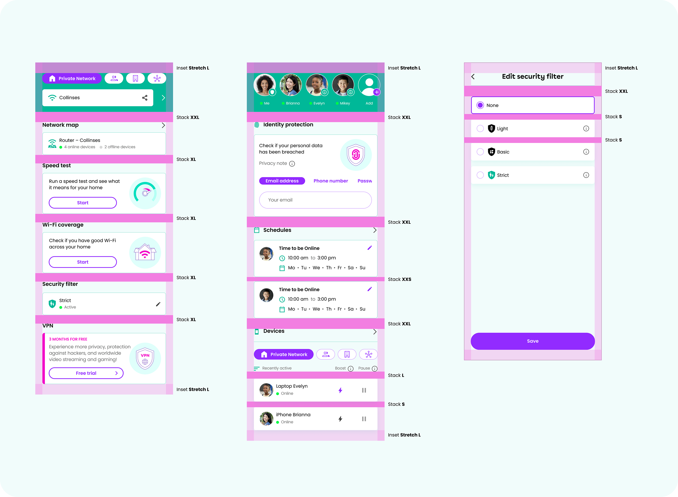
I translated a complex B2B2C IoT platform into a joyful, ownable world – giving Gamgee the character and confidence to connect with broadband partners and households alike.
Gamgee Digital Products:
Complex Wi-Fi systems, made useful every day.
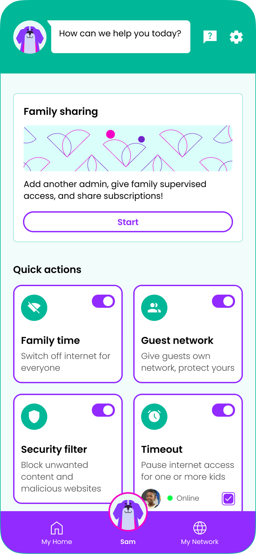
I turned specialist network technology such as coverage and network mapping, parental controls, family sharing, identity protection, movement detection, and home alarm into clear, useful experiences by creating one approachable product for households, partners and service providers.
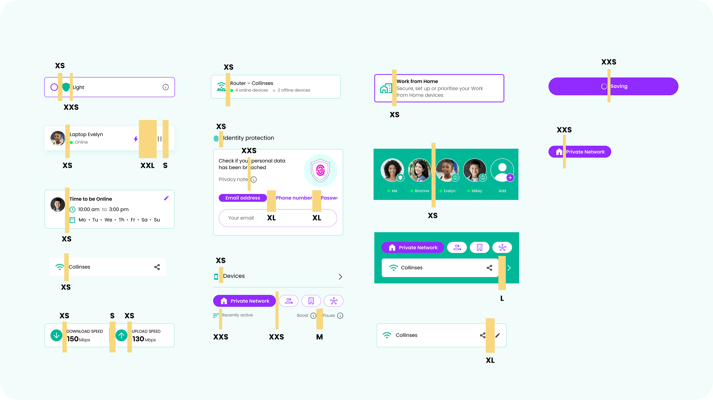
Gamgee White-label Design System:
Letting every partner brand feel unmistakably its own.
I transformed a fragmented product estate into a scalable design engine – accelerating delivery and dramatically reducing inconsistencies.
For a B2B2C product operating across multiple partner ecosystems, this level of consistency was a direct business advantage, ensuring every end-user experience felt coherent, polished, and on-brand regardless of which partner was deploying it.
I designed a platform to facilitate donations, allowing supporters to directly contribute to AWU’s advocacy efforts, and to offer membership options that foster a strong, interconnected community.
Our design work aimed to make the platform a powerful tool in the national conversation, ensuring that arts workers had the visibility and support they needed.
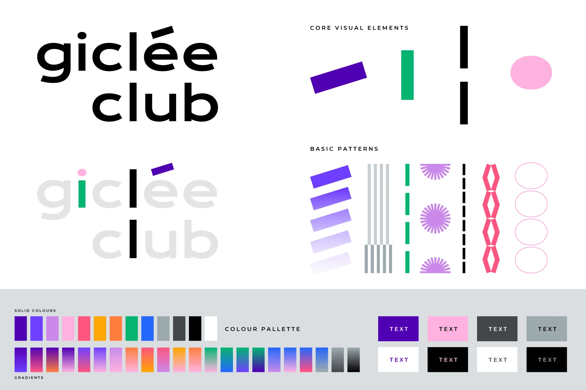
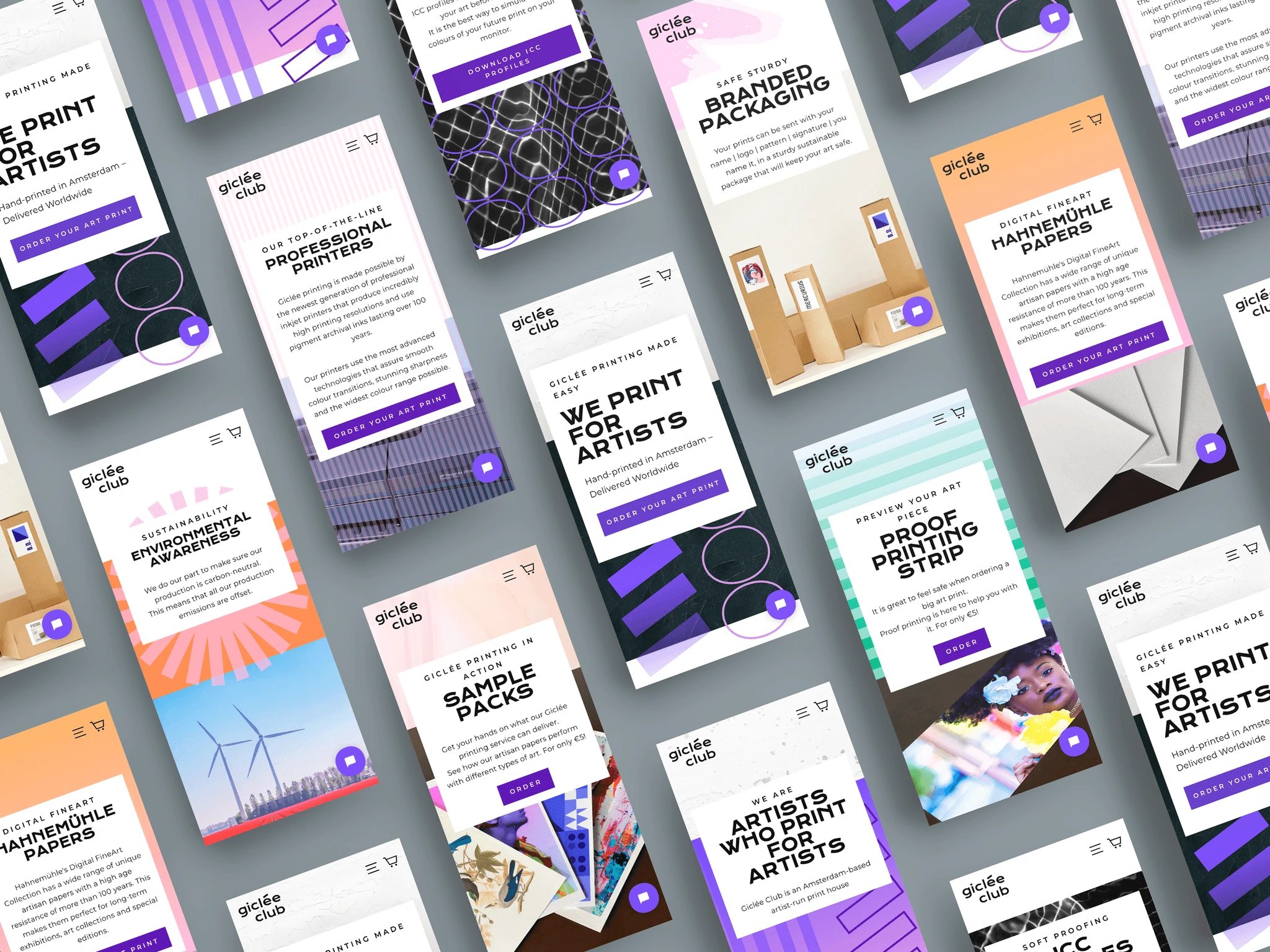
Giclée Club:
Leading e-commerce destination for visual artists.
I led the end-to-end design work from branding to product design, creating a user experience that reflected the high standards of Giclée printing. The goal was to make the platform intuitive and visually appealing, meeting the needs of artists who care deeply about quality and presentation.
This project emphasised the importance of cohesive product branding, where the e-commerce platform was meticulously designed to align with and enhance the overall brand identity.
For the one-man band, I crafted a brand identity that reflects the artist’s exploration of love, fears, dreams, and societal expectations. To amplify his disruptive nature, I used bold, explosive colours traditionally associated with femininity.
CrowdyHouse:
Launchpad and marketplace for designers and makers.
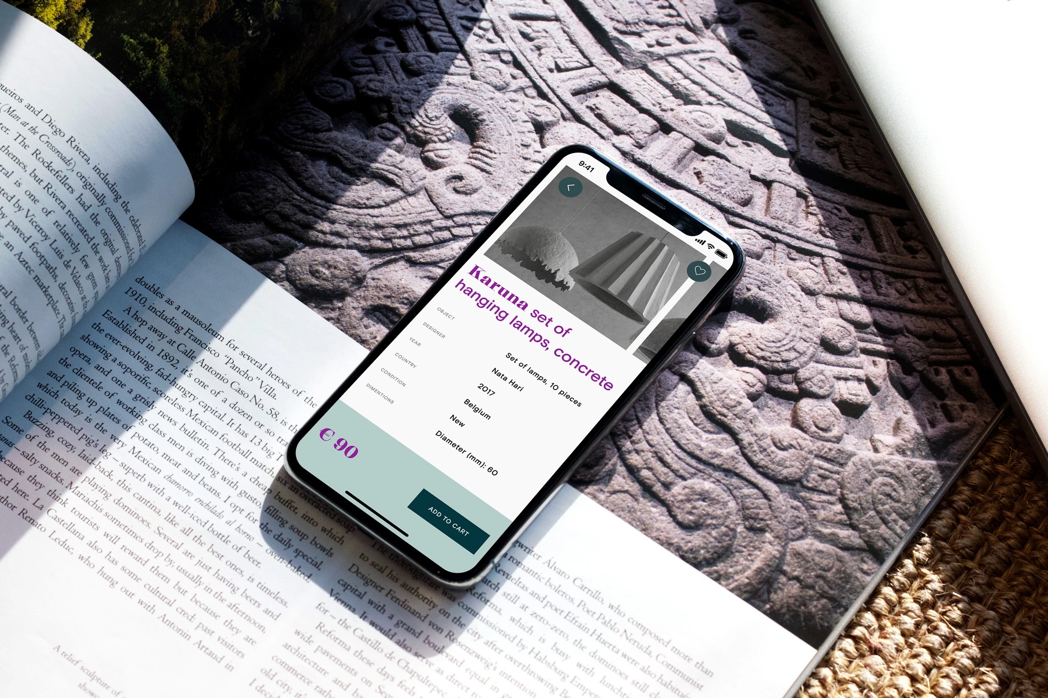
The platform’s mission is to democratise the design industry by enabling creatives, whether new or established, to sell directly to design enthusiasts worldwide.
I created a brand that reflected this mission of empowerment, and a product design that streamlined the process, allowing designers to maximise their profits while bringing diverse, high-quality design to a global audience.