HOW IT ALL STARTED
When I joined Lebara as their Global Design Lead, one of the first things I identified was that the company's Brand Design and Visual Identity was no longer fit for purpose. The last Brand Design Refresh had taken place in 2018 – and while significant investment had since gone into digital transformation, that work had been focused almost entirely on technical and functional improvements, leaving the brand's aesthetic largely untouched.
An OG Challenger brand that had taken on Big Mobile for over 20 years had quietly lost its challenger spirit in the branding, visual, and digital spaces – and it was time to bring it back.
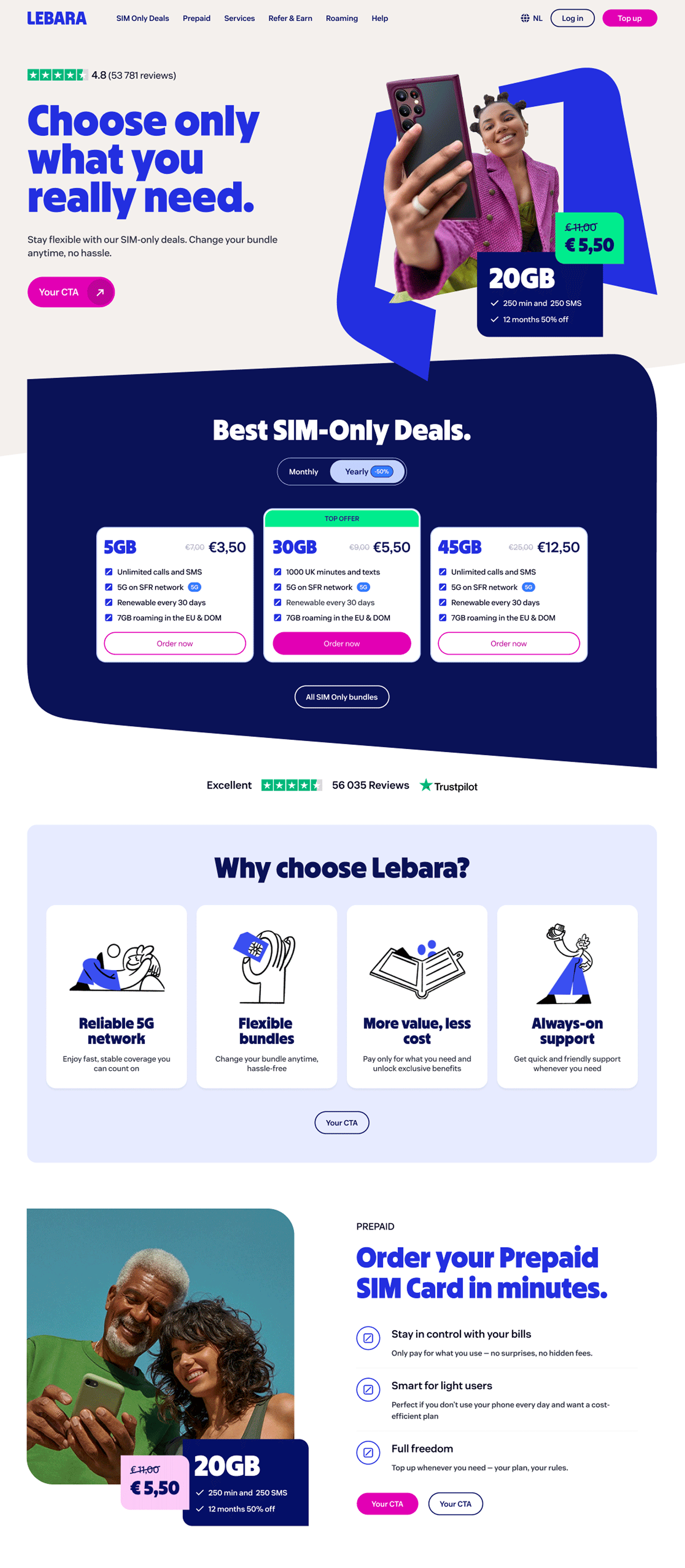
Lebara's digital presence before Brand Design Refresh
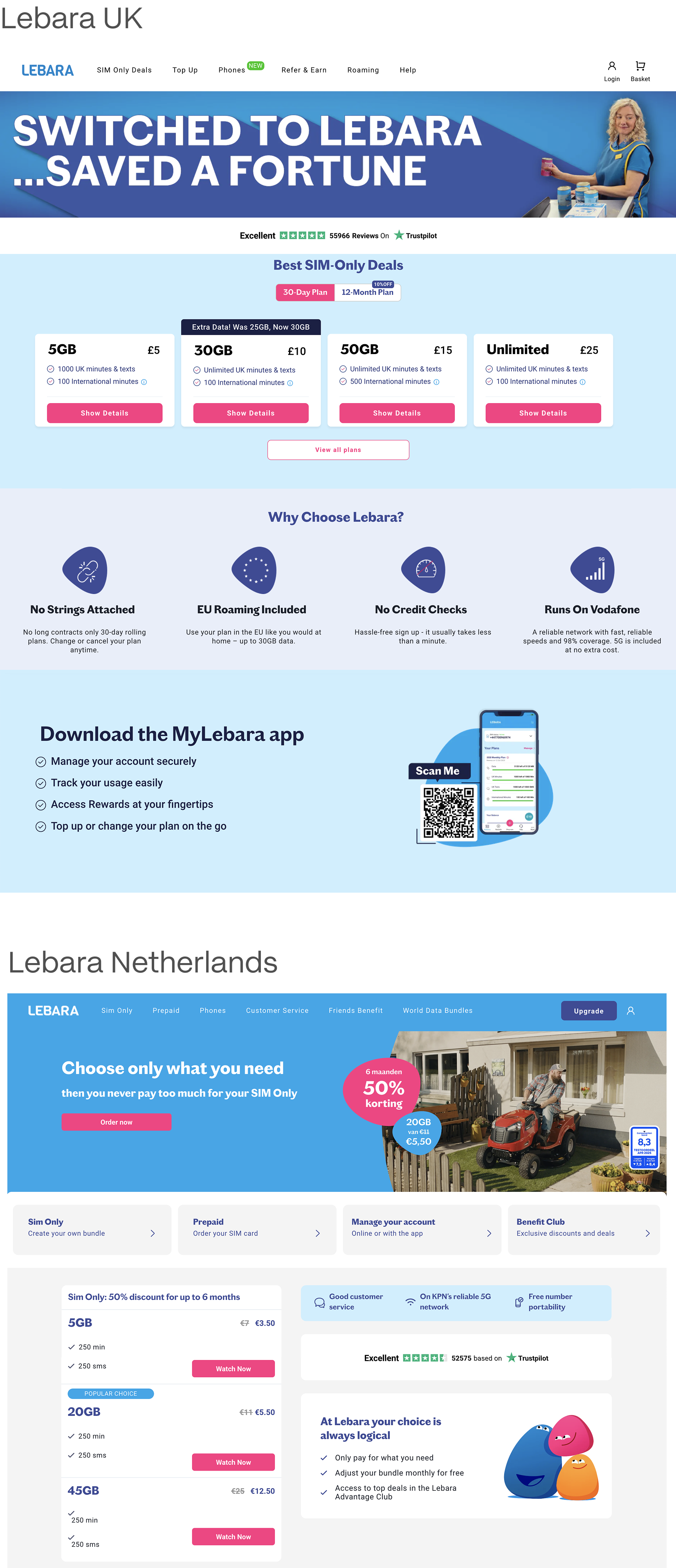
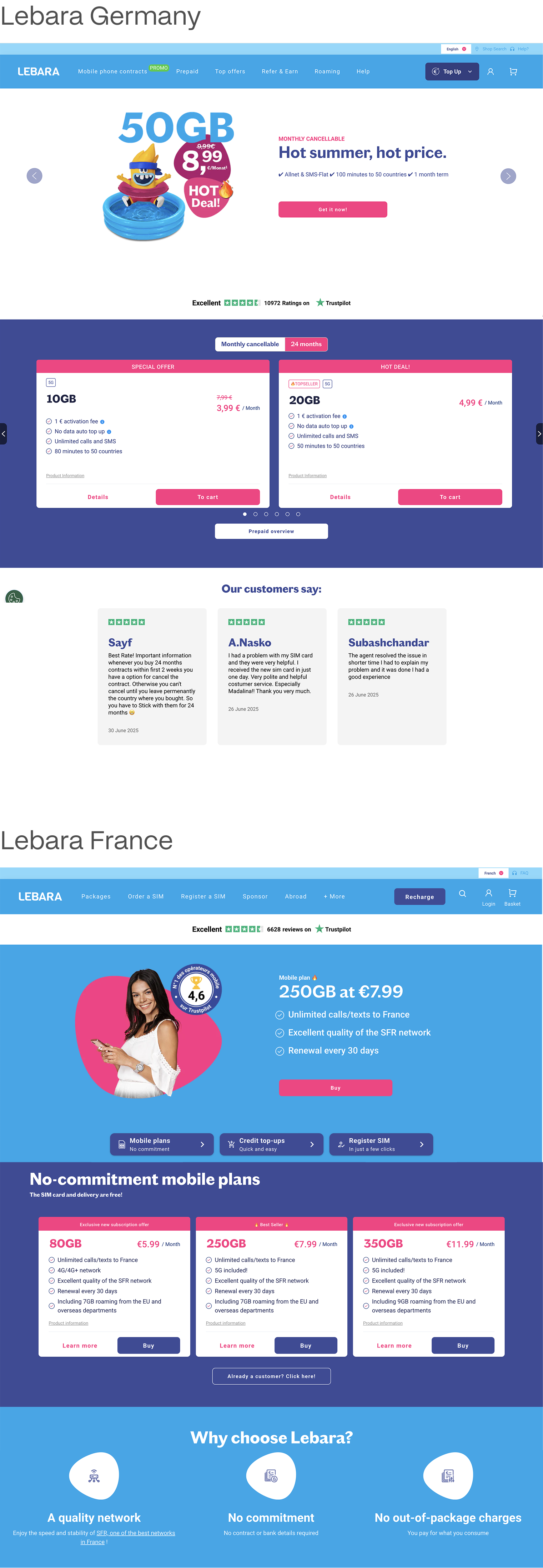
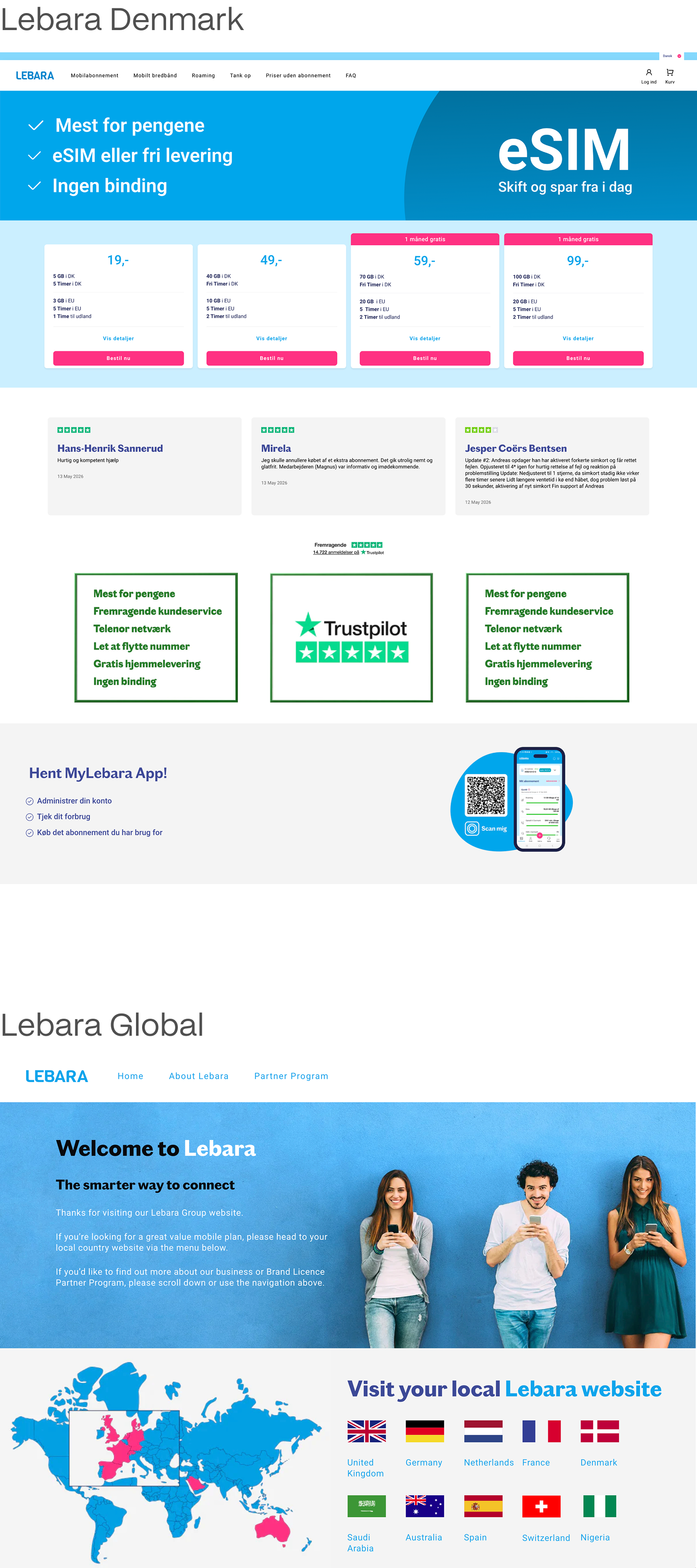
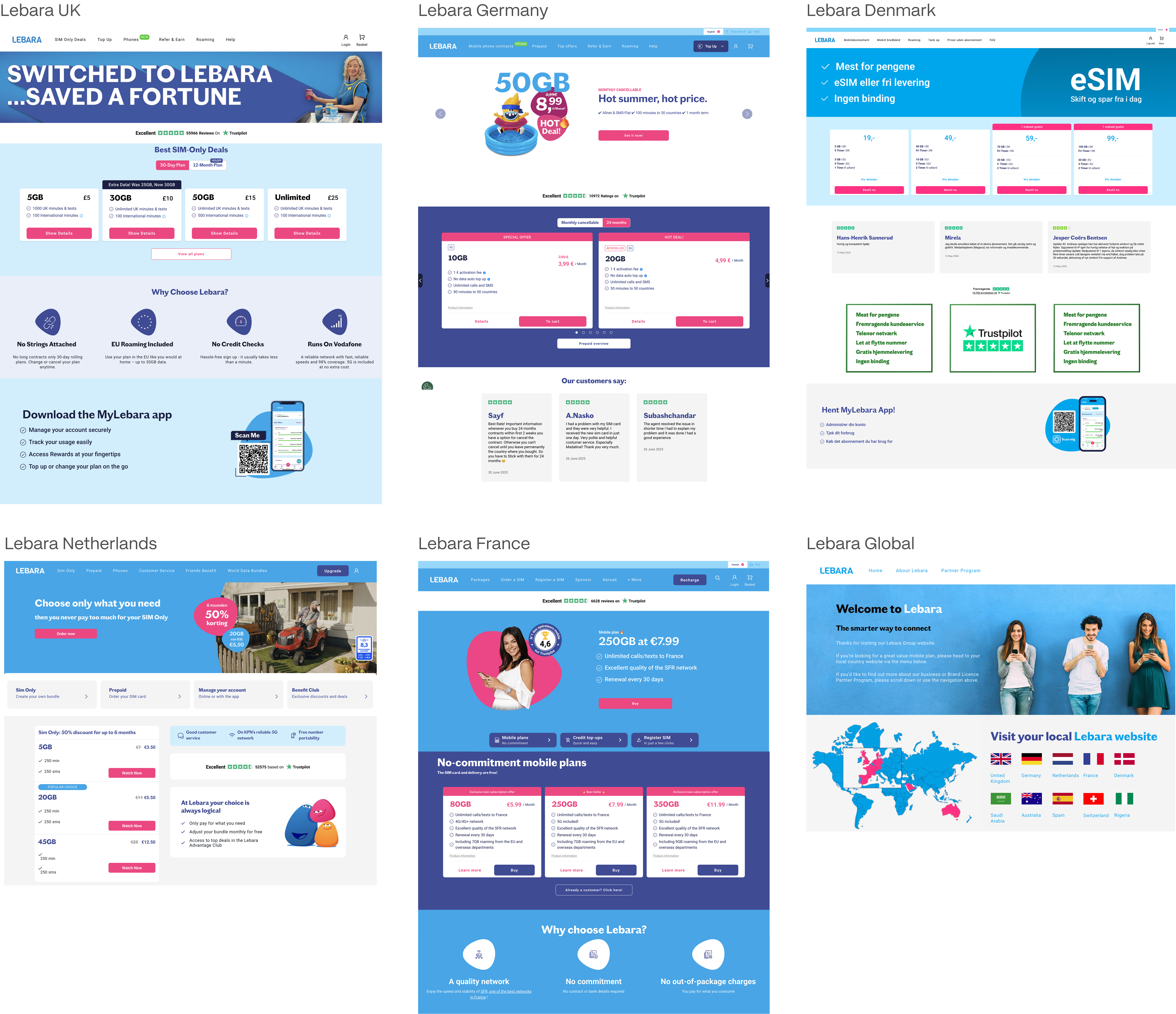
It was also apparent that this was having real consequences on the business: research showed that brand perception was lagging significantly behind industry peers, and customer feedback consistently pointed to an unprofessional look and feel of the websites, visual / UX inconsistencies, lack of emotional connection, and an absence of a coherent brand story or tone of voice – associations that were actively undermining trust and suppressing conversion.
The internal Design Team was also struggling with a severely limited visual toolkit: a narrow colour palette that lacked both sophistication and Accessibility compliance, a single graphic element which held no specific meaning, no proprietary typography and imagery, etc. etc. – all this made consistent and creative output nearly impossible.
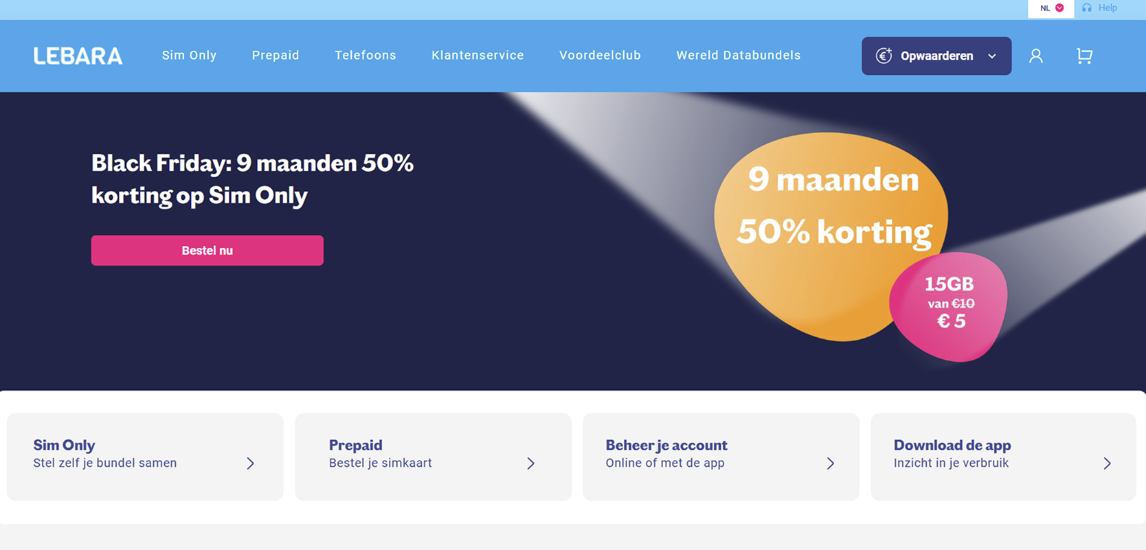
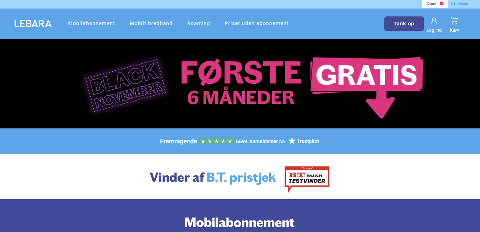
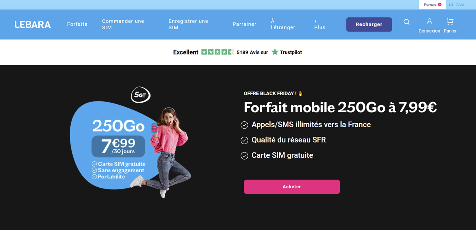
Pre-Refresh Black Friday hero banners in different Lebara markets. Left to right: Netherlands, Denmark, France.
Determined to make the case for change, I brought this to the C-level board as a strategic priority. Drawing on multiple examples of successful rebrands – including Wise, Miro, Monzo, etc. – which boosted conversion rates and brand consideration through targeted identity improvements, and challenger brands that had transformed customer trust and market share through Design – I demonstrated that investing in brand perception is not a cosmetic exercise, but a proven commercial driver. With Lebara's brand strategy shifting toward improving brand consideration and reclaiming the OG Challenger brand status, the timing was both urgent and strategically aligned.
THE C-LEVEL STAKEHOLDER BOARD AGREED, AND THE PROJECT WAS GREENLIT.
CHOOSING THE RIGHT PARTNER FOR THE BRAND DESIGN WORK
The next critical decision was selecting the right creative partner to bring the vision to life. The brief demanded more than executional capability – it required a studio that could think strategically, move at pace, and understand the unique challenge of refreshing a brand that needed to feel both globally coherent and locally relevant across five European markets.
After evaluating a number of candidates, Verve emerged as the clear choice – and not only for their craft. Their work on Miro's brand refresh had demonstrated exactly the kind of thinking Lebara needed: bold, purposeful, and designed to scale. From the very first presentation, it was clear this was the right partnership. The concept they brought to the table on day one was so precisely aligned with the strategic direction that it became the foundation we built everything on.
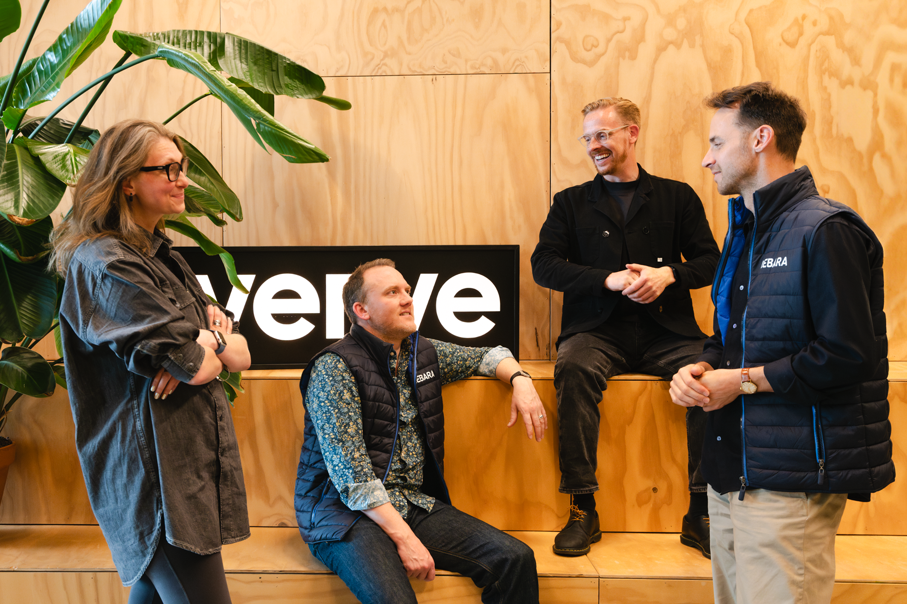
What set Verve apart was their ability to truly listen – to understand not just the brief, but the business context, the market pressures, and the opportunity behind them. Creative chemistry matters in work like this, and from the first sketch, it was there.
READ VERVE'S FULL CASE STUDY HEREARTICLE ON BRAND IDENTITYCOLLABORATIVE WORK PROCESS
What made this collaboration genuinely special was the depth of my creative involvement as the Global Design Lead of the project. This was not a client-agency relationship defined by approvals and sign-offs – it was one defined by active co-authorship, where I was as much a creative partner to Verve as I was their client.
We really appreciated Angelina's vision, commitment, and trust throughout the whole journey. Honestly, it was such a pleasure working with her and the wider Lebara team. Strong opinions, high standards, good energy, and real collaboration from start to finish. This combination is rare! Very proud of what we created together.
Roman Stikkelorum
Co-Founder, Managing Director Verve
After the project was finished, I sat down with Verve's founder Roman Stikkelorum to talk about making the internal case for change, why getting people on board is part of the design process and why the next chapter of any Tech company's branding is UX.
READ FULL INTERVIEW HERE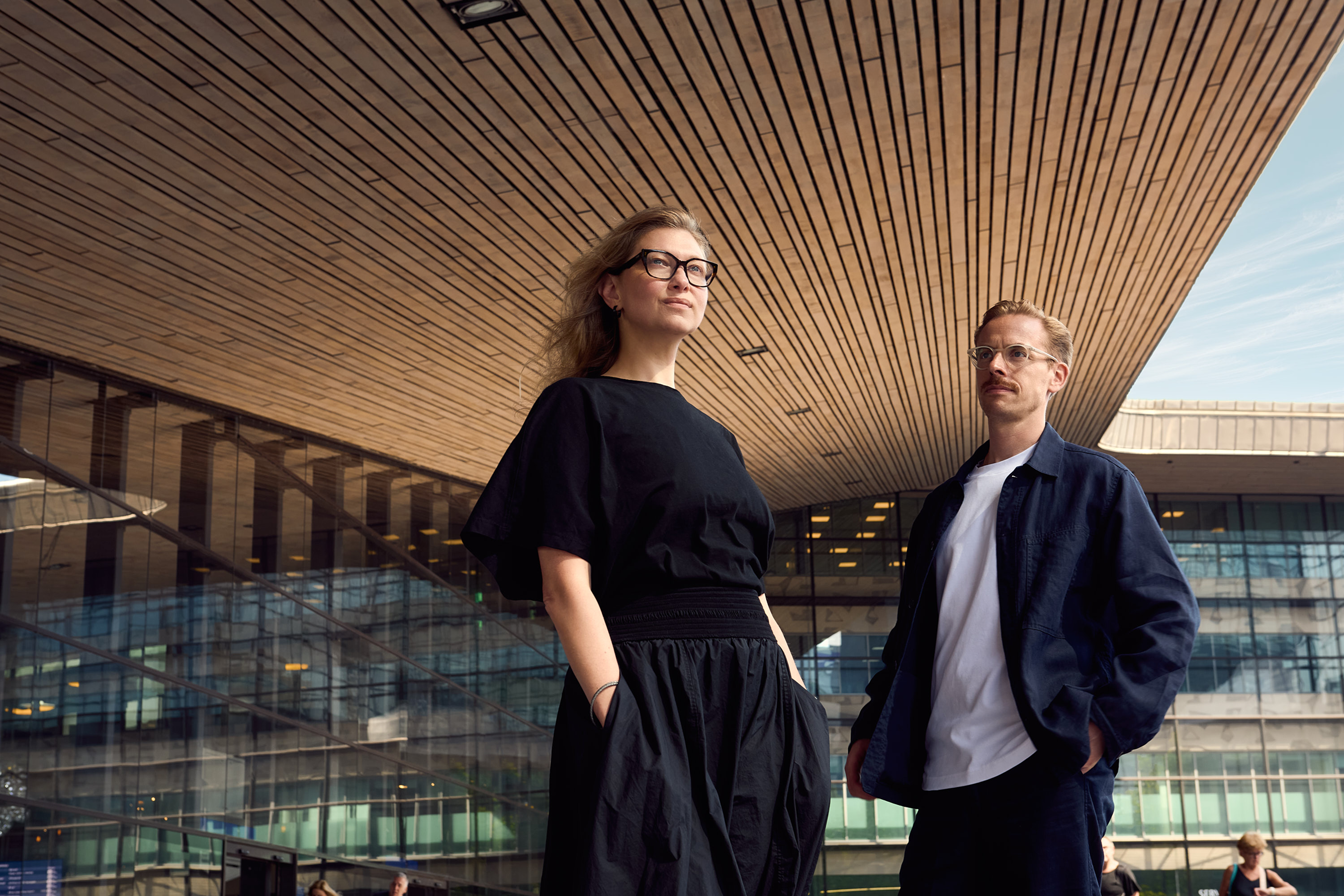
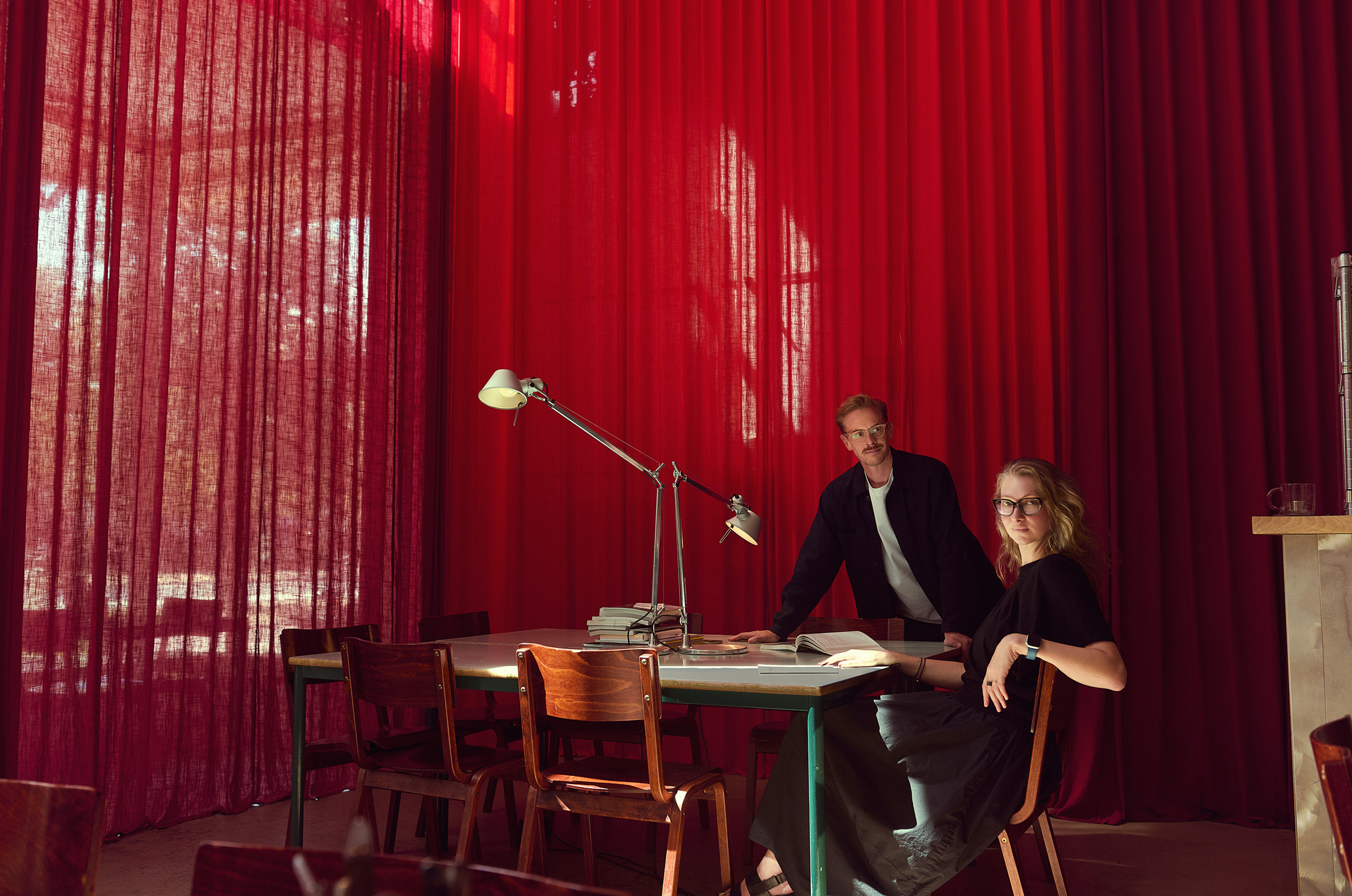
Photography: Mark David Weverling
Process
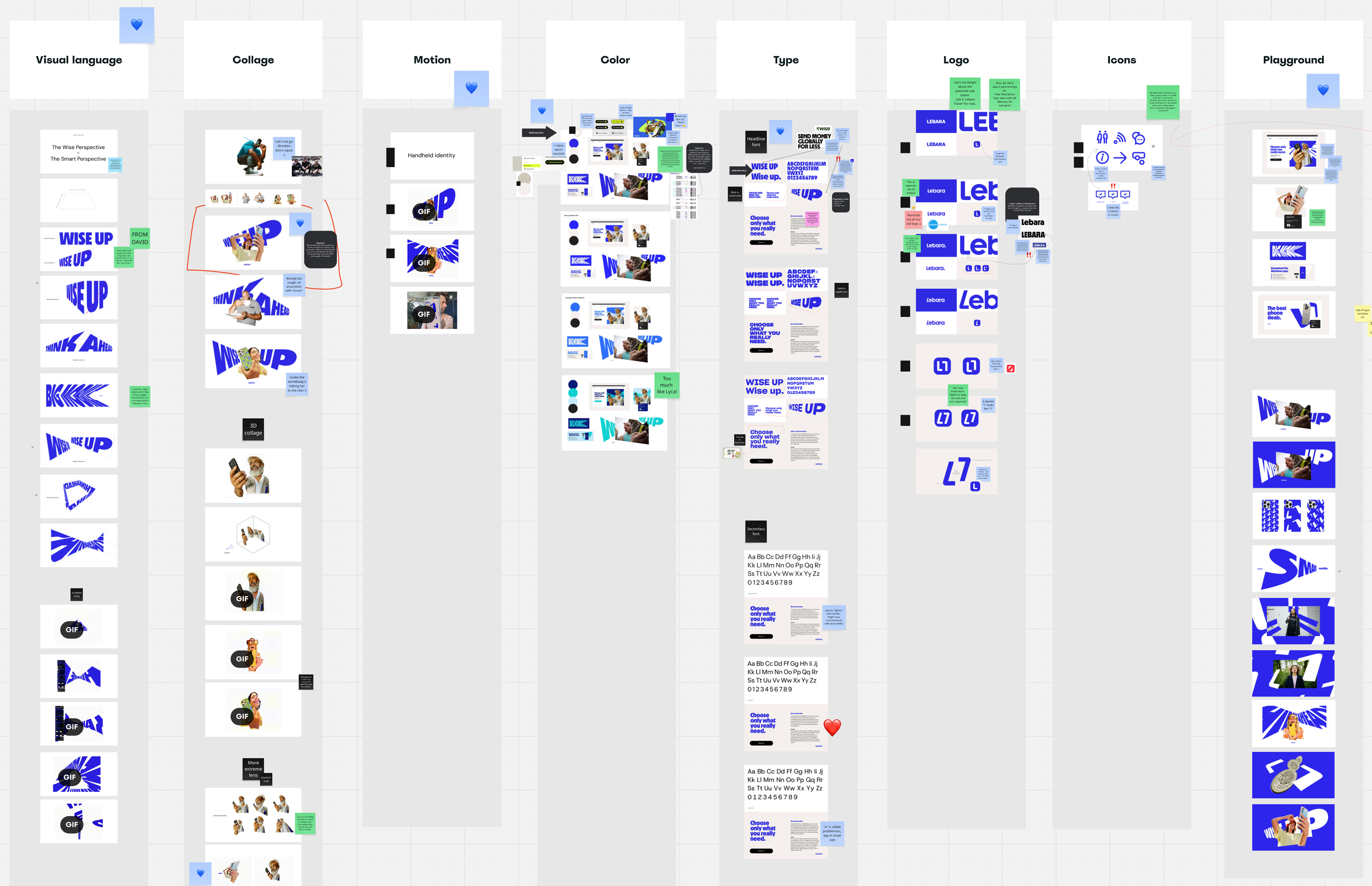
The whole working process lived in Miro – an open, shared canvas where strategy, references, sketches, and decisions accumulated over time into a living record of how the identity came to be. Nothing was hidden. Nothing was handed down. Every direction was arrived at together.
Reinforcing Brand Positioning: The Smart Perspective
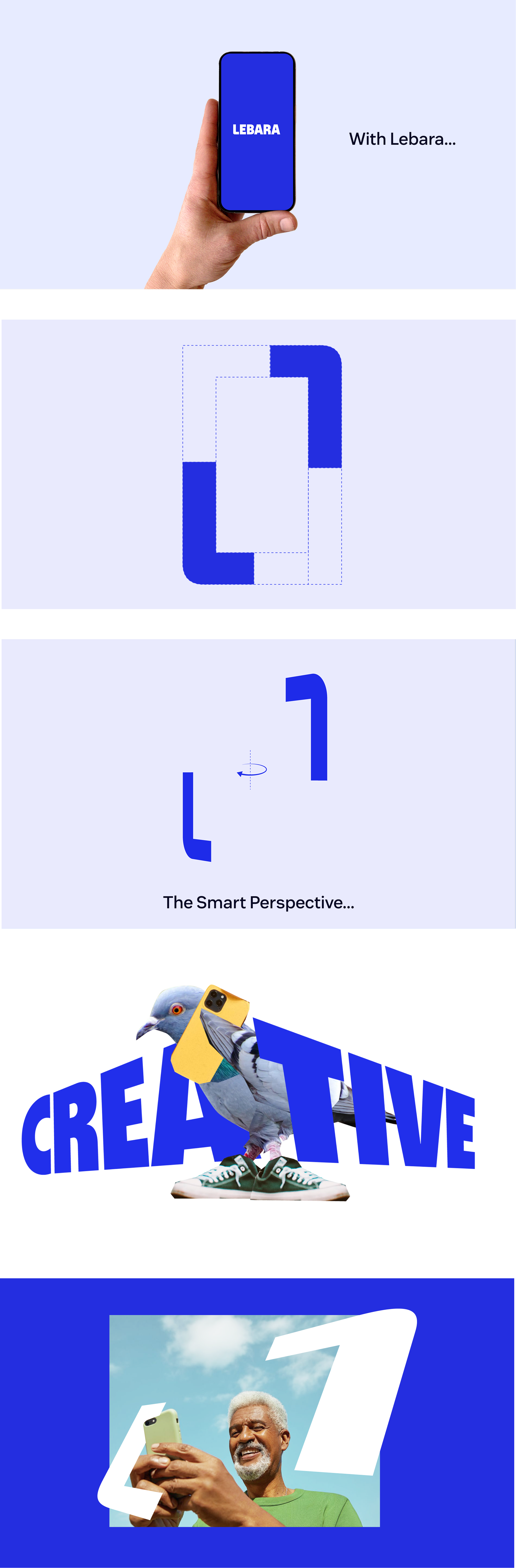
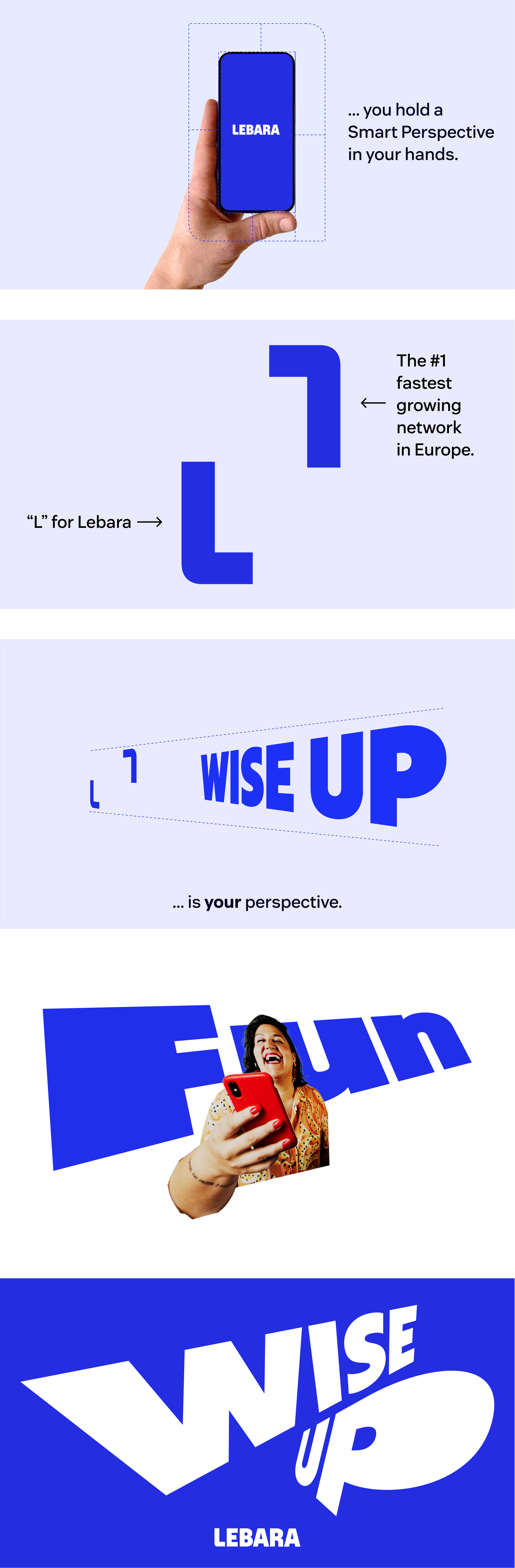
Lebara's existing brand positioning – Smarter Way to Connect – was already a genuine strength. The task was not to reinvent it, but to create a stronger brand platform with its own visual and verbal language – powerful enough to make it felt.
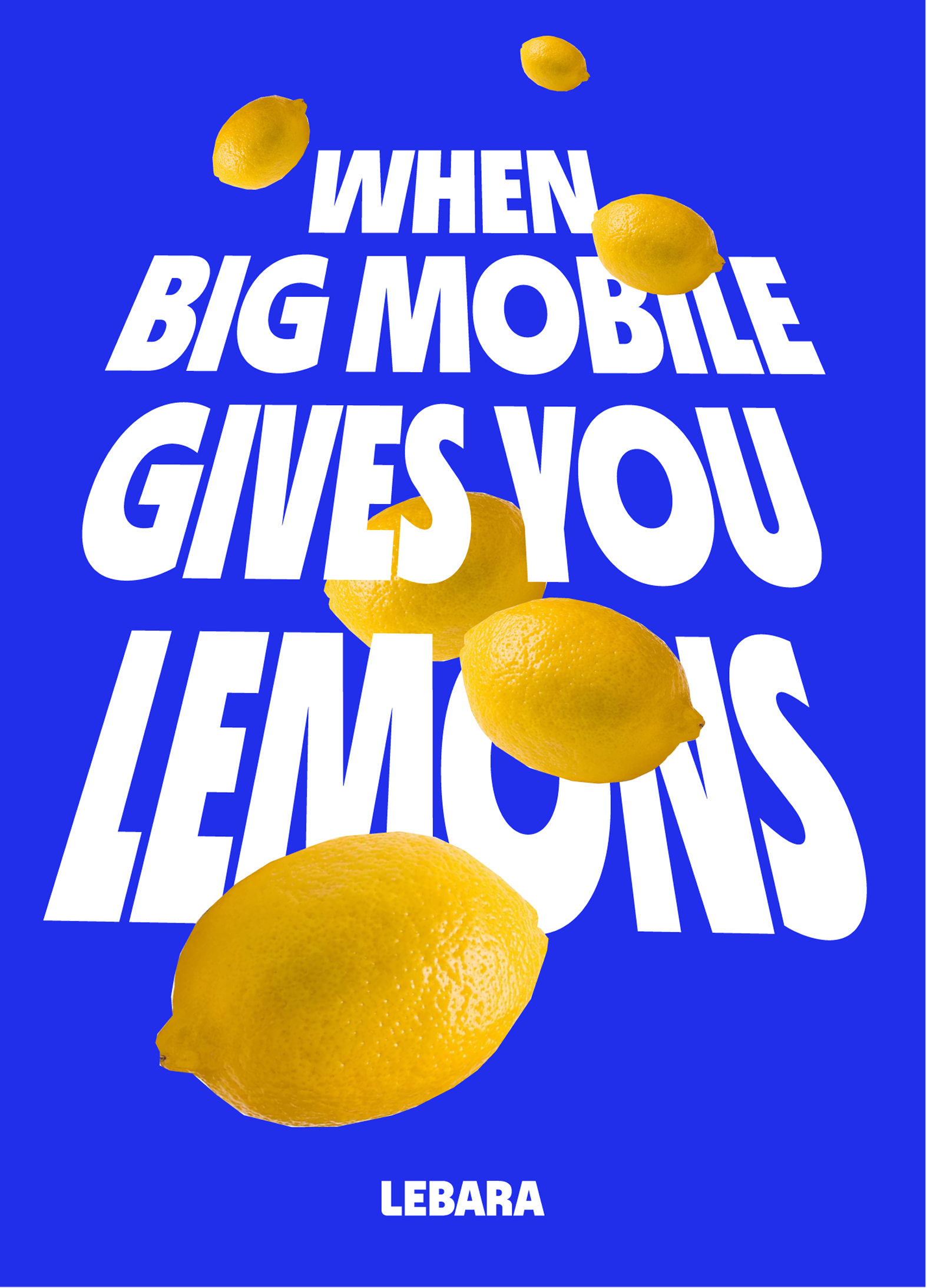
The creative concept that Verve brought to the table did exactly that. Built on a sharp, confident observation about the Telecoms industry – where traditional networks had spent years hiking prices, cutting data, and lowering expectations while customers were expected to simply accept it – the concept reframed Lebara as the brand that refuses to play along. The one that calls it out. The one that invites customers to wise up and expect more.
This positioning had a point of view, a tone, and an attitude – and it aligned perfectly with what Lebara had always stood for, just never said quite so boldly.
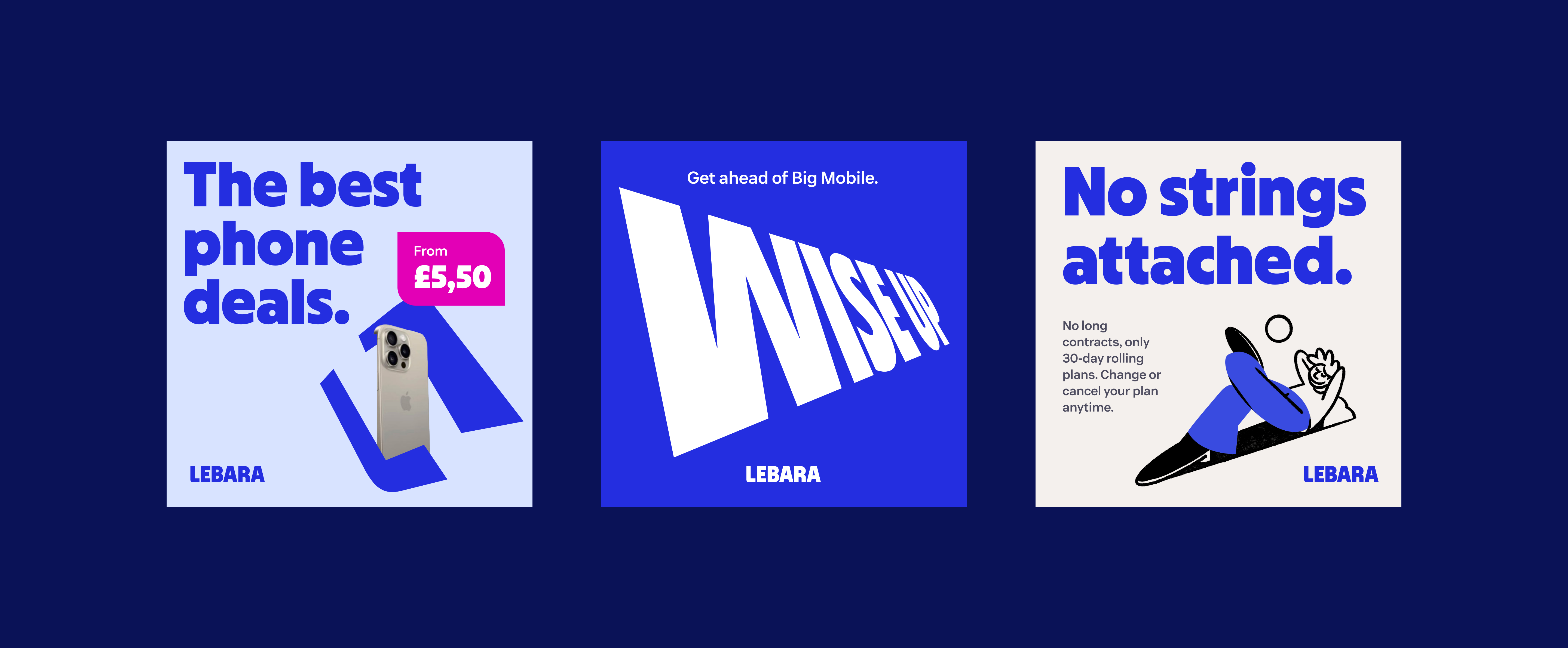
From this concept, the visual language followed naturally. A smart perspective needed to look the part: considered, distinctive, and confident without being corporate. The design direction that emerged – the graphic devices, the colour palette, the typography, the characters – was built to express that intelligence visually. Every element was chosen to signal that Lebara sees things differently, and that choosing Lebara means you do too.
Logo
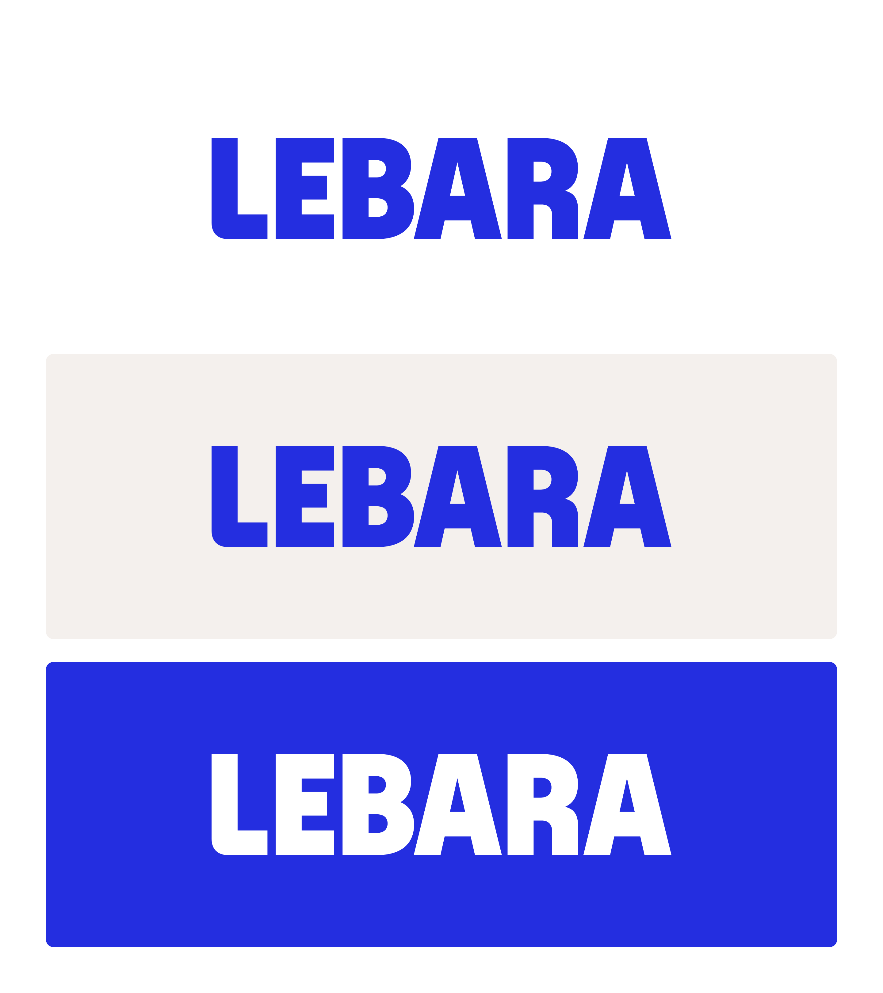
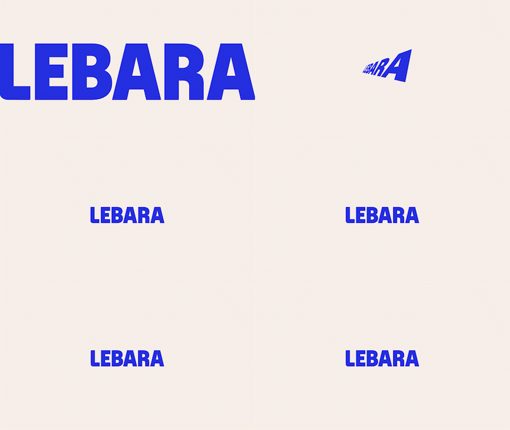
My vision for the logo was clear from the outset. LEBARA in all caps – bold, loud, and unapologetic – had always been the right foundation. The goal was to execute it better: to take the core idea and elevate it into something that felt modern, considered, and built to last.
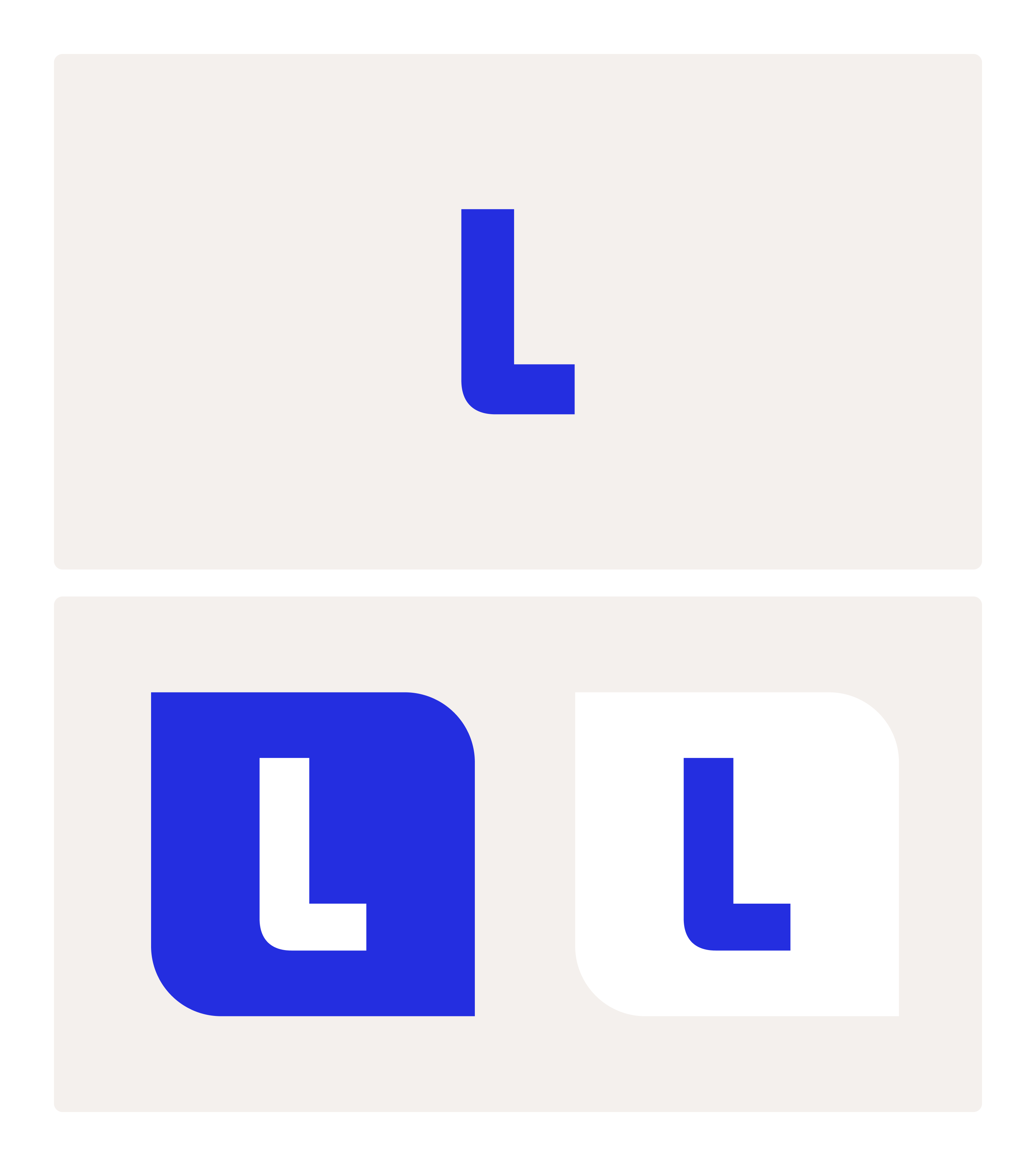
It was very rewarding to watch Verve's concept of the smart frame and smart perspective align so naturally with that vision. The letter L became the forming element of the smart frame, the logo icon, and the styling base for the entire visual system – a single letter shaping the whole identity! It was one of those rare moments where the initial brief and creative execution arrive at exactly the same place.
Custom Typography
The old Lebara logo had been manually drawn rather than built on an actual typeface – which meant the logo lettering and the brand typeface had always been treated as two unrelated design assets – an inconsistency quietly working against the coherence of the identity. For the new Lebara, the ambition was simplicity, boldness, and honesty – a visual language with nowhere to hide and nothing unnecessary. That meant full consistency from the very first letter: the logo font and the brand font had to be one and the same. Developing Lebara Sans as a bespoke custom typeface was therefore a foundational requirement. A single typographic voice, running from the logo through every touchpoint of brand communication, without exception. The custom Lebara Sans was created in close collaboration with Blast, a type foundry based in Amsterdam.
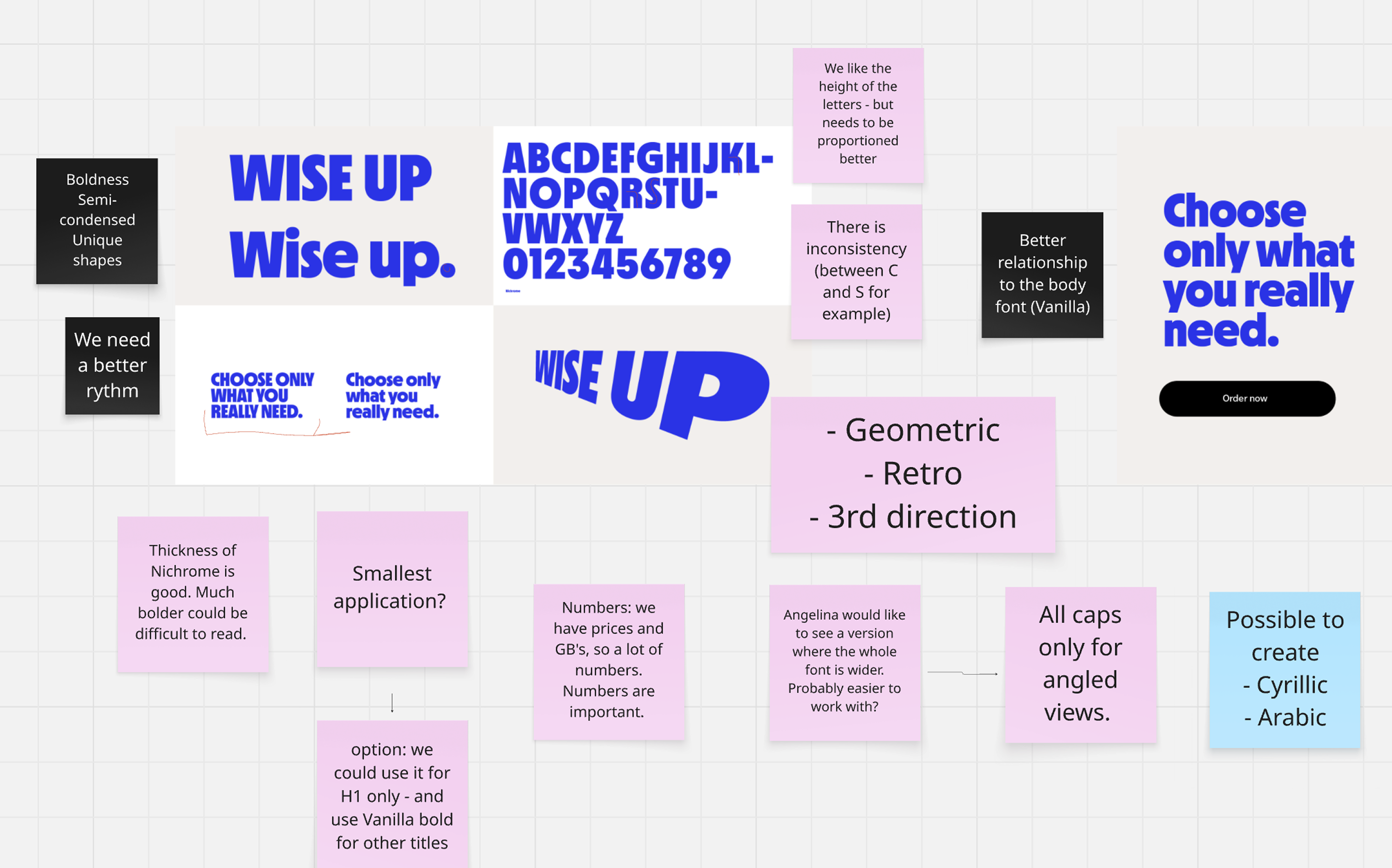
The design direction was defined early: bold, semi-condensed, geometric, with unique letterforms that would give the typeface a personality as strong as the brand itself.
The exploration was rigorous – testing rhythm, weight, proportions, and consistency across the full character set, including numbers, which for a telecoms brand carrying prices, data allowances, and plan comparisons, were central to the typographic brief.
Directions were evaluated, challenged, and refined – with specific feedback shaping every iteration, from the relationship between individual letterforms to how the typeface would behave at its smallest application. The result was a typeface that could stand alone and still be unmistakably Lebara. It became the backbone of the new brand.
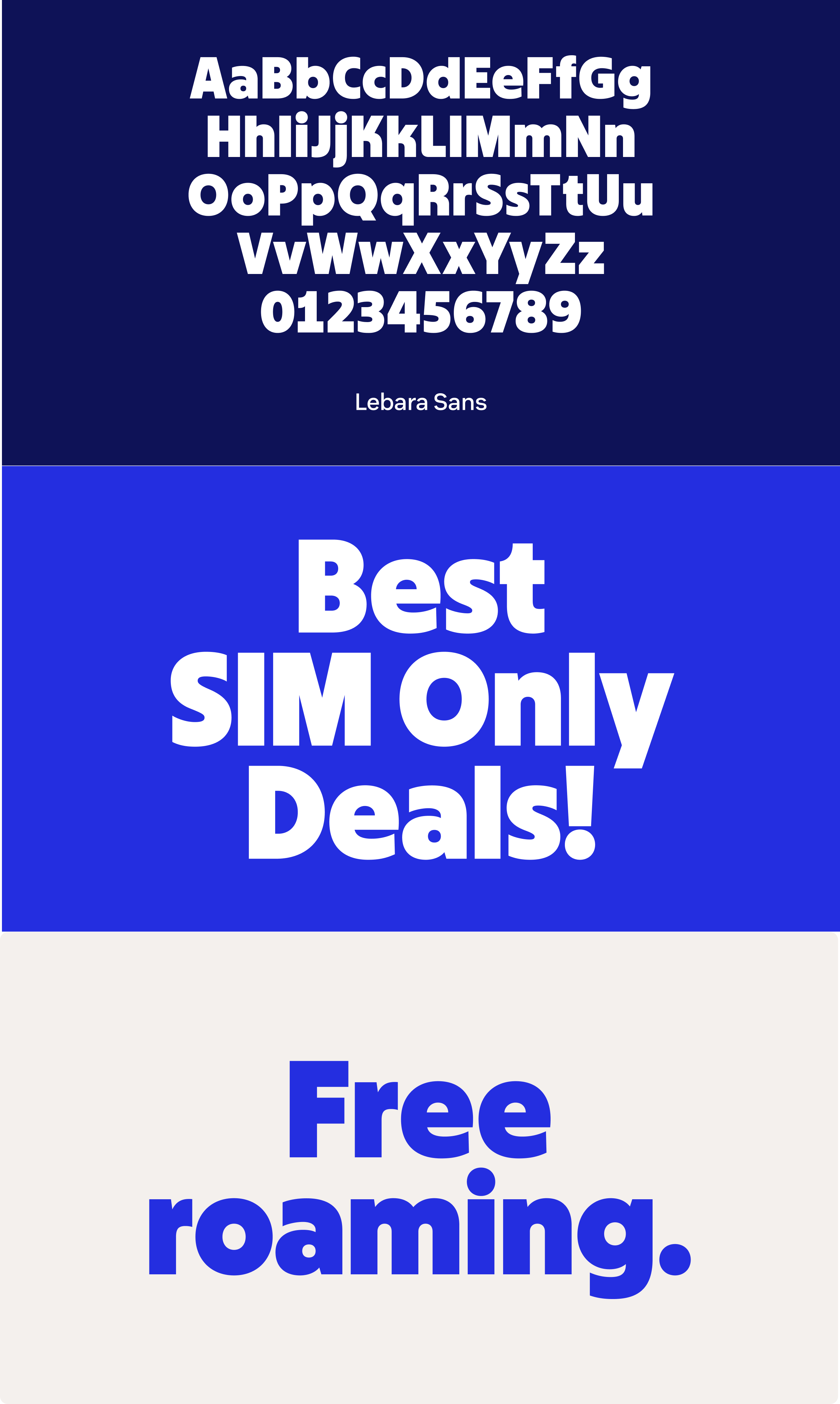
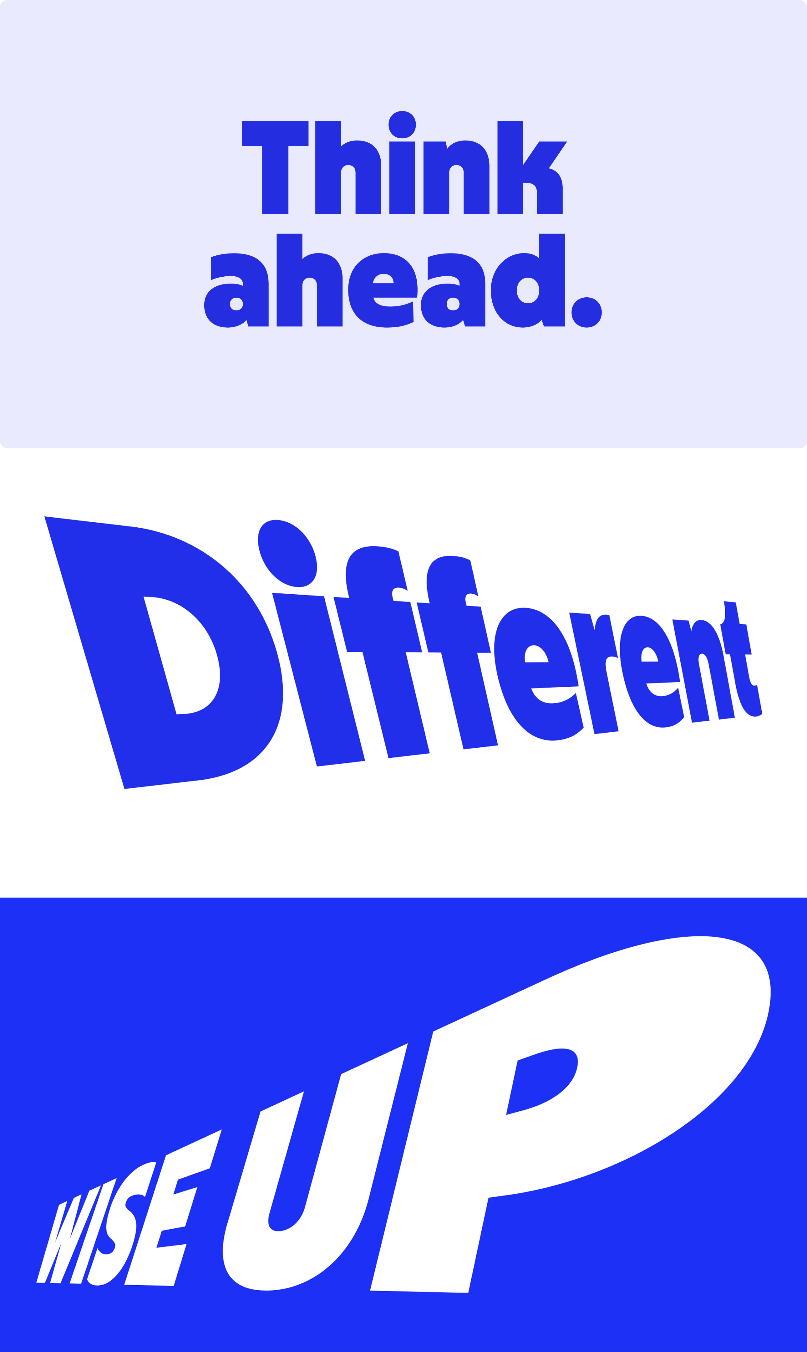
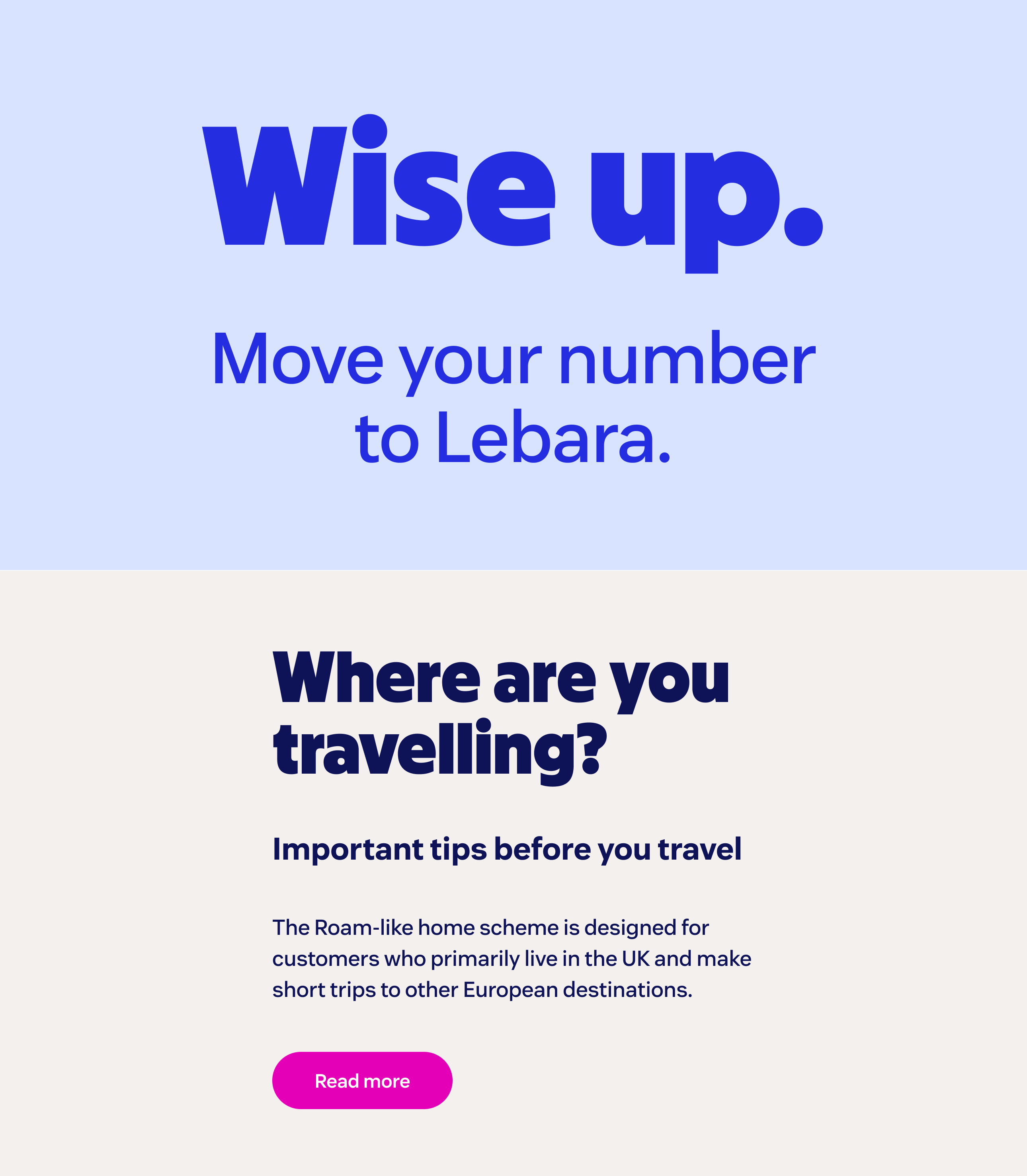
Alongside Lebara Sans, we selected Vanilla as the brand's supporting body typeface – also from Blast, making it a natural typographic companion. Neutral where Lebara Sans is bold, flexible where it is distinctive, and exceptionally legible in longer texts, Vanilla provides the quiet counterbalance that allows the primary typeface to lead. Two fonts from the same foundry, designed to work in harmony – and together, more than sufficient for everything the brand needs to say.
Colour
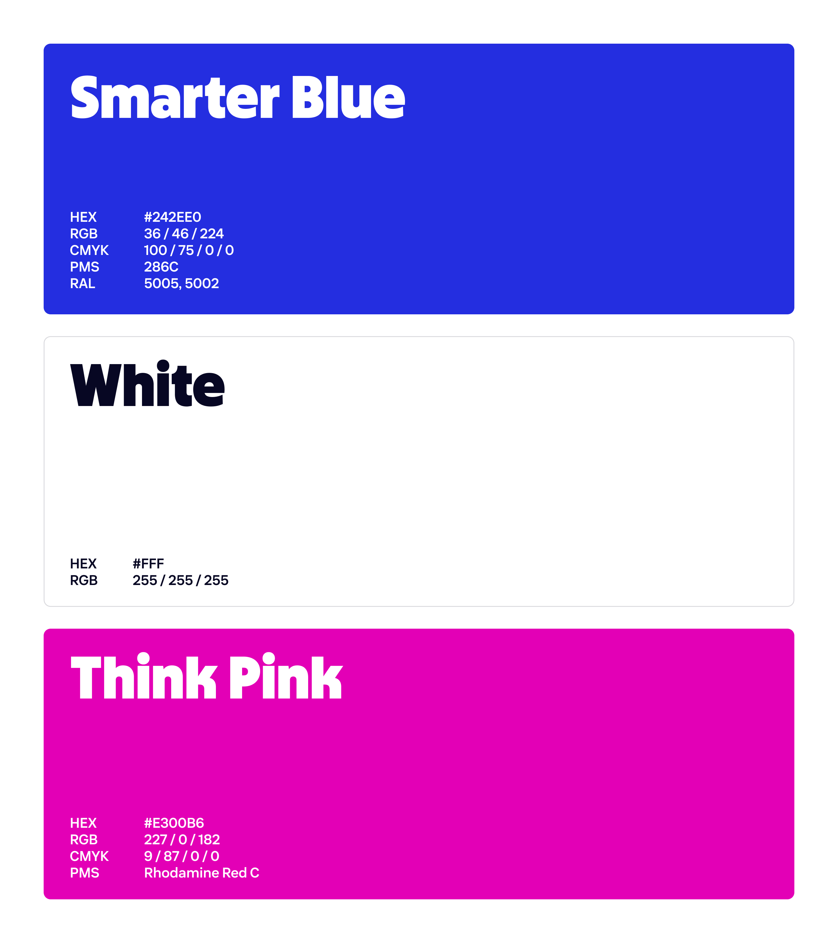
The colour direction was shaped by evidence. Multiple preference tests and qualitative user interviews offered people a range of colour schemes under consideration – and the results were both clear and instructive. People responded most strongly to the legacy combination of blue and pink, describing it as familiar, trustworthy, and recognisably Lebara.
The decision was to honour that and elevate it. The blue and pink combination was retained, but given a modern polish – pushed to be more punchy, more vibrant, and built for the demands of digital-first communication. Evolved enough to signal change, grounded enough to protect what people already loved.
Colour Proportions
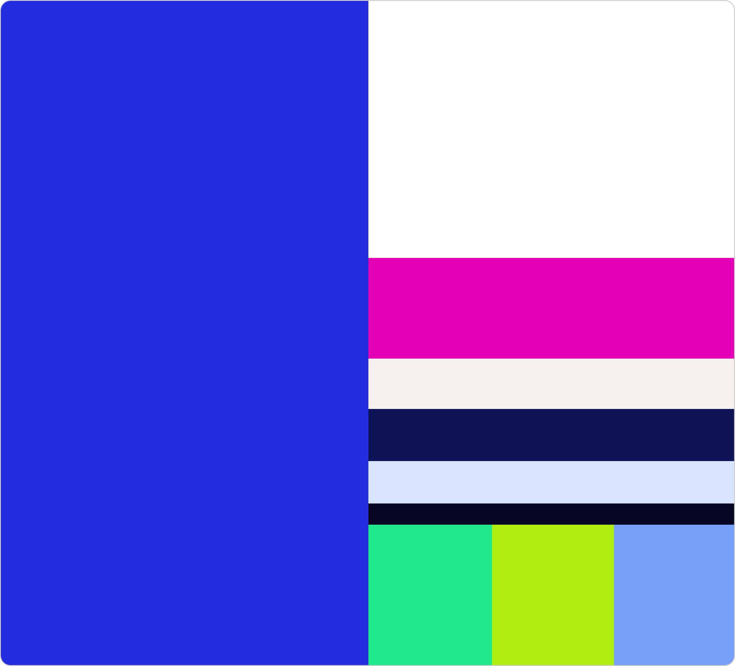
With the palette defined, the next step was establishing how the colours live together – their proportions, hierarchy, and the distinct role each one plays in the system.
Lebara is, unambiguously, a blue brand. Smarter Blue dominates every application, anchoring the identity with consistency and visual weight. Think Pink follows as the most strategically important accent – reserved for calls to action and the moments that demand attention. Neutral and dark shades provide compositional grounding, while tertiary colours bring energy and flexibility where needed.
This proportional framework transforms colour from a creative choice into a practical system – giving any designer, in any market, the clarity to build any touchpoint with confidence.
L-Frames as the Main Dynamic Graphic Element
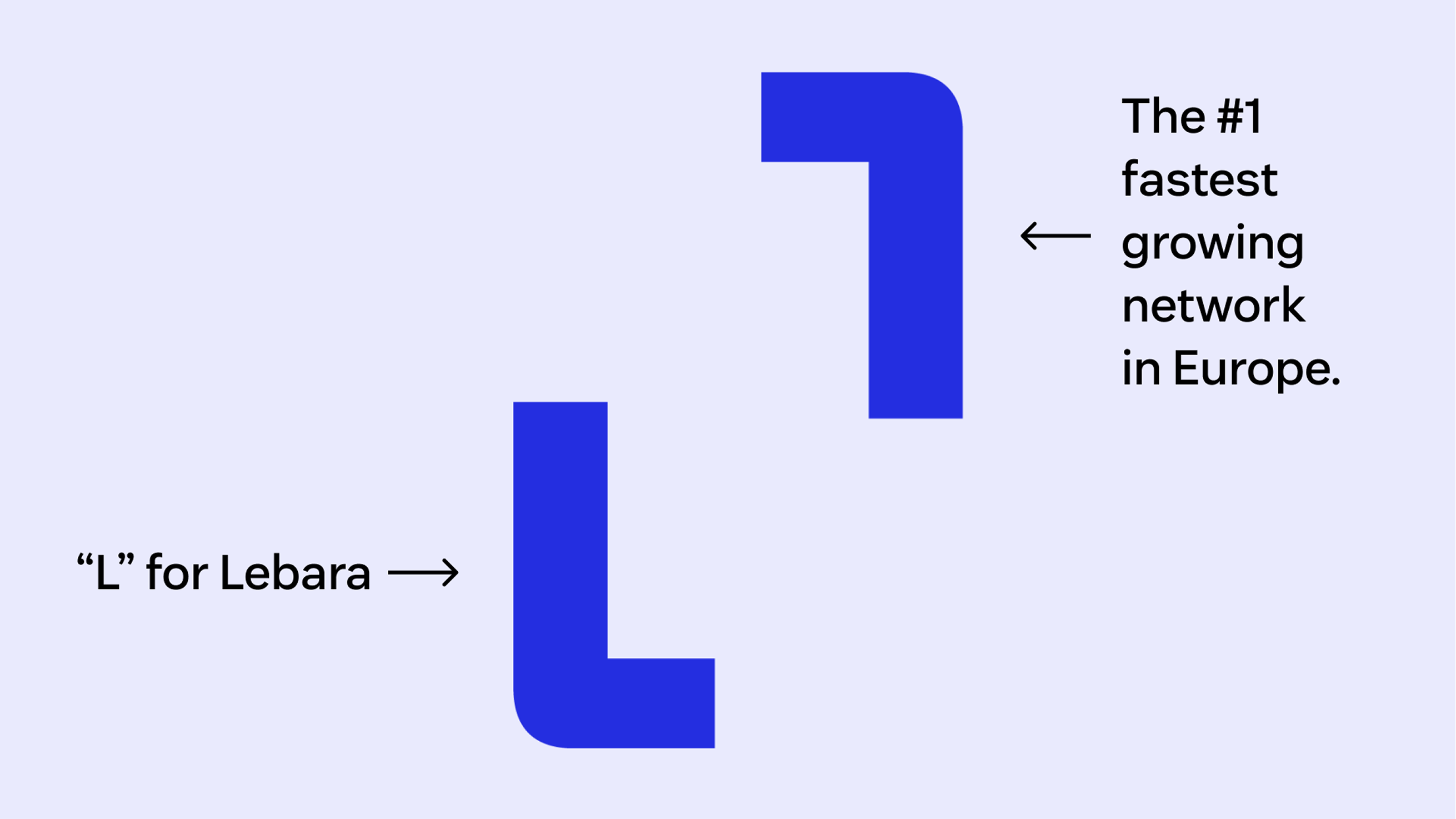
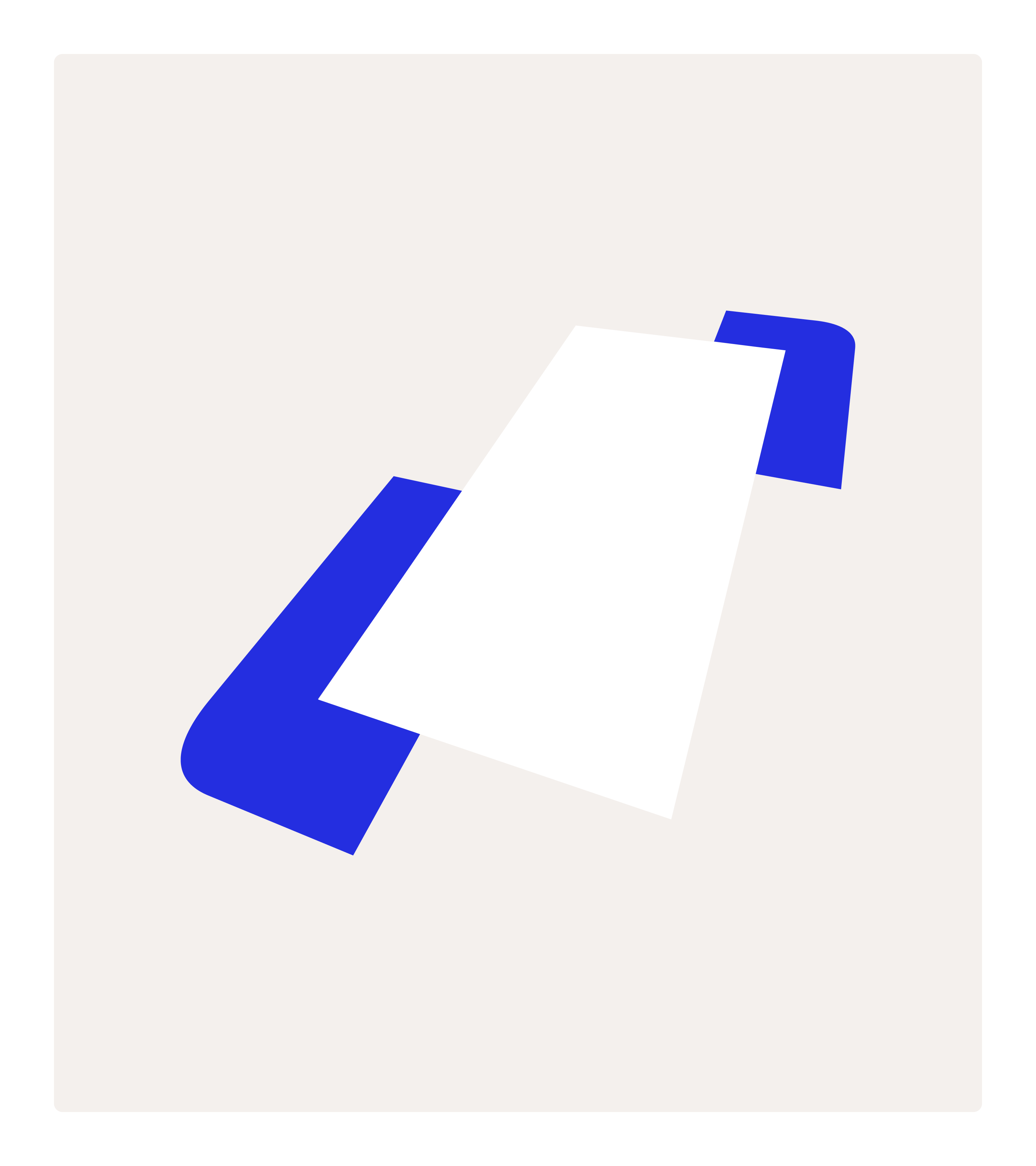
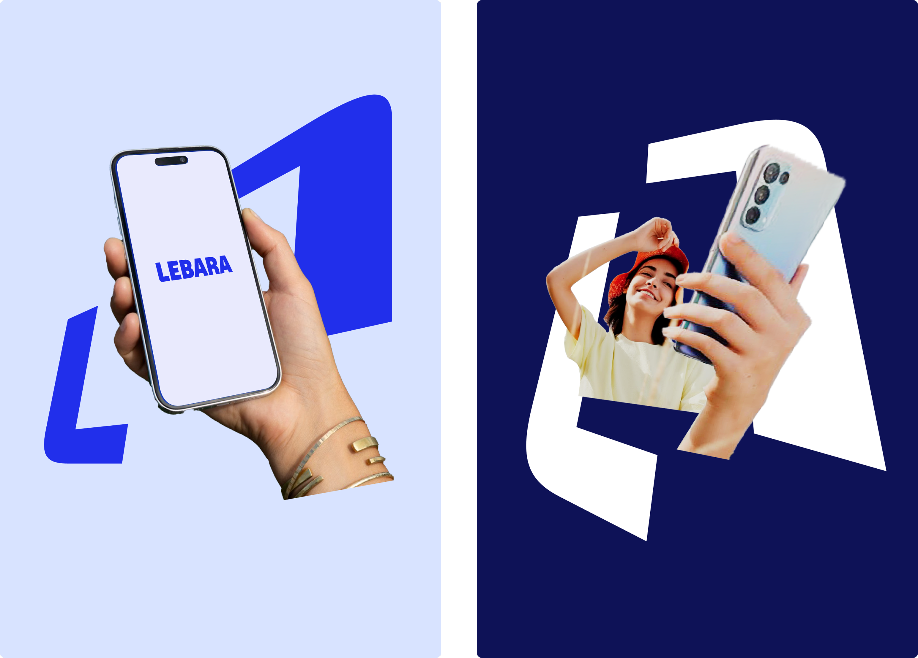
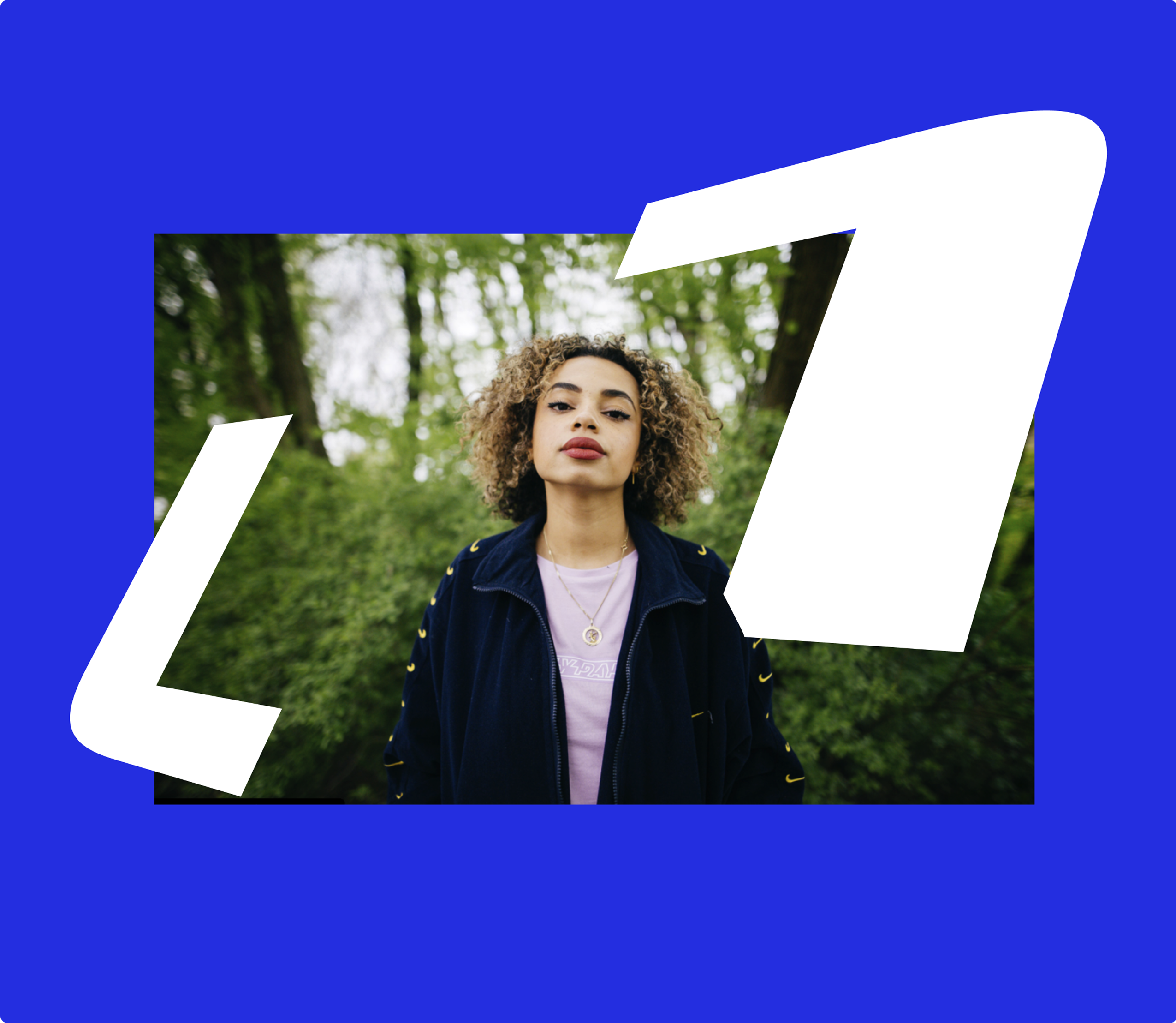
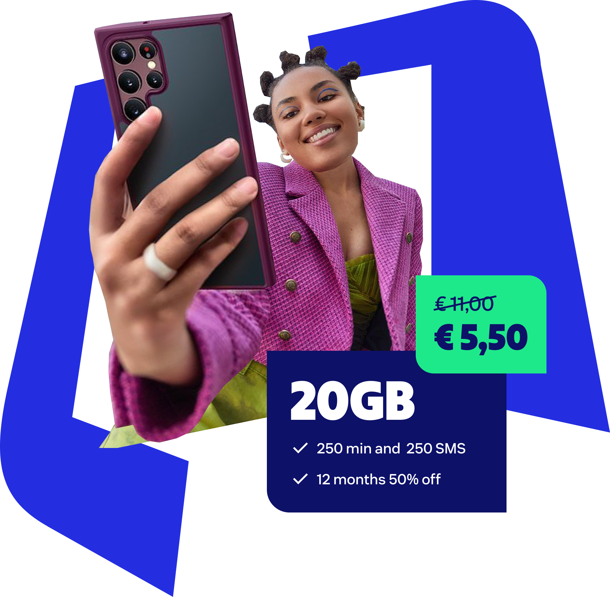
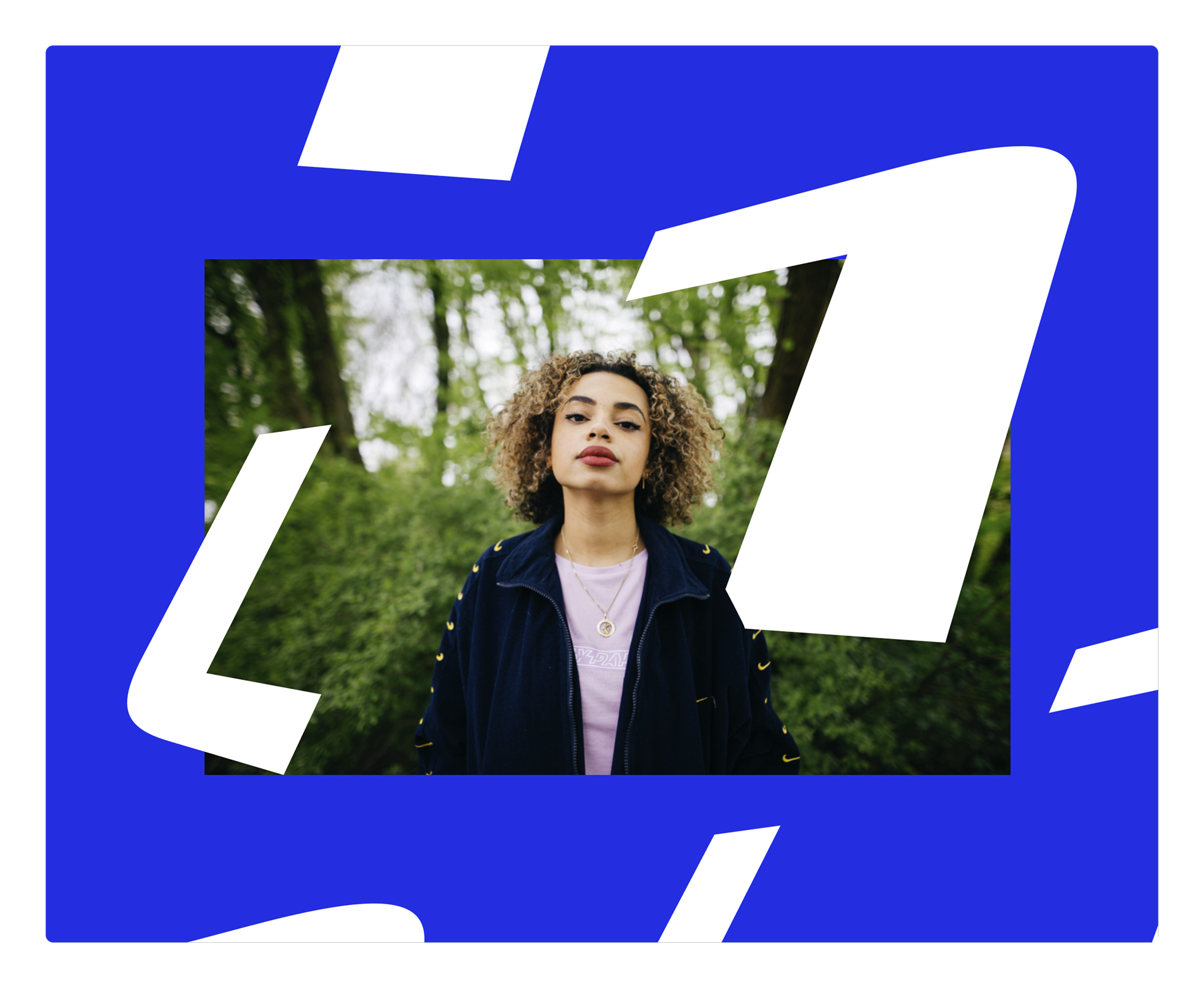
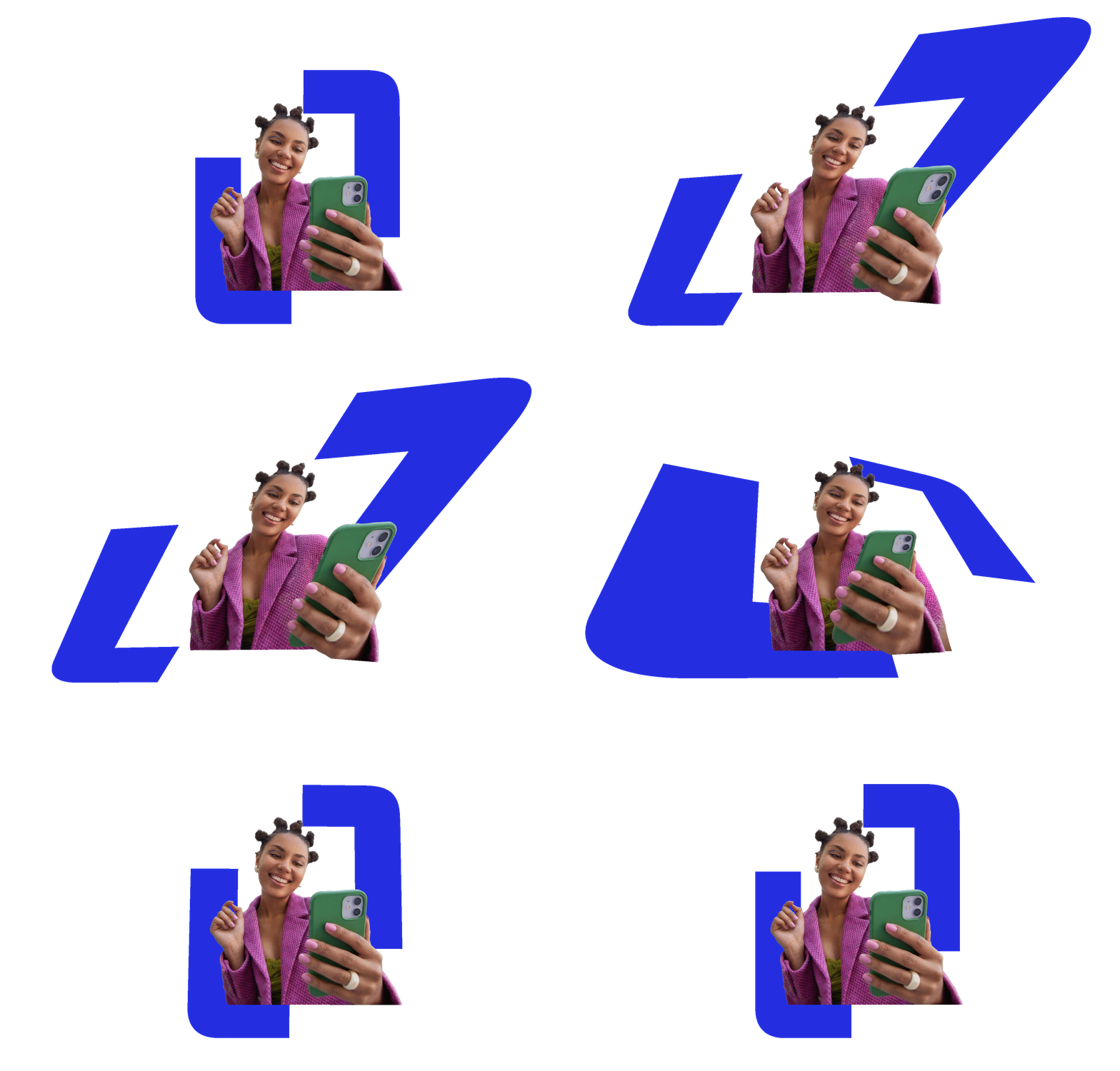
The Lebara logo icon became a foundation of the brand visual system. When two L-shapes are combined, they form a flexible frame capable of holding images, people, or text. It works on two levels: drawing the eye to whatever lives inside it, while referencing both the L of Lebara and the number 1 – a deliberate nod to growth and market leadership.
Like the typography it was born from, the frame can be stretched into perspective – gaining depth, energy, and movement. The same device that anchors the logo becomes the engine of the entire visual language.
Smart Containers
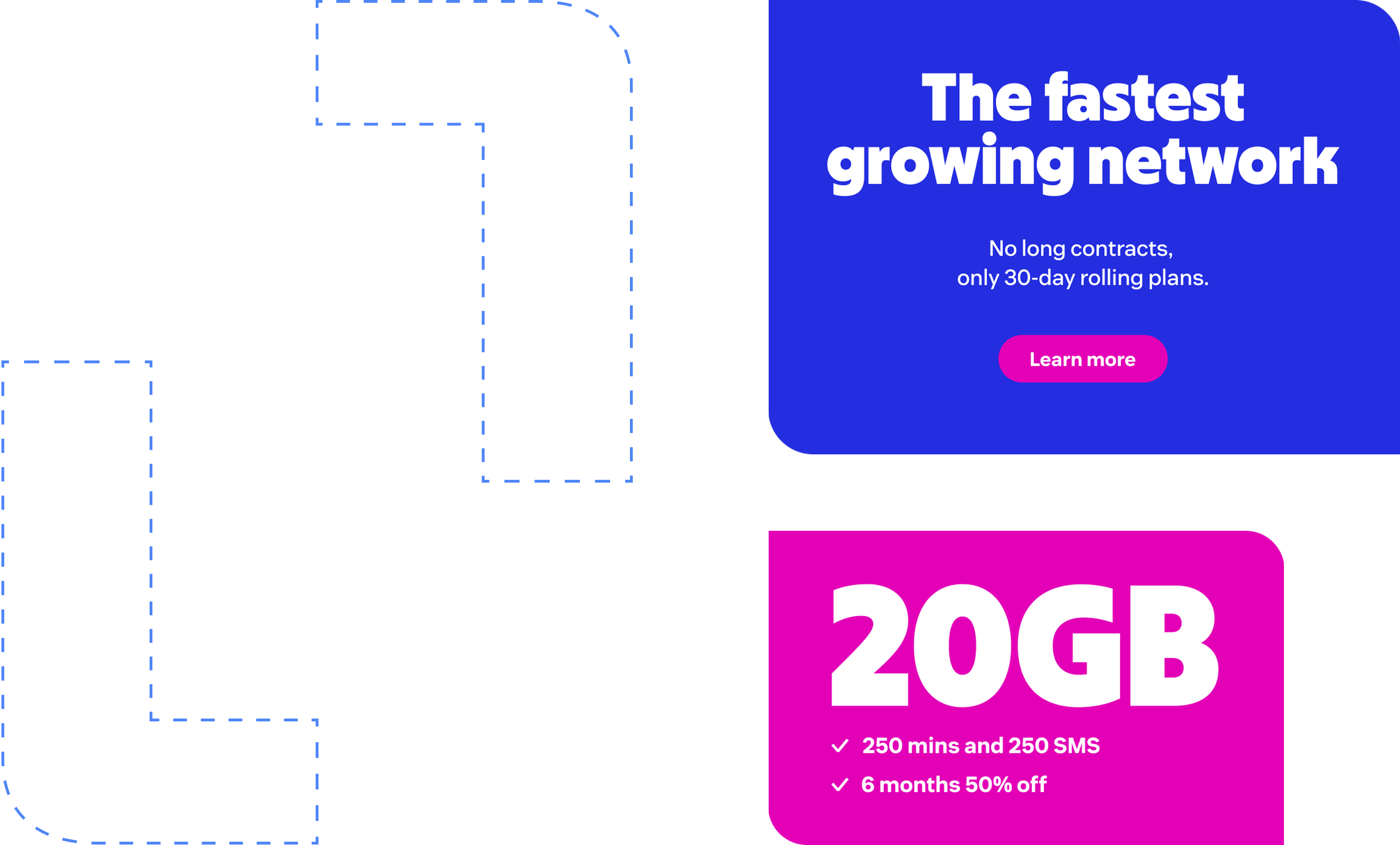
Drawn directly from the geometry of the L, Smart Containers bring the brand's visual language into UI and communication design. Built on the same principle as the Smart Frame – with two rounded corners at the top right and bottom left – they create an immediately recognisable content vessel that feels distinctly and consistently Lebara.
Flexible by design, Smart Containers are used to hold deals, offers, cards, and any content that needs to be packaged with clarity and brand confidence. The same shape logic that lives in the logo and the frame now lives in the product – a single design language running seamlessly from brand identity to digital interface.
Imagery: Smart Collages
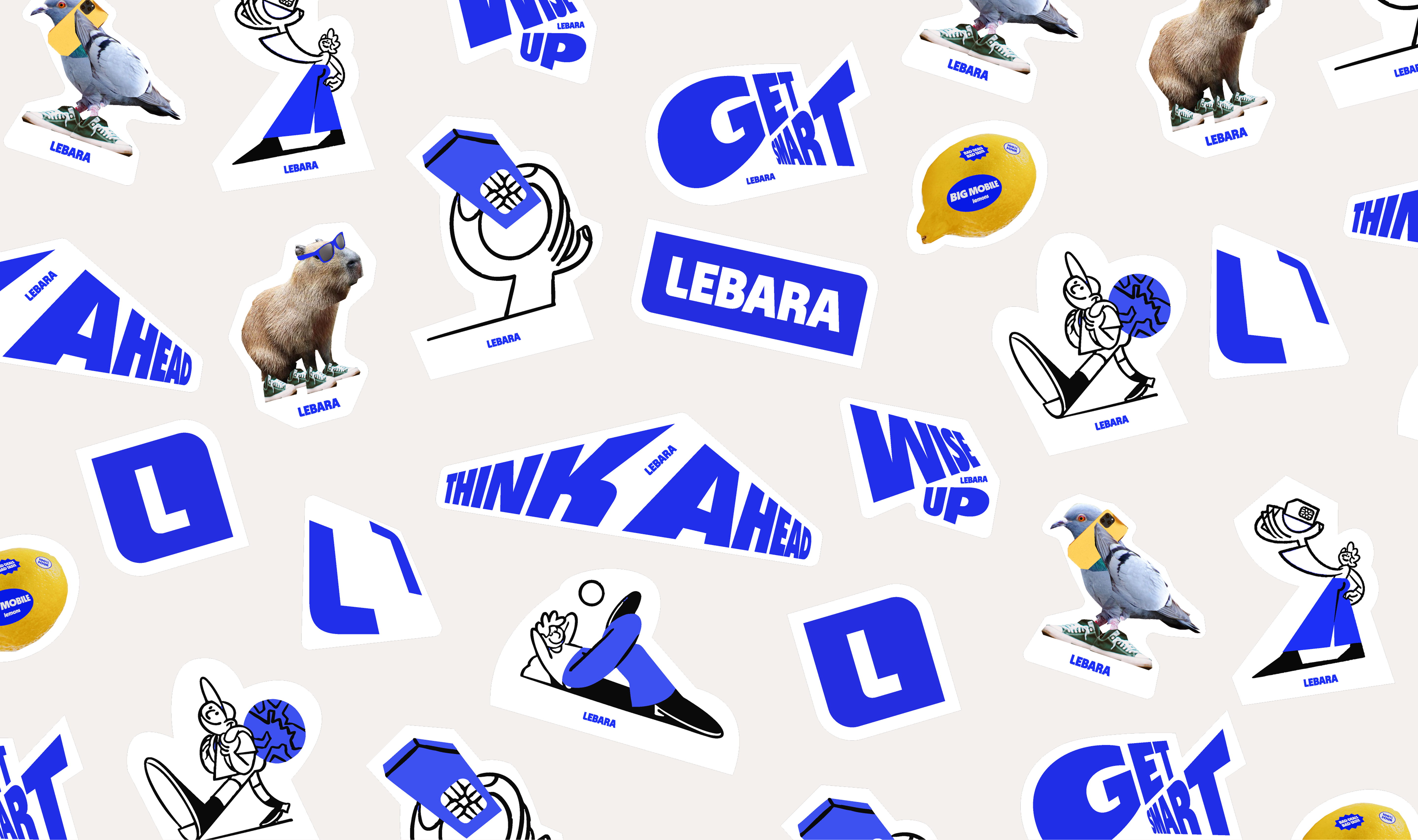
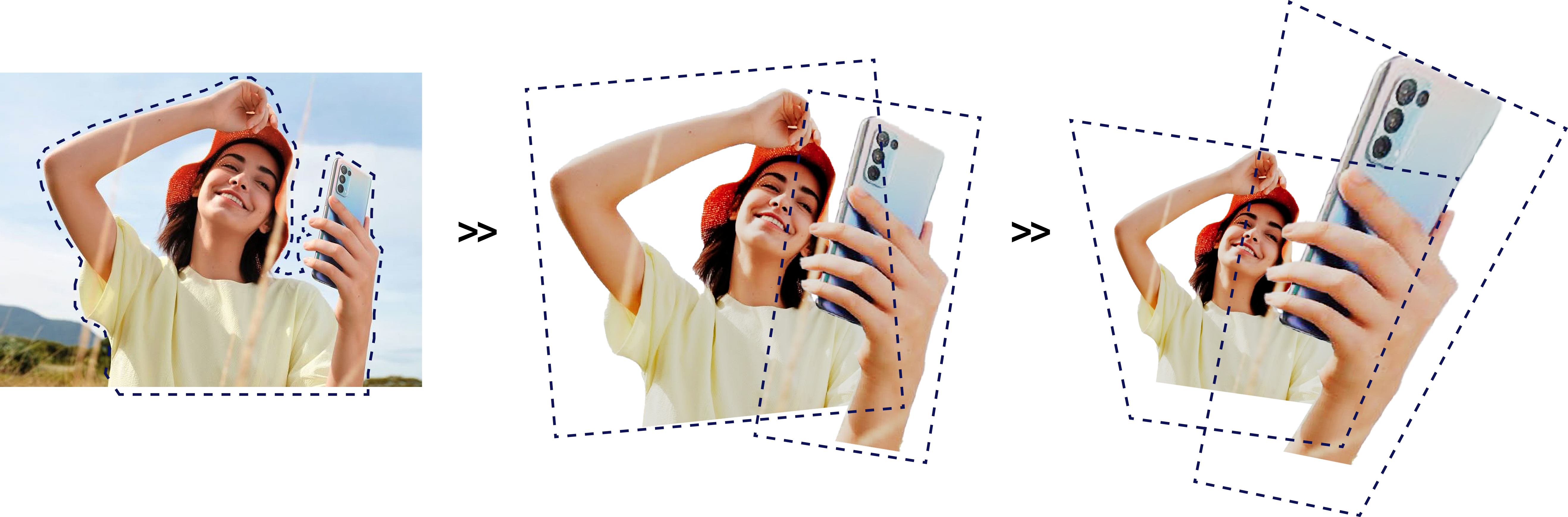
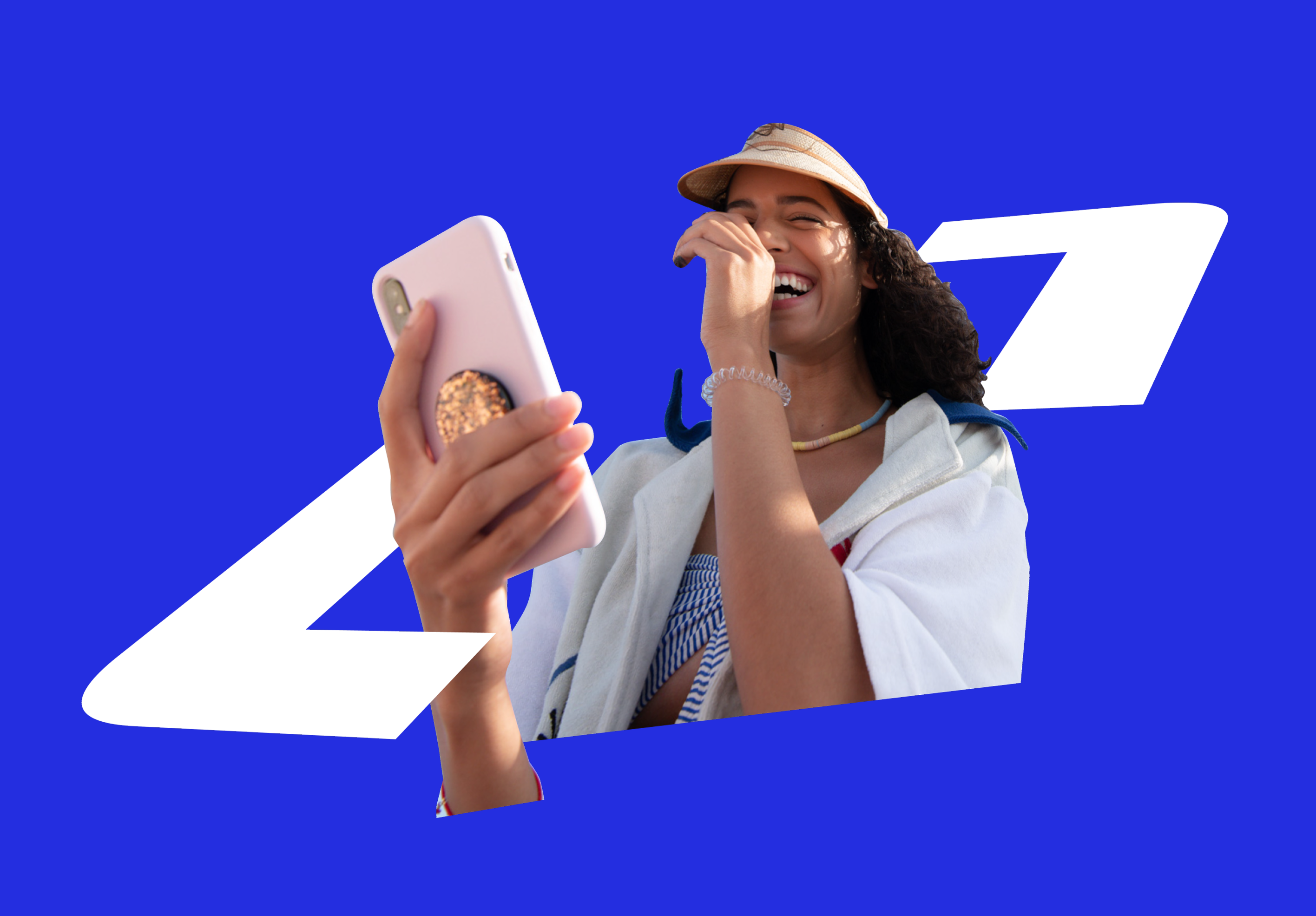
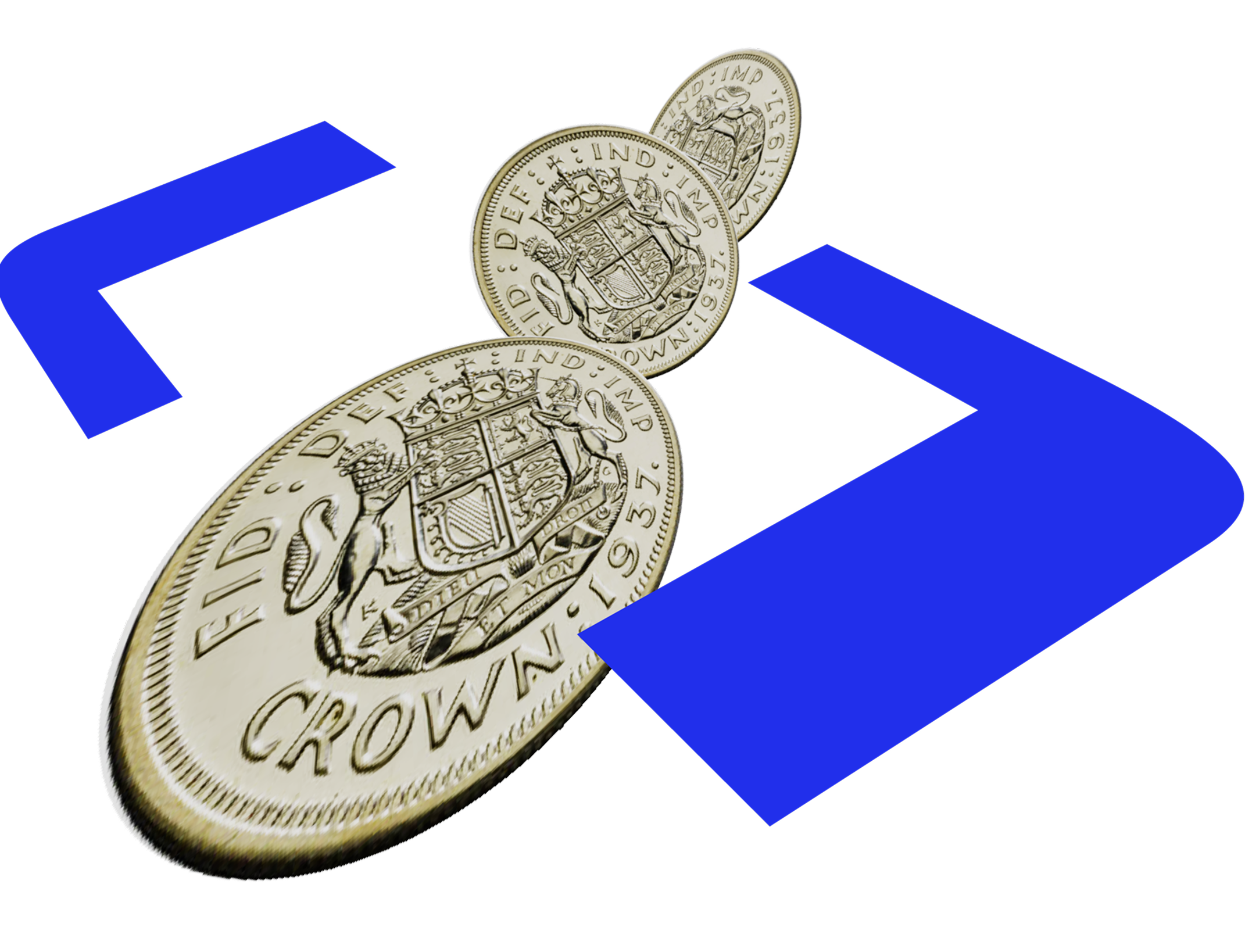
Smart Collages bring personality and unexpectedness to Lebara's visual language. They add wit, depth, and energy through skewed compositions and exaggerated scale. In a telecoms market defined by polished but soulless stock imagery, the collage aesthetic signals something different: a brand with genuine personality that takes its customers seriously, but never takes itself too seriously.

Iconography
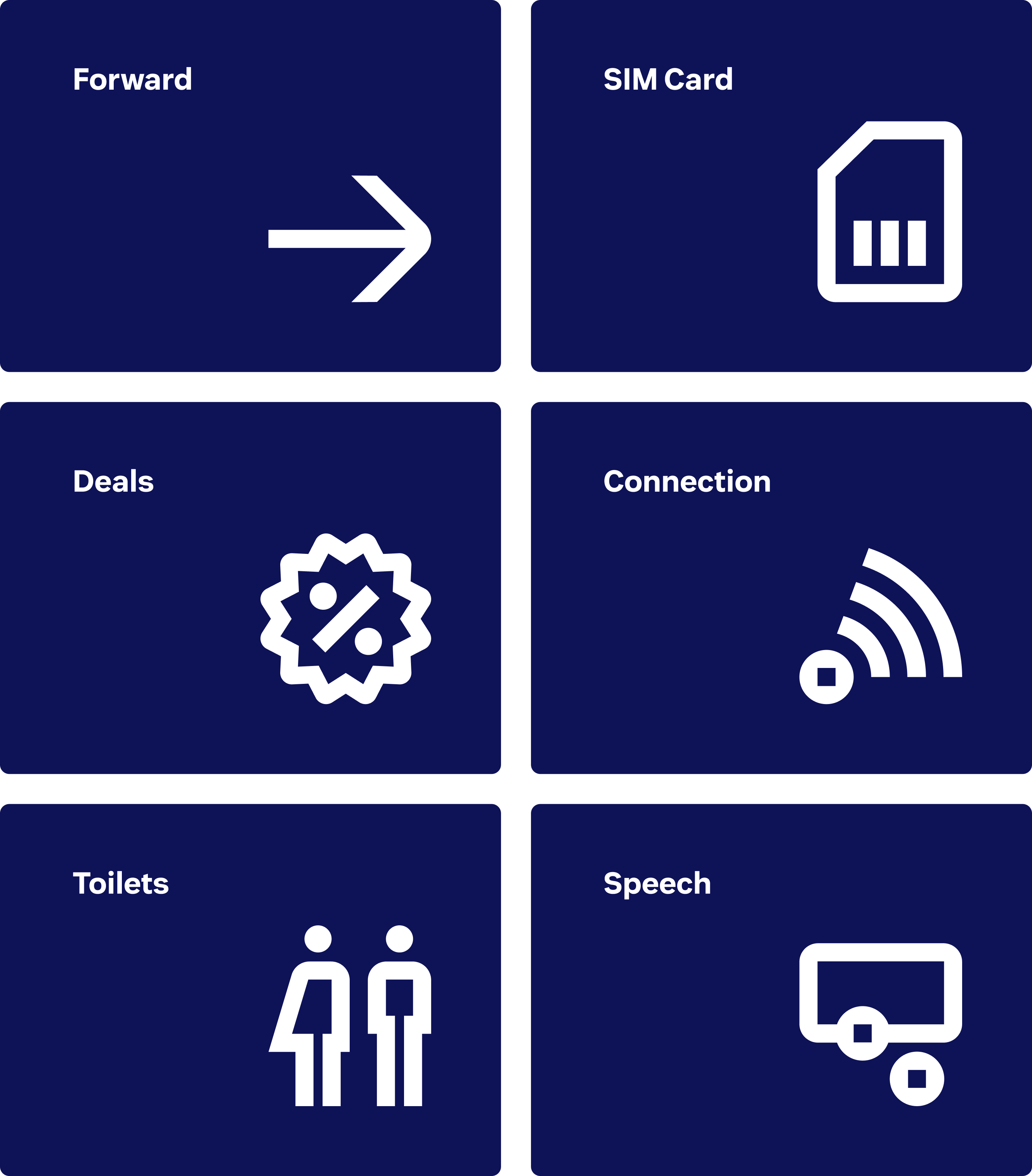
Lebara's icons are fully custom-designed, carrying the brand's personality into the smallest functional details. They draw directly from the L icon – mixing rounded and sharp edges to create a distinctive character that feels both expressive and purposeful.
Every icon is built on a 24x24 grid, with main strokes set to the width of two cells – a simple rule that keeps the entire set visually unified. Outer corners are rounded and inner corners stay sharp, applied as a guiding principle that allows each icon to flex to its own needs while remaining part of the same family. The result is a coherent, balanced, and unmistakably Lebara icon system.
Patterns
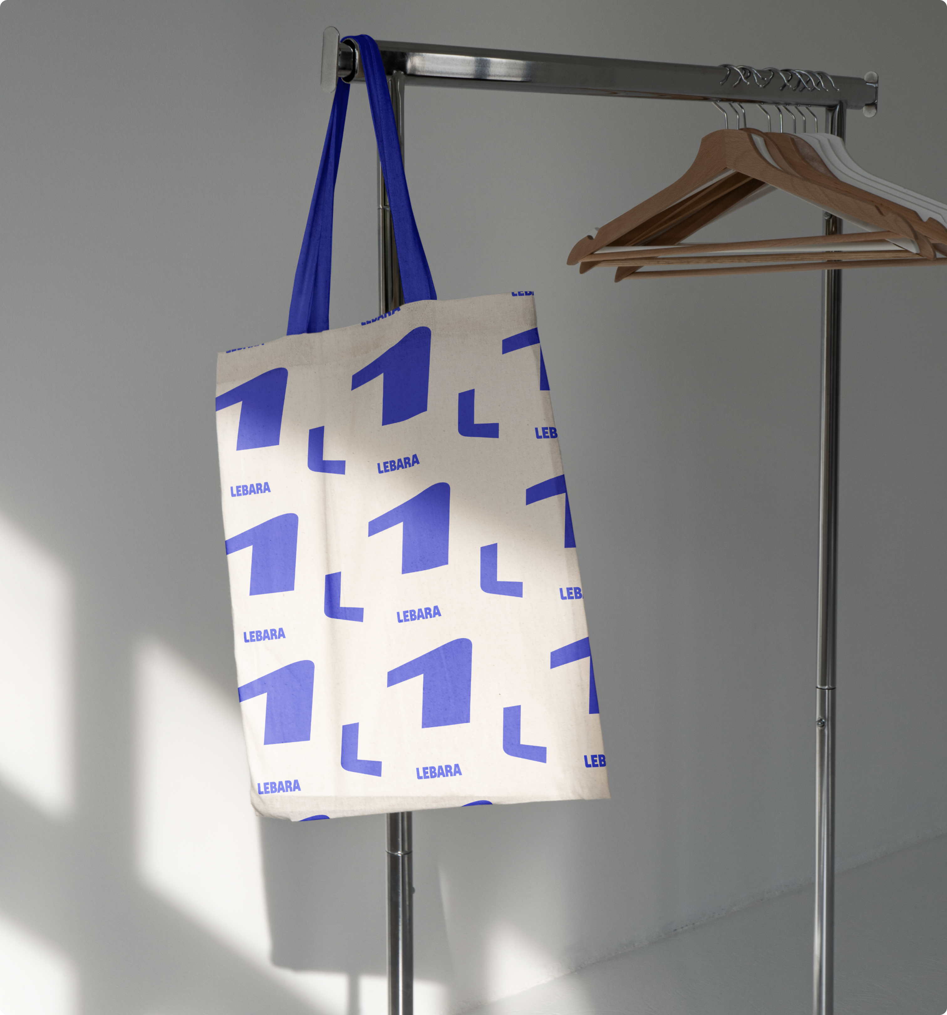
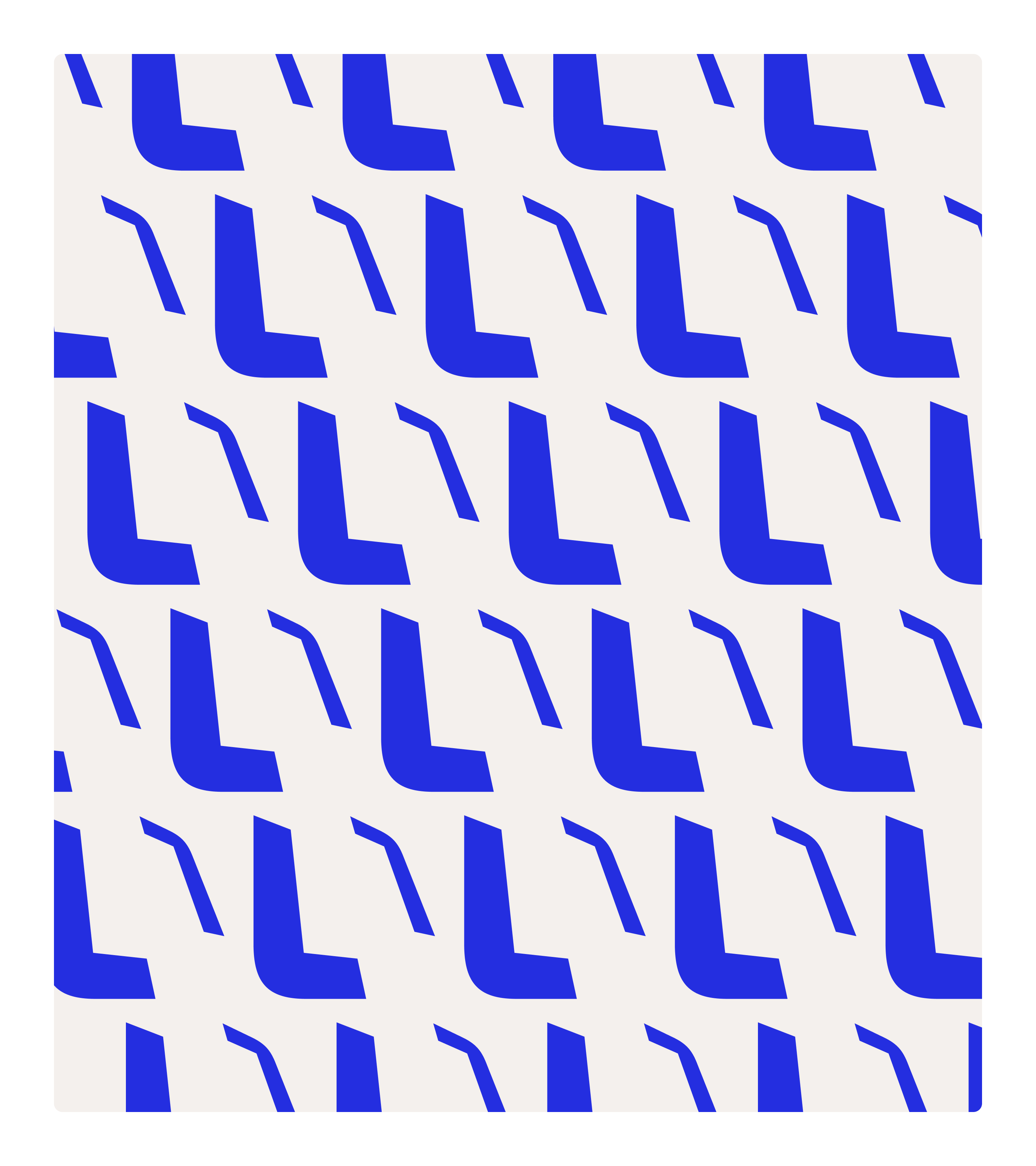
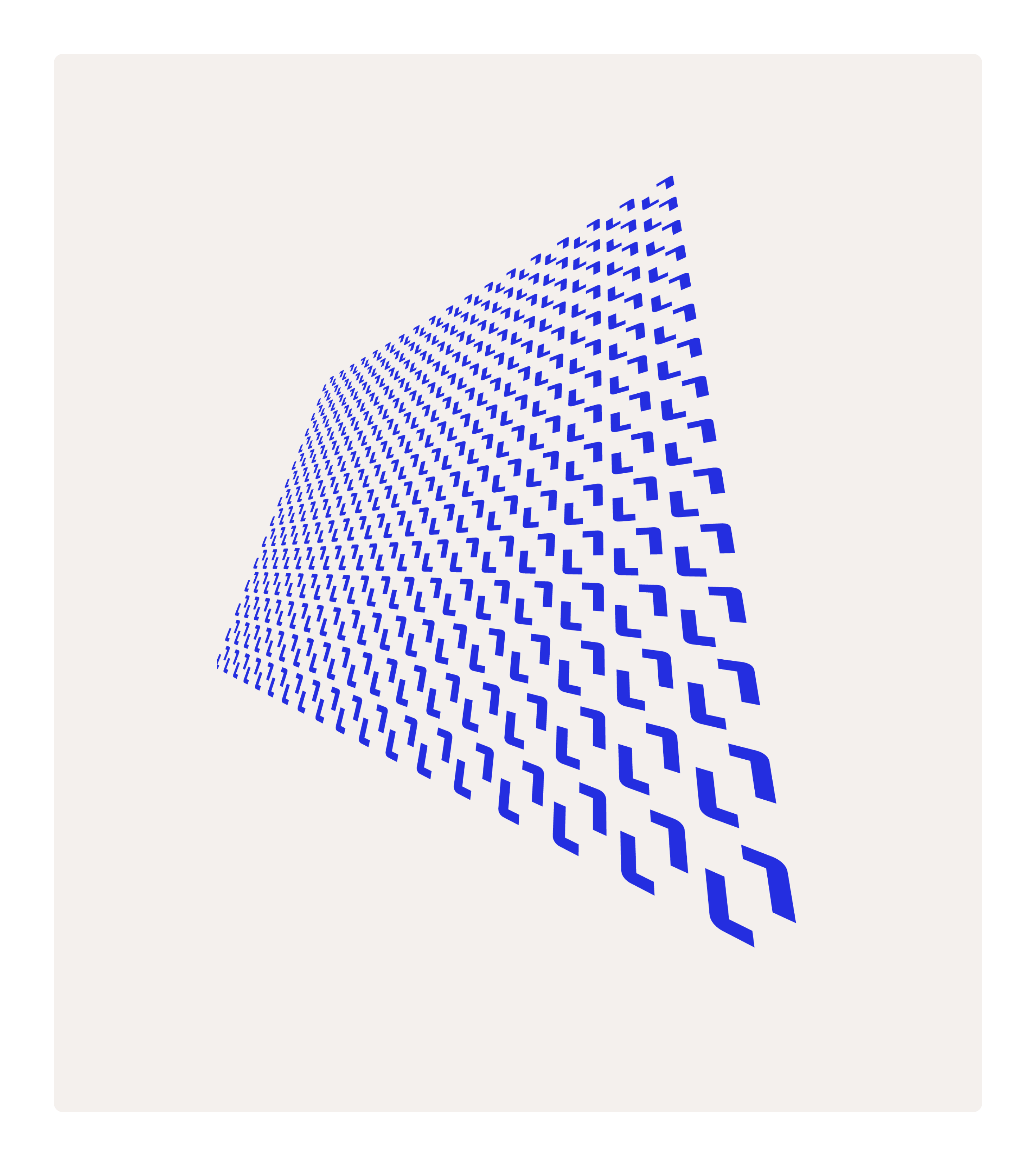
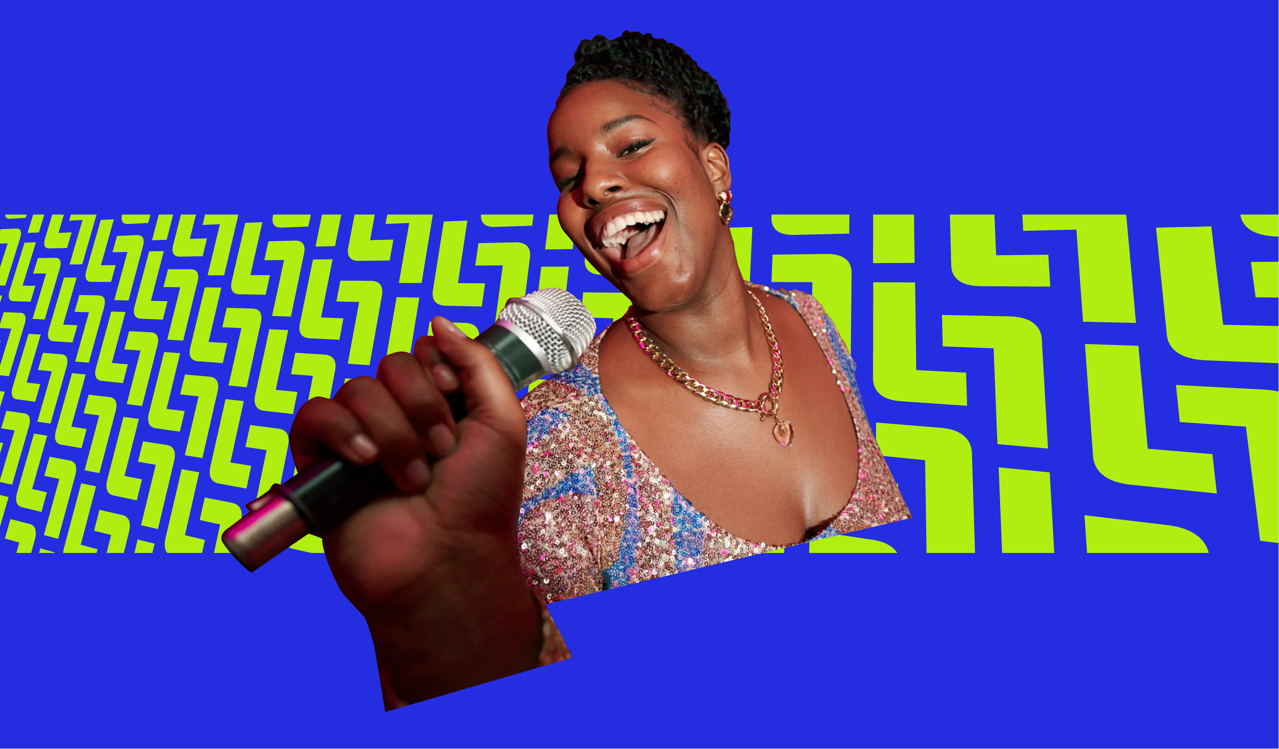
Lebara's patterns are built directly from the Smart Frames. By repeating and combining the L-shape, dynamic structures emerge that reflect the brand's energy, momentum, and sense of growth. Frames are aligned along two consistent angles, creating a deliberate rhythm and perspective that holds the system together across every application.
The result is a pattern language that always feels distinctly Lebara: structured, bold, and dynamic – with enough flexibility to adapt to context without ever losing the underlying logic. Patterns work seamlessly in digital backgrounds and can hold imagery within the frames themselves, using the L-shape to centre and elevate the subject.
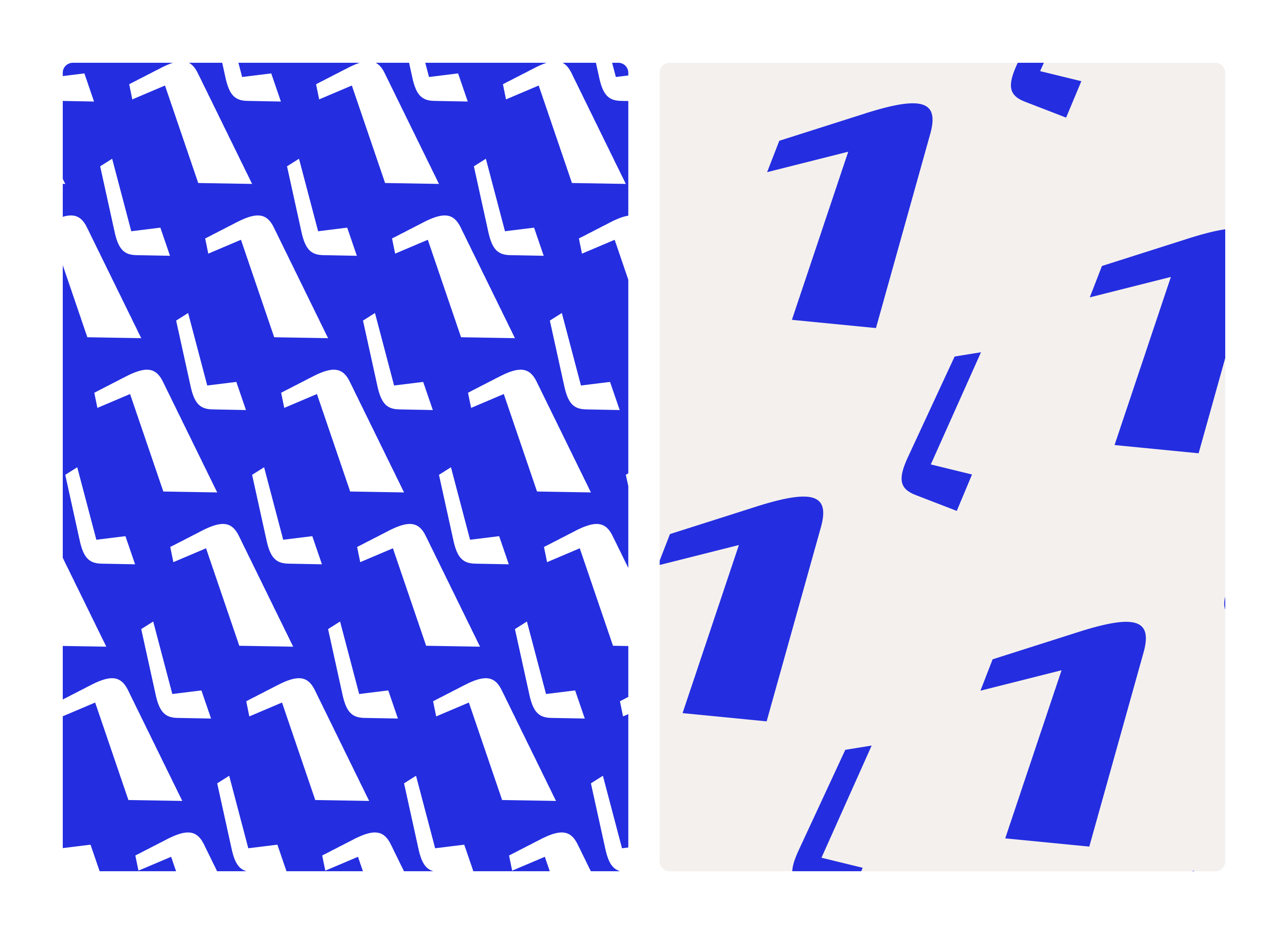
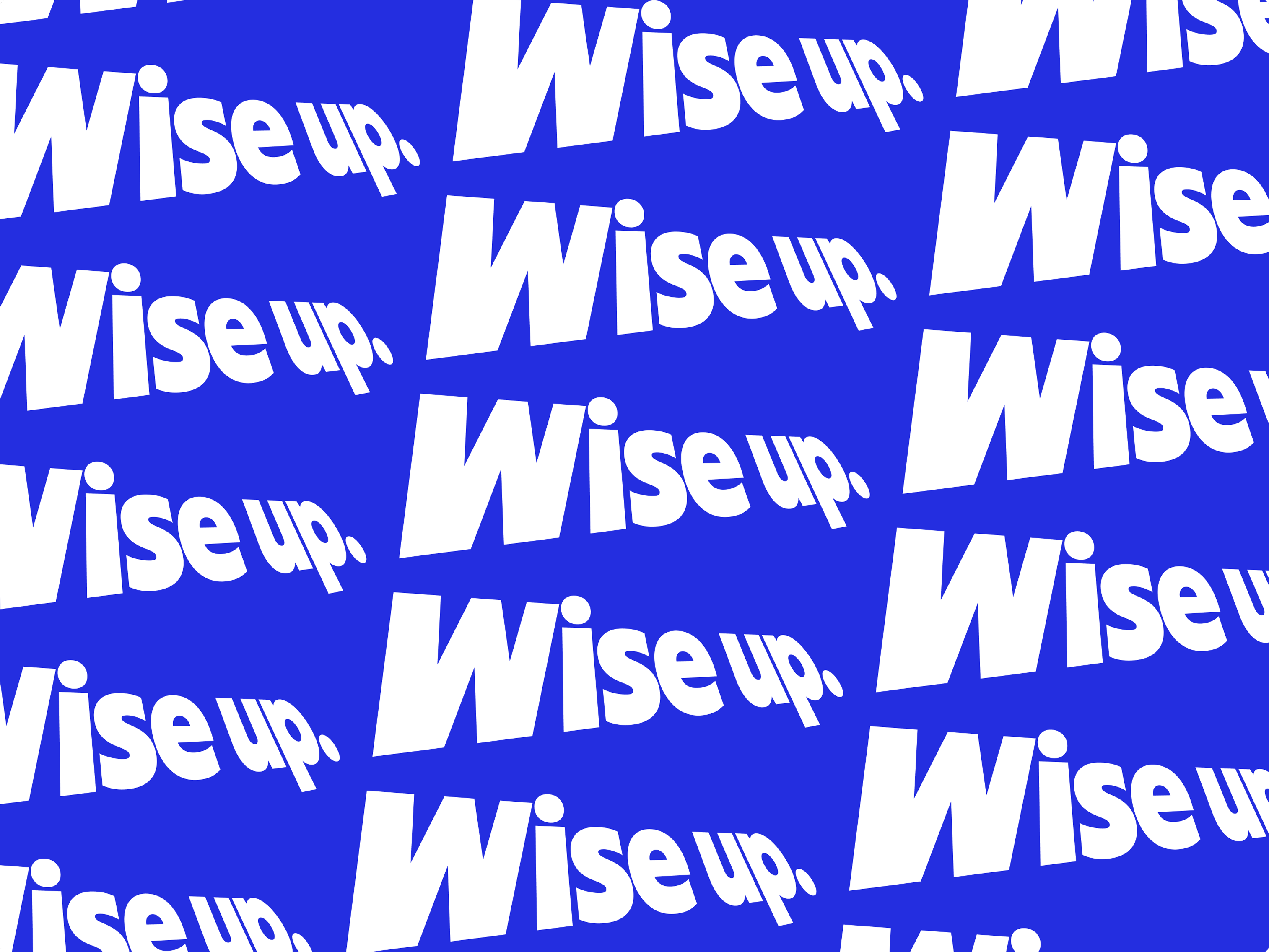
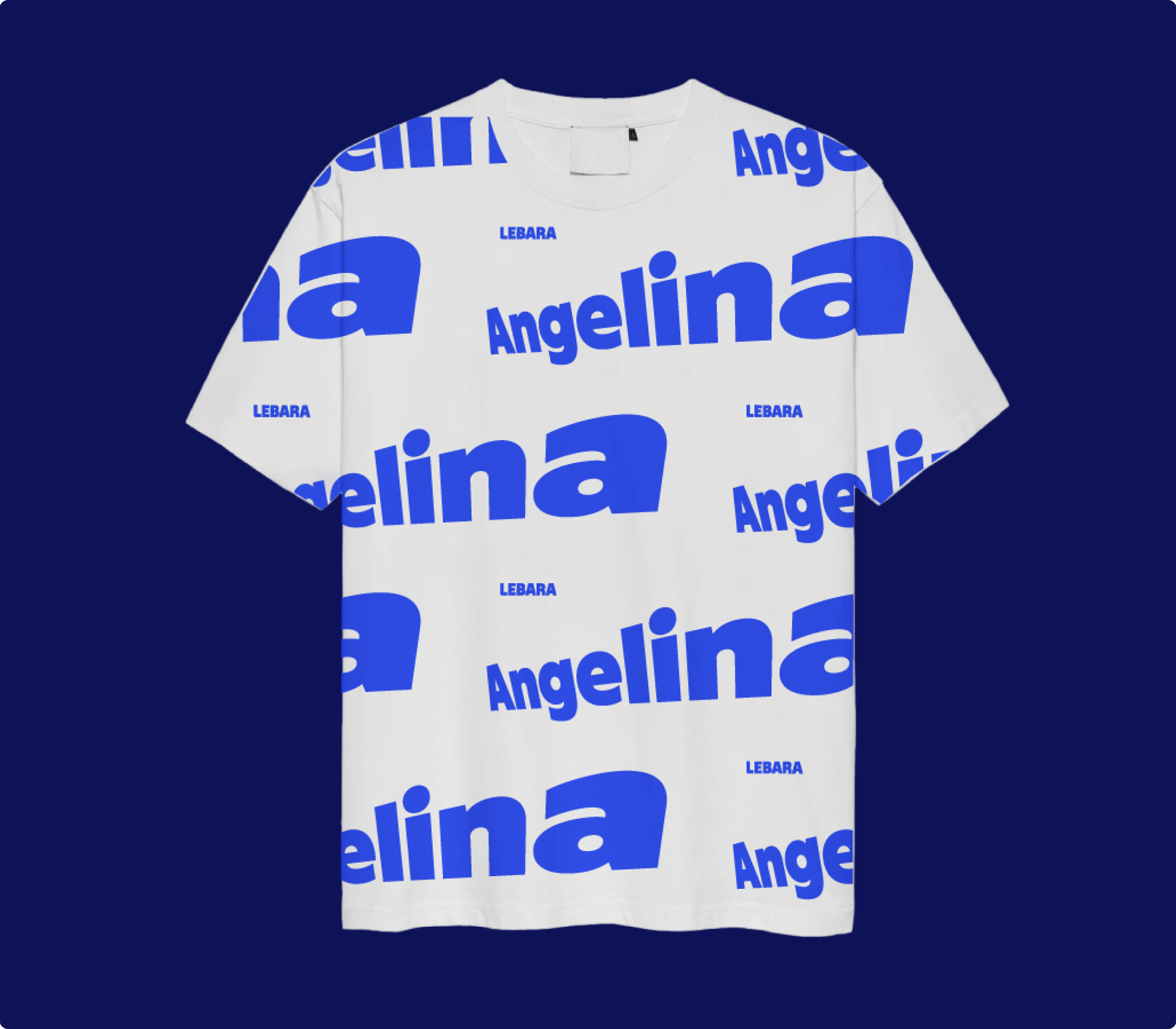
The same principle extends to typography. Perspective text – repeated along the same two angles – becomes a pattern in its own right, turning headline messaging into a brand-defining visual moment.
Illustrations
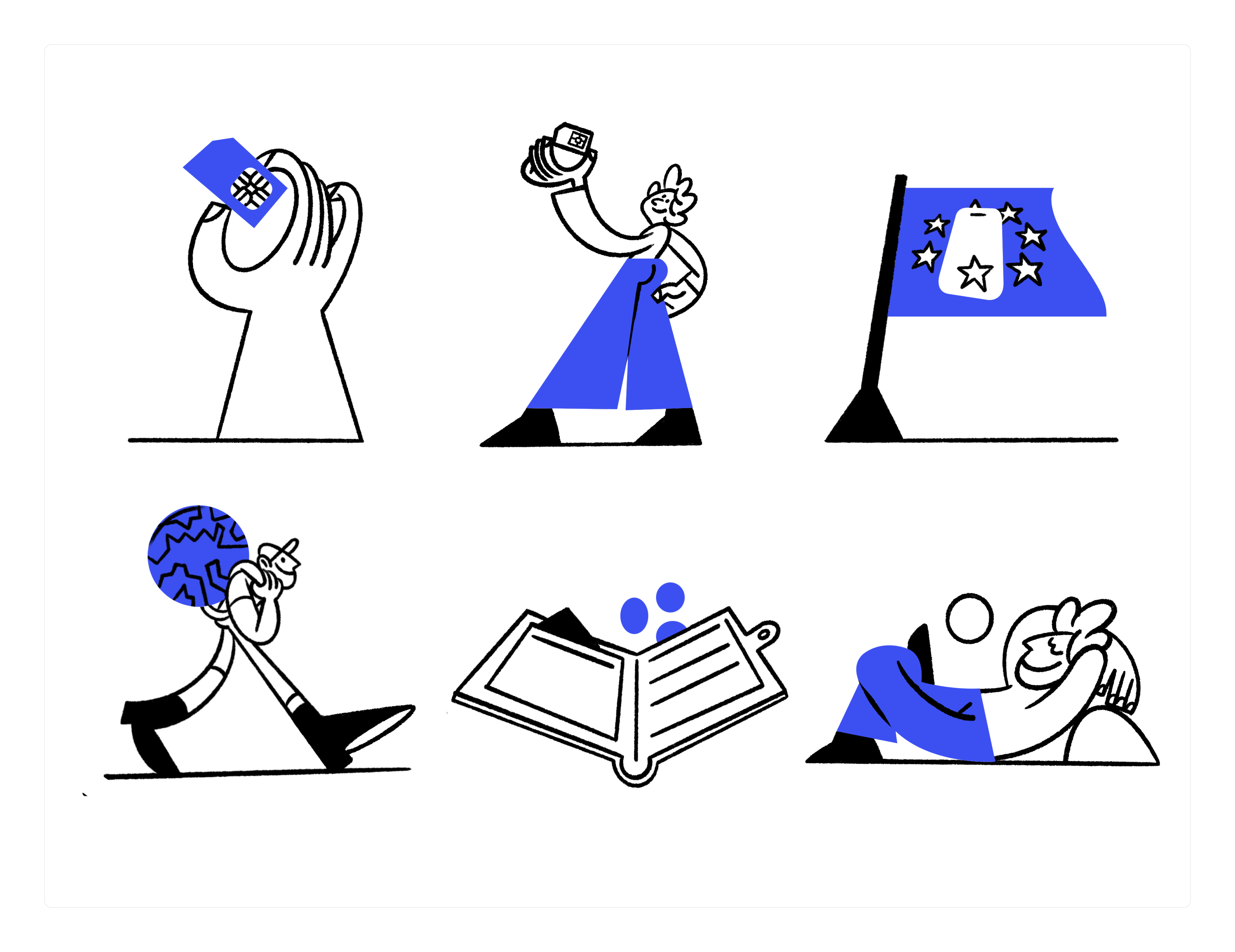
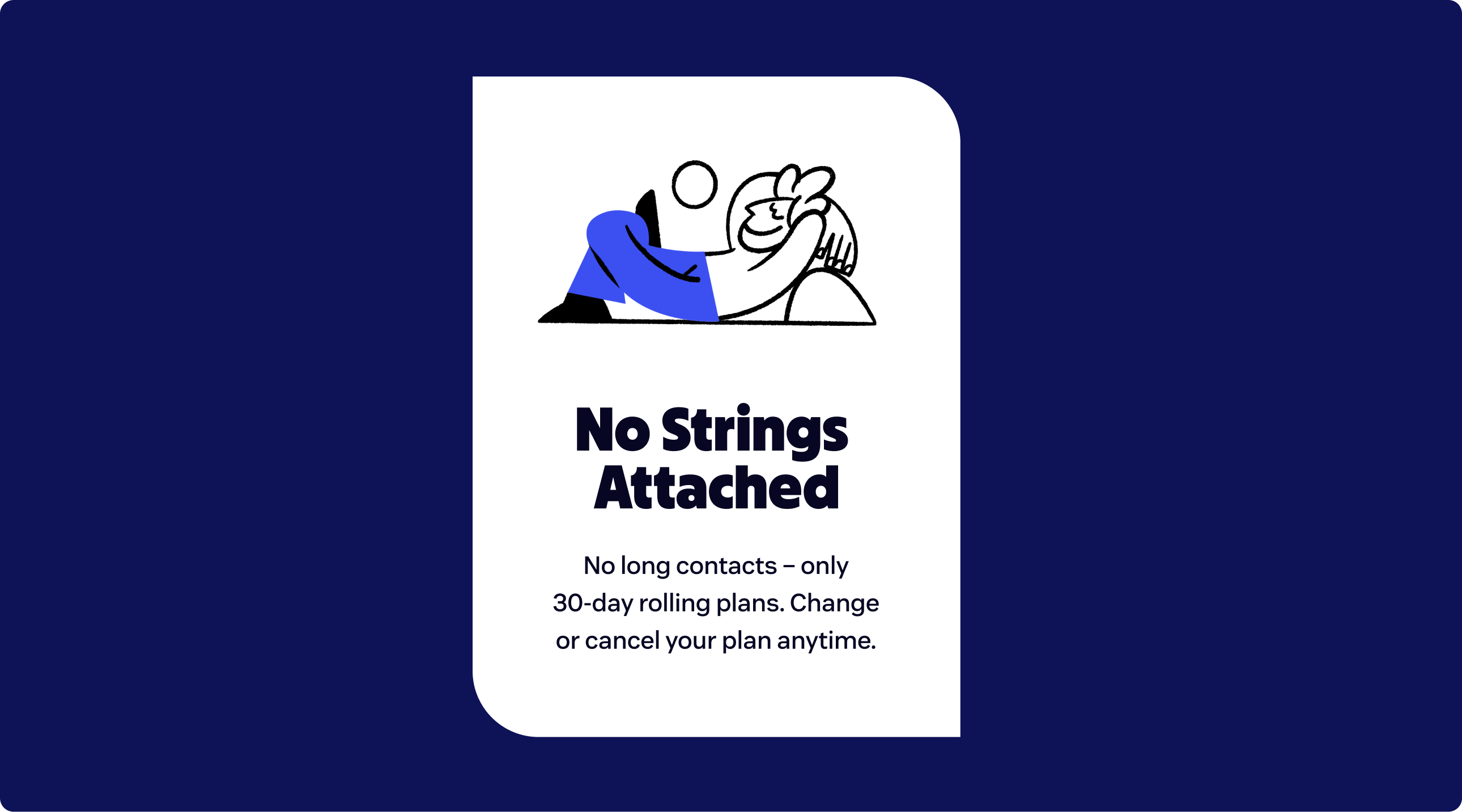
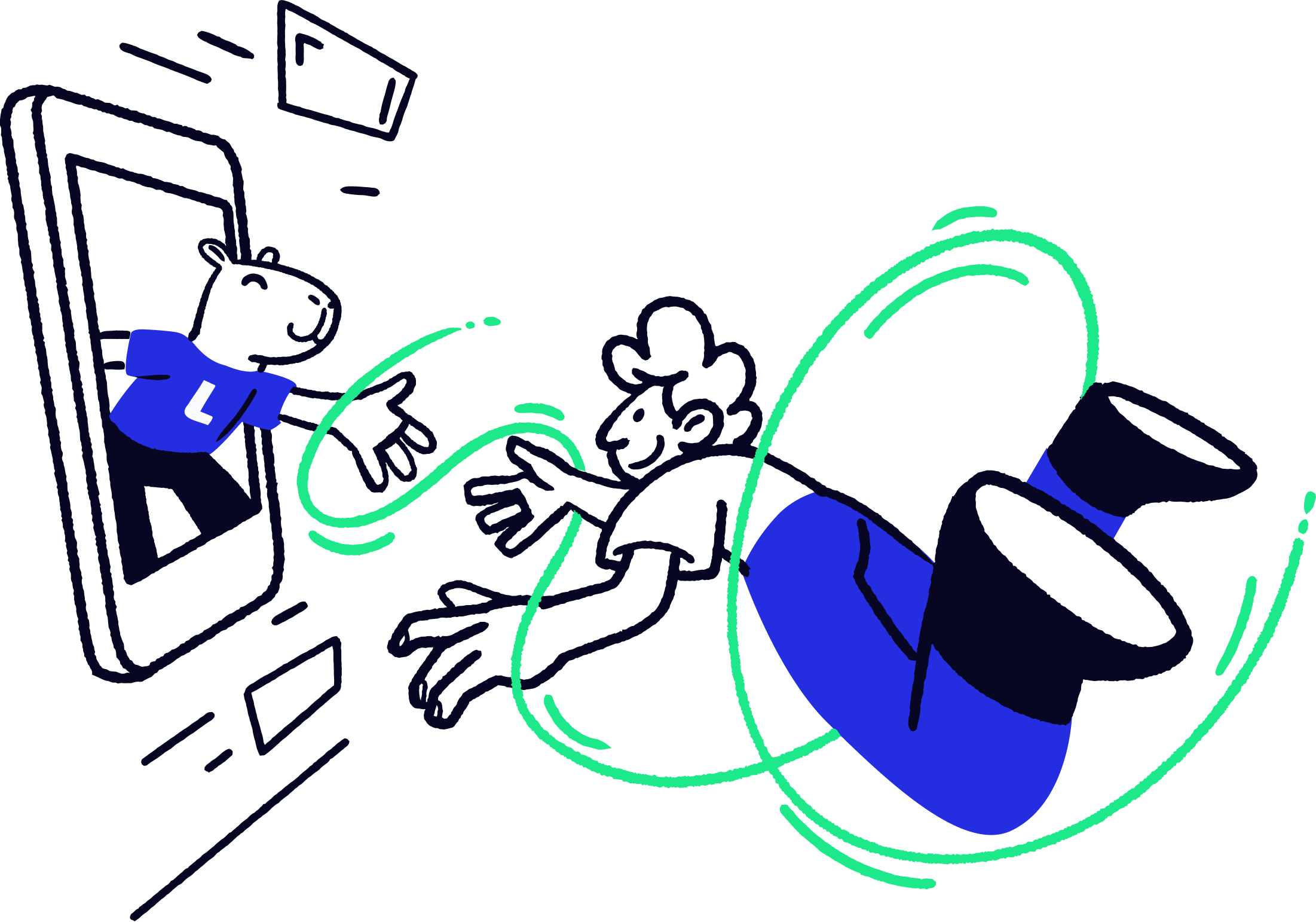
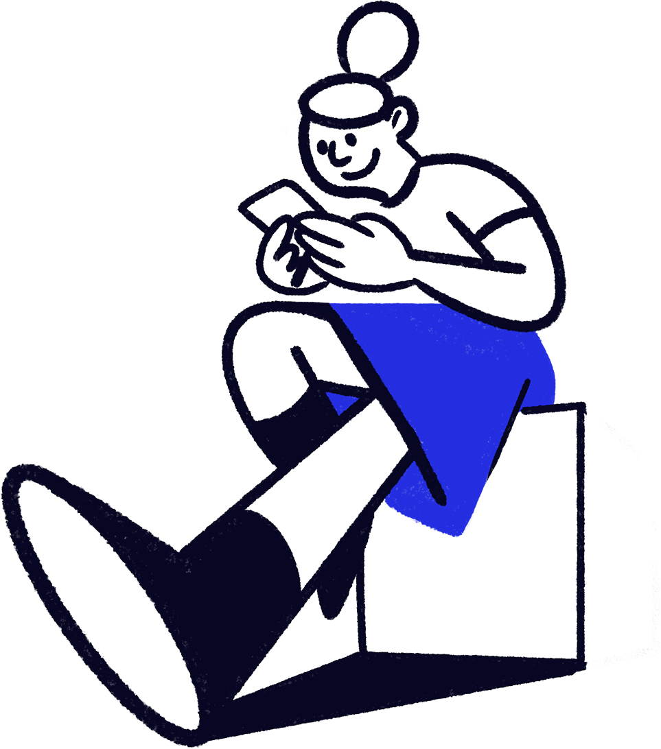
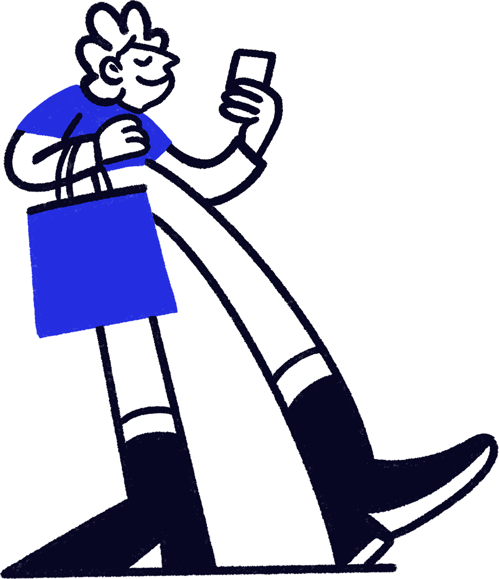
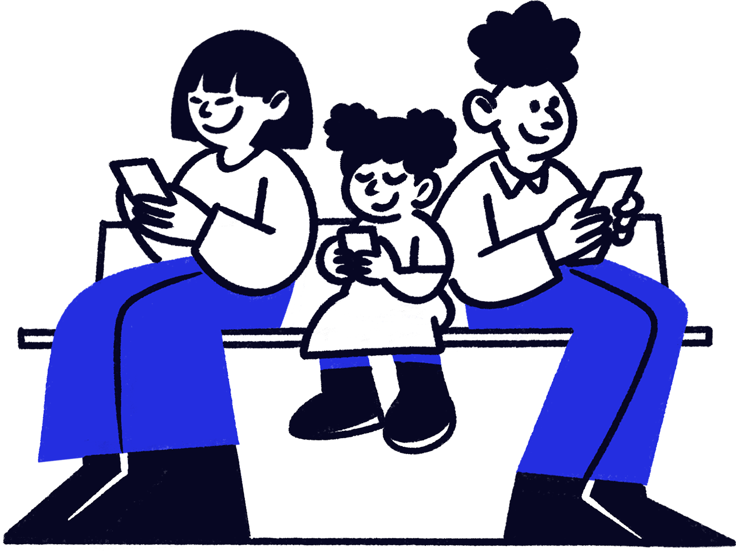
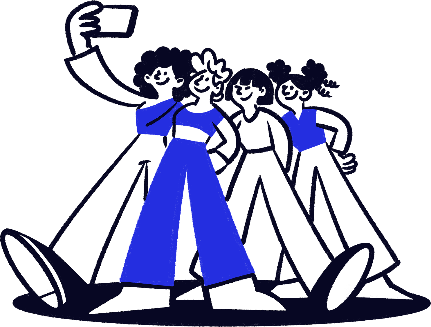
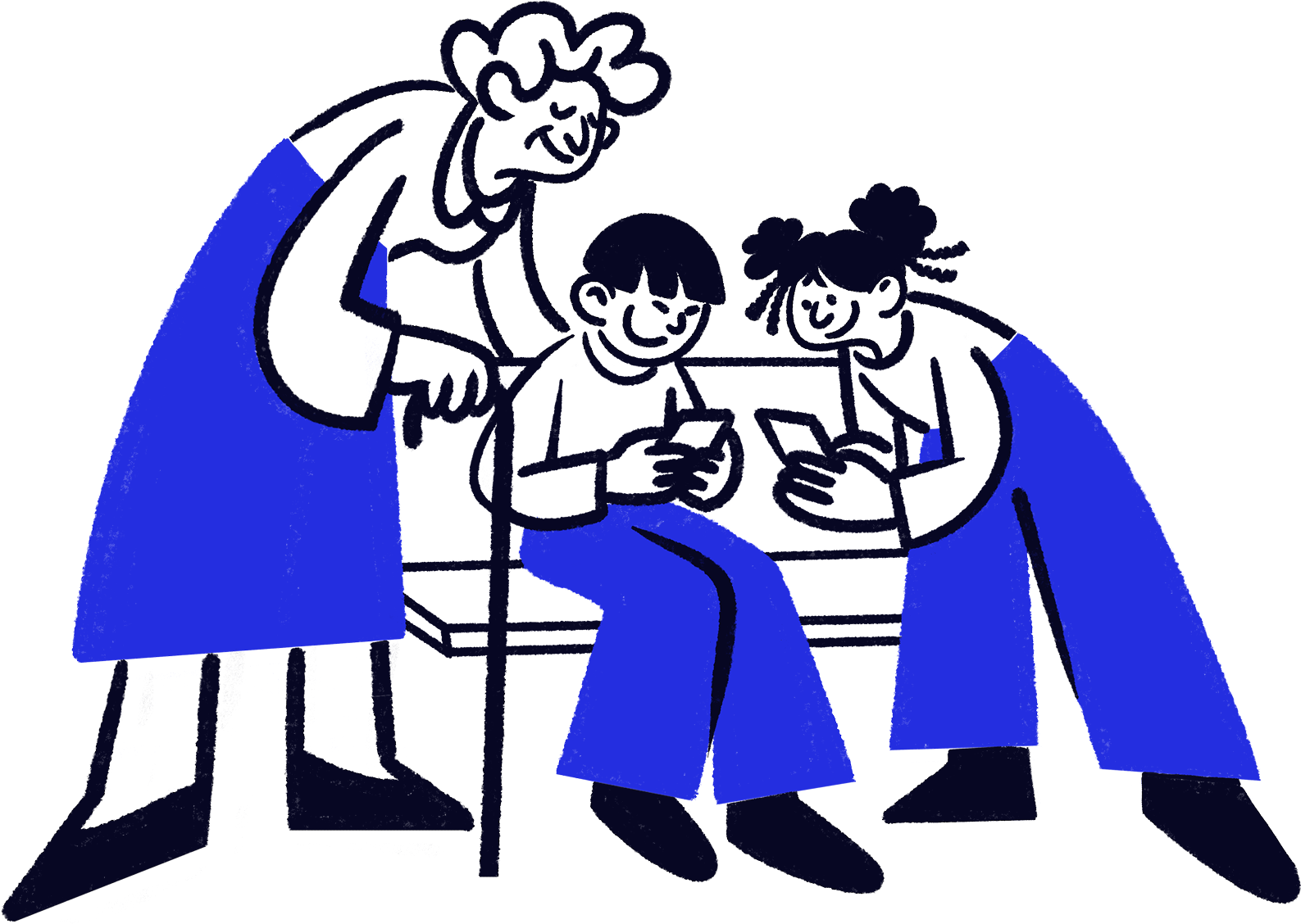
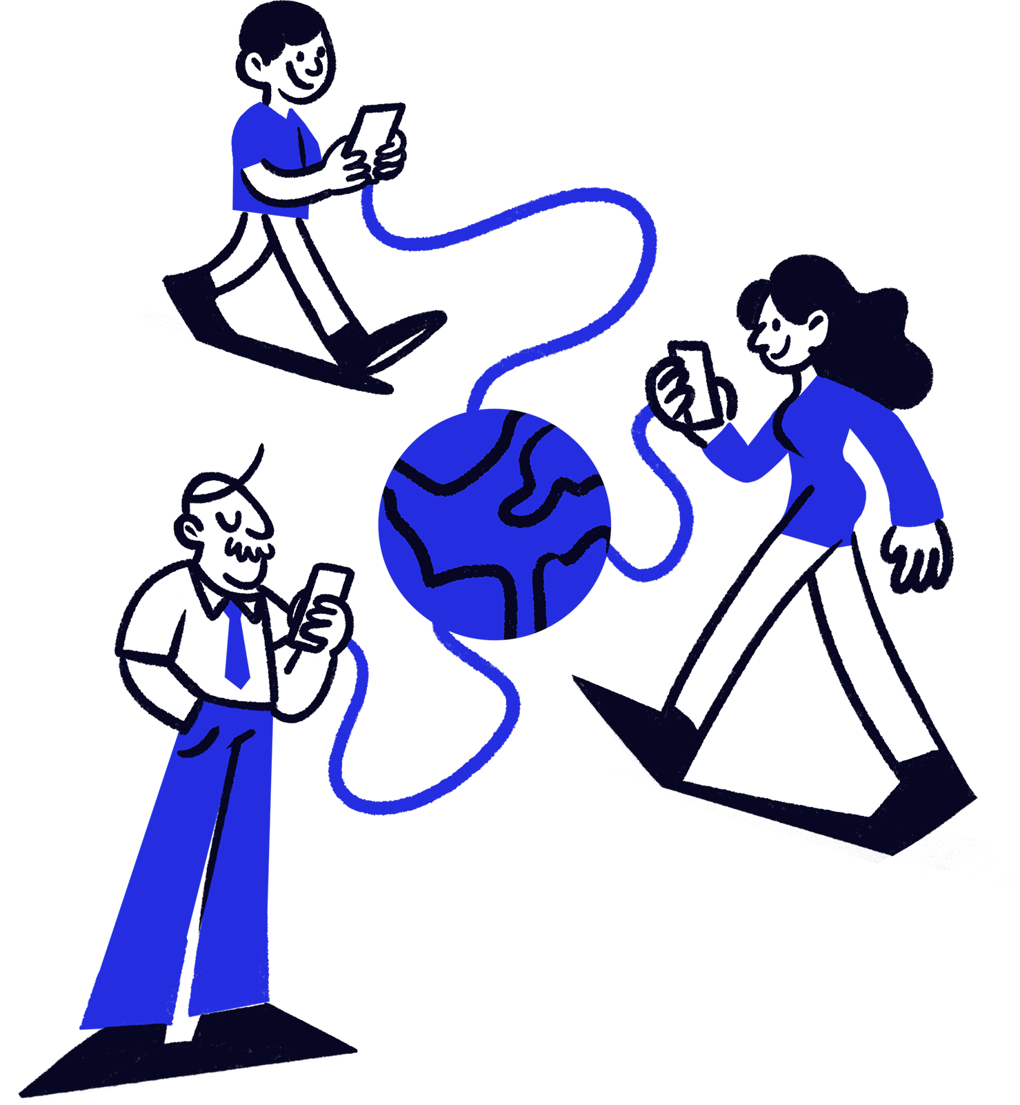
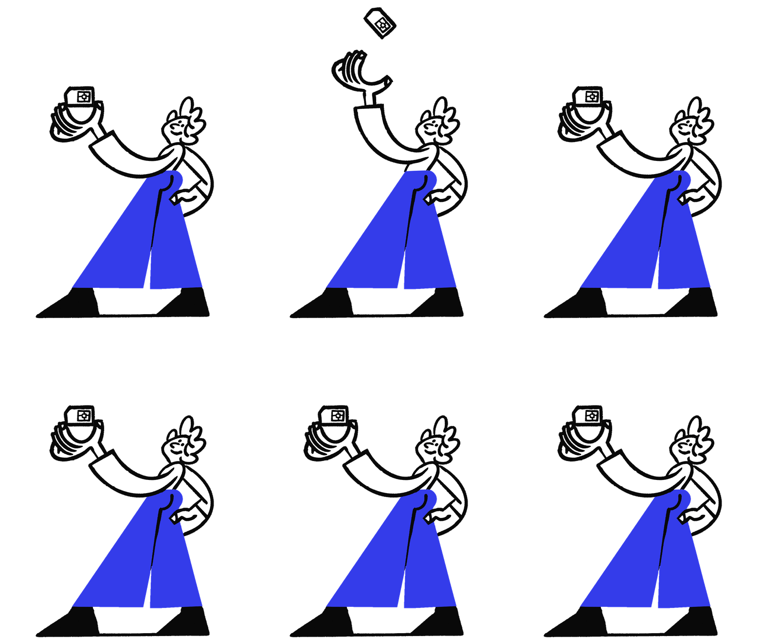
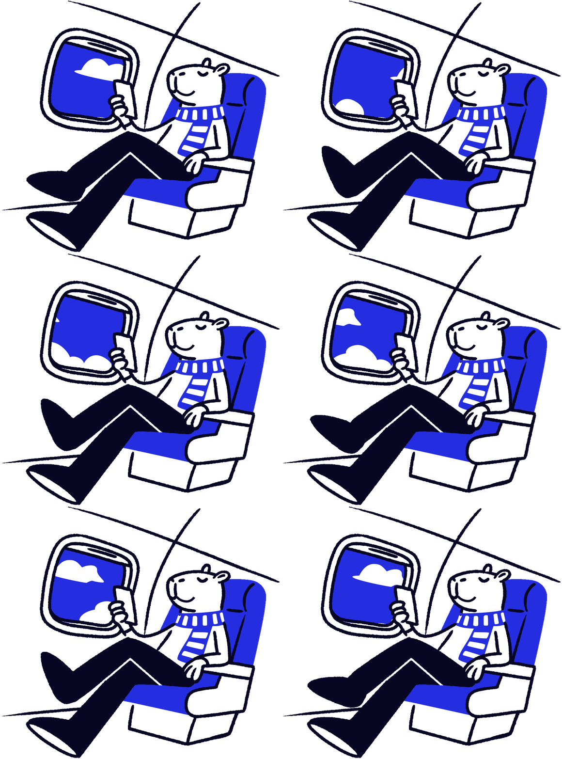
Lebara's illustration style brings warmth and personality into the brand. Hand-drawn black lines combine with a single Smart Blue highlight, and a skewed perspective mirrors the angled energy of the typography – keeping the illustrations visually consistent with every other part of the brand language.
The choice of a hand-drawn aesthetic was deliberate. Where the wider identity leans confidently into geometry, structure, and bold typography, the illustrations introduce a softer, more human counterpoint – balancing the precision of the brand with a touch of imperfection, character, and humour. The result is a visual world that feels both intelligently designed and genuinely warm: smart and sharp, but never cold.
Bara the Capybara
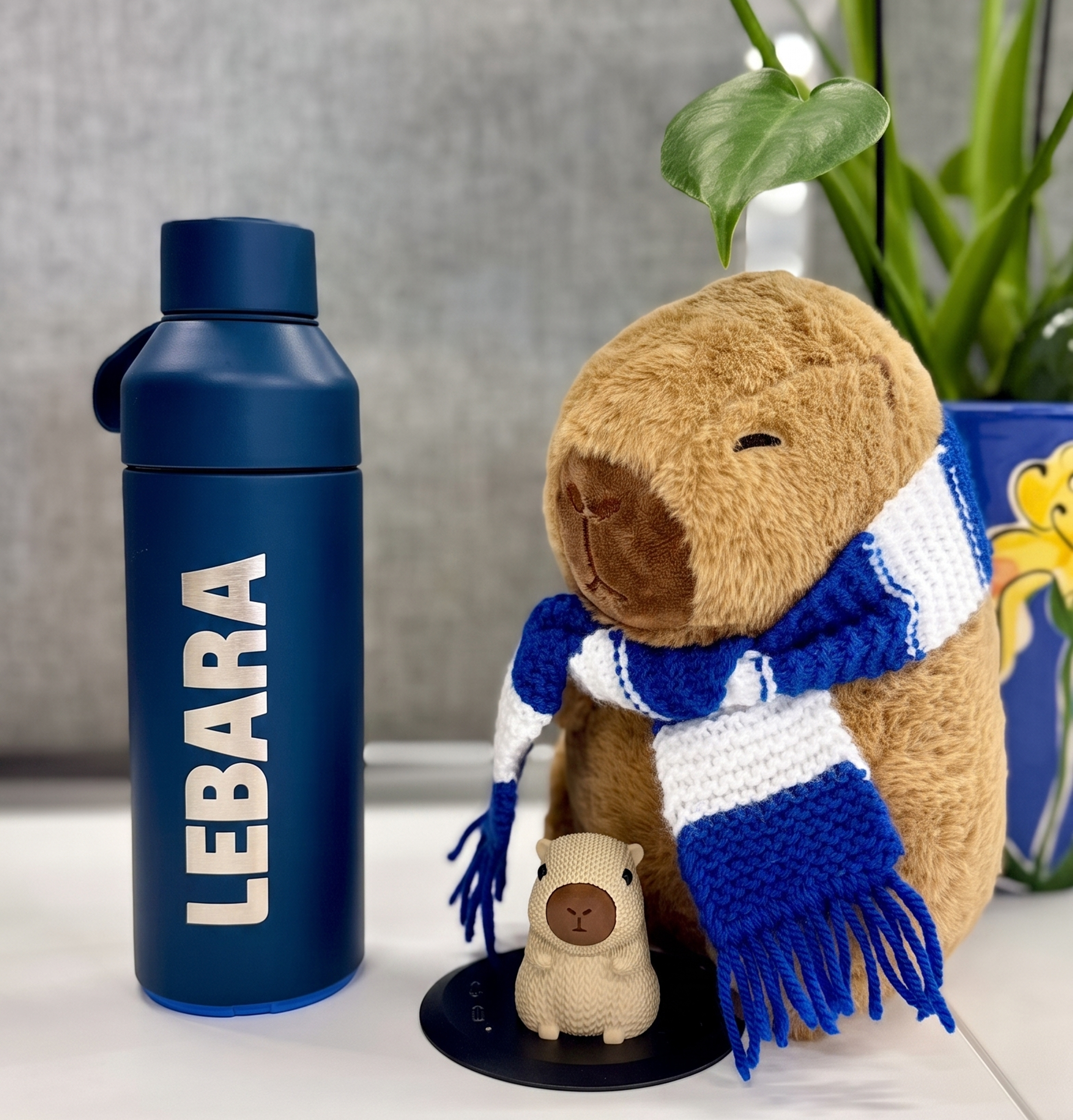
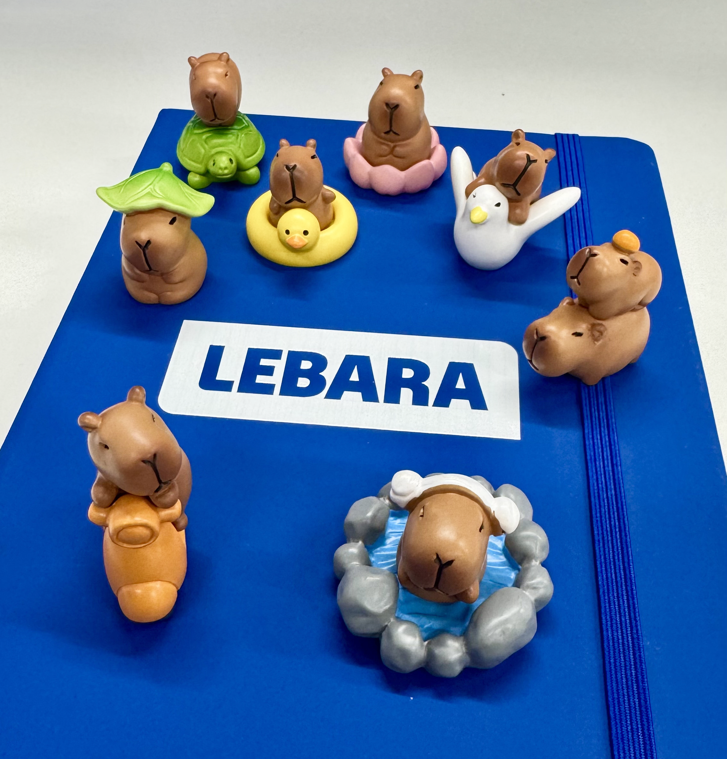
Bara (internal loving name) is Lebara's very own mascot, began as a quietly brilliant suggestion from a member of our Data team – pointing out that “capybara” rhymes with “Lebara”, and the door was open. Bara always keeps a cool head and a friendly smile, mostly appearing as the face of Lebara customer service, as the internal team mascot, on t-shirts, and on TV screens!
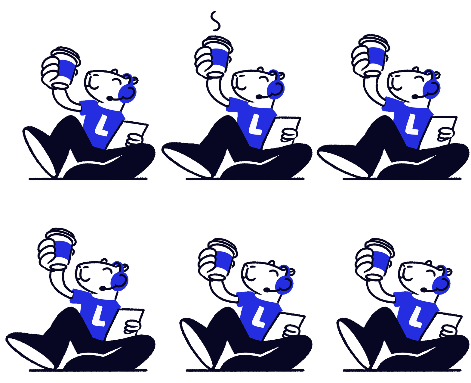
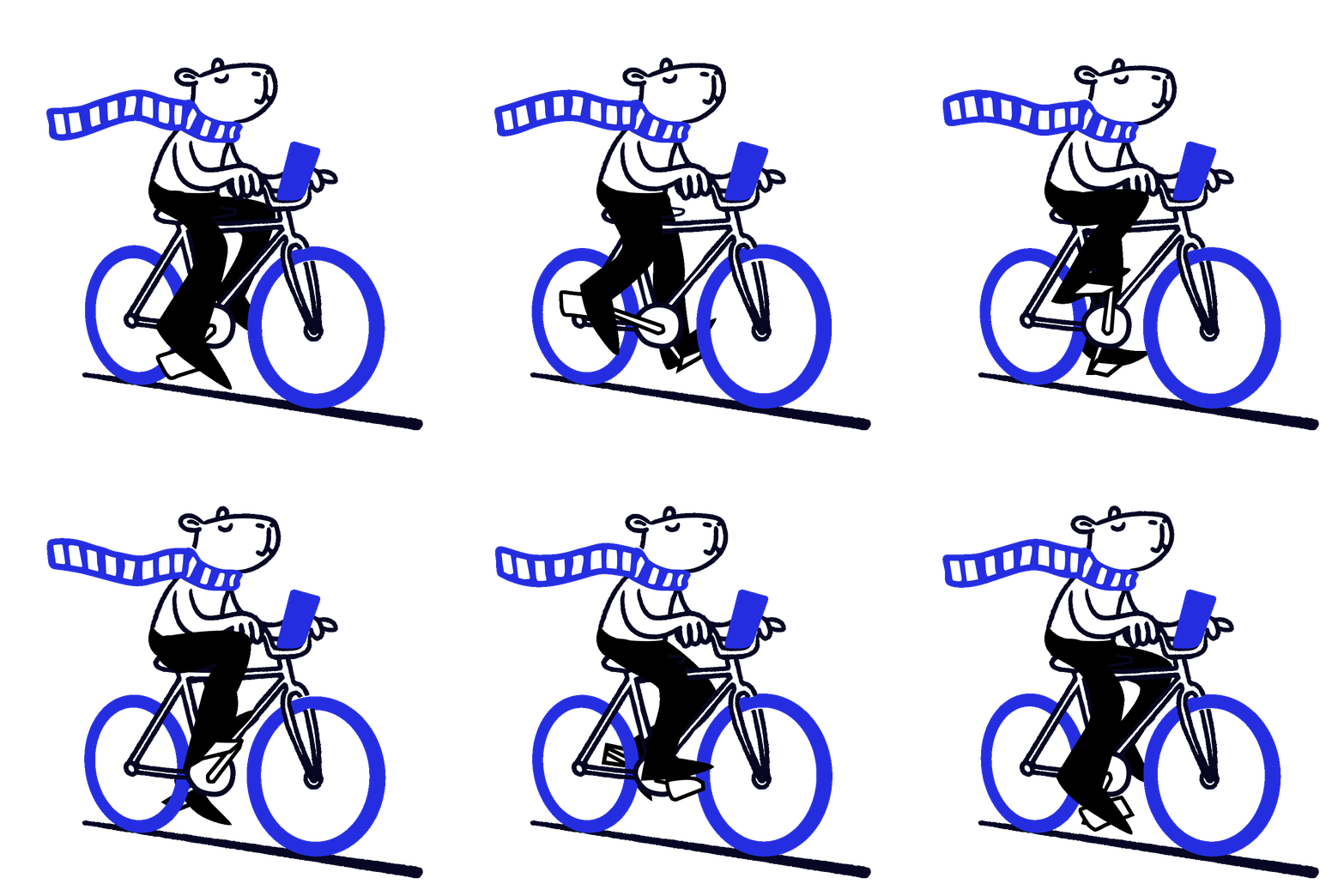
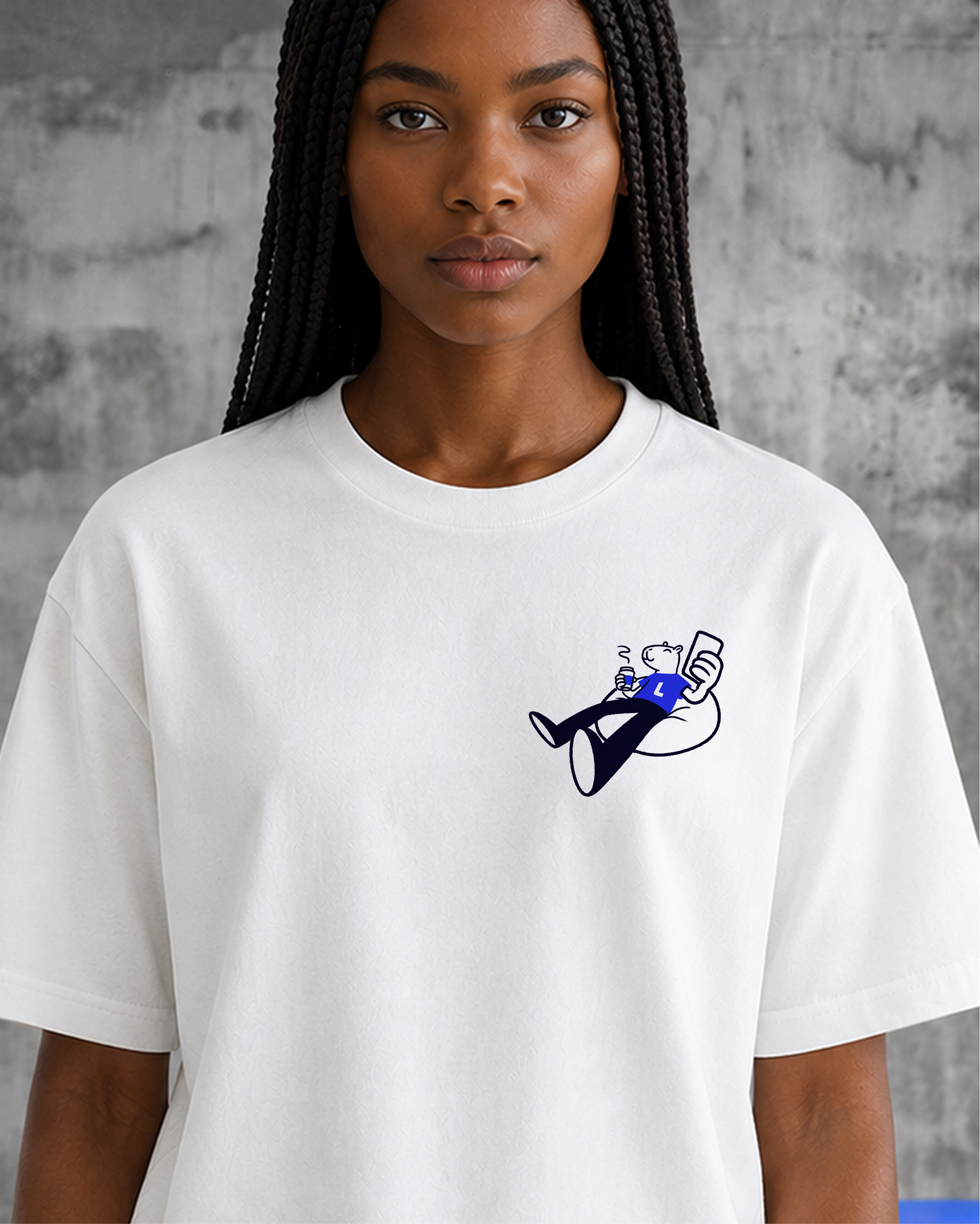
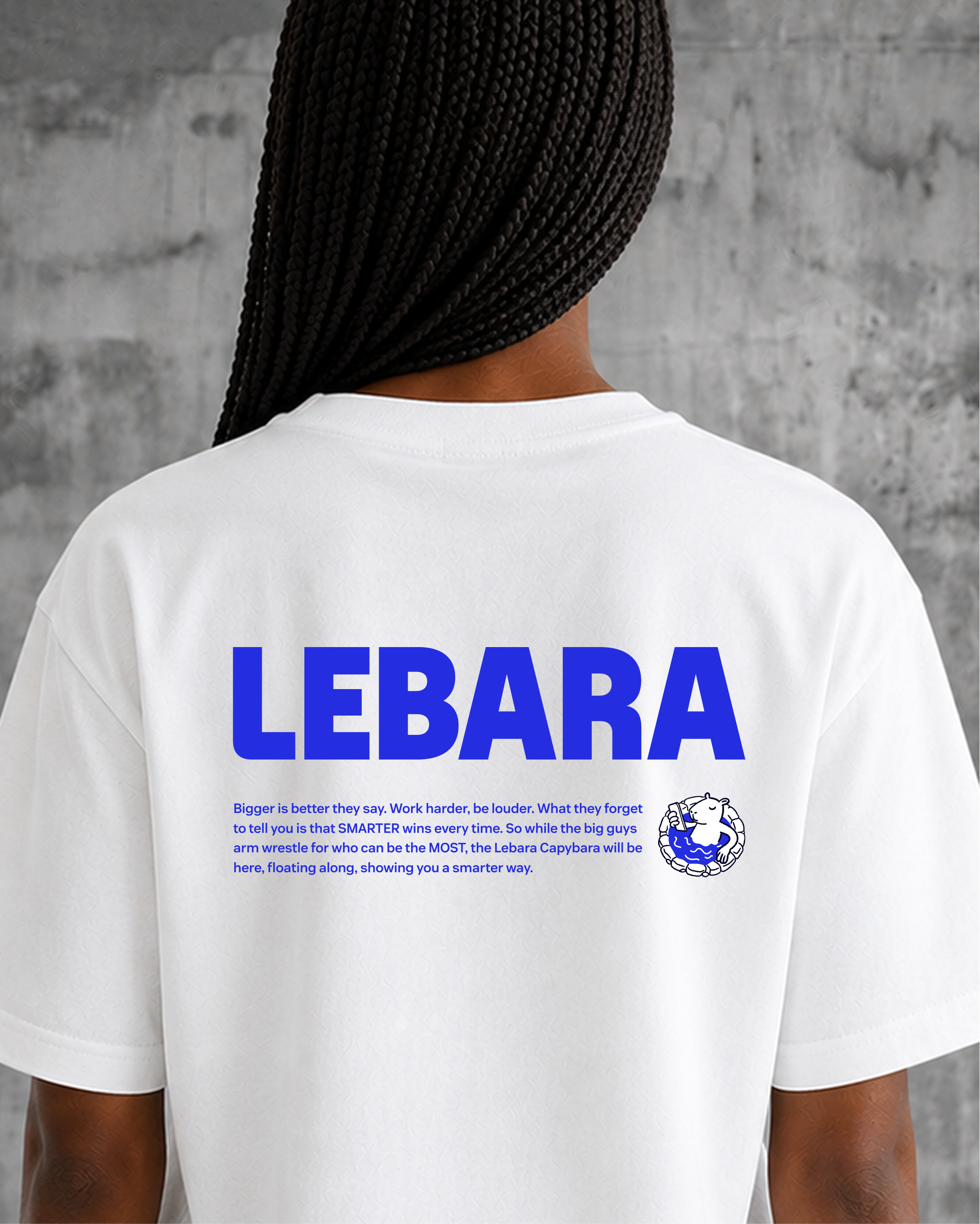
For a brand built on connection, the choice fits perfectly. The capybara embodies connection without stress – exactly the way Lebara helps people stay in touch with the people they love, simply and reliably.
Capybaras don't shout for attention. They win hearts through warmth, patience, and good vibes – precisely the energy a customer service brand should give.
We commissioned a very talented illustrator who demonstrated the ability to interpret Verve's visual direction and expand it into a comprehensive character system. Bara became the flagship – anchoring a broader cast of people characters that form Lebara's illustration world.

The Volume System
When Lebara's markets first encountered the new brand identity – the dynamic perspective typography, the kinetic collage compositions – some pushed back. The more traditional markets felt the energy was too far removed from what they knew.
Rather than dilute the whole concept, I looked at everything we had built with Verve to date, and realised something: the full range of expressive tools was already there. The custom typeface worked beautifully at rest, not just in motion. The collage system held up without the skew.
So I framed it as volume – not as a compromise, but as a strong feature.
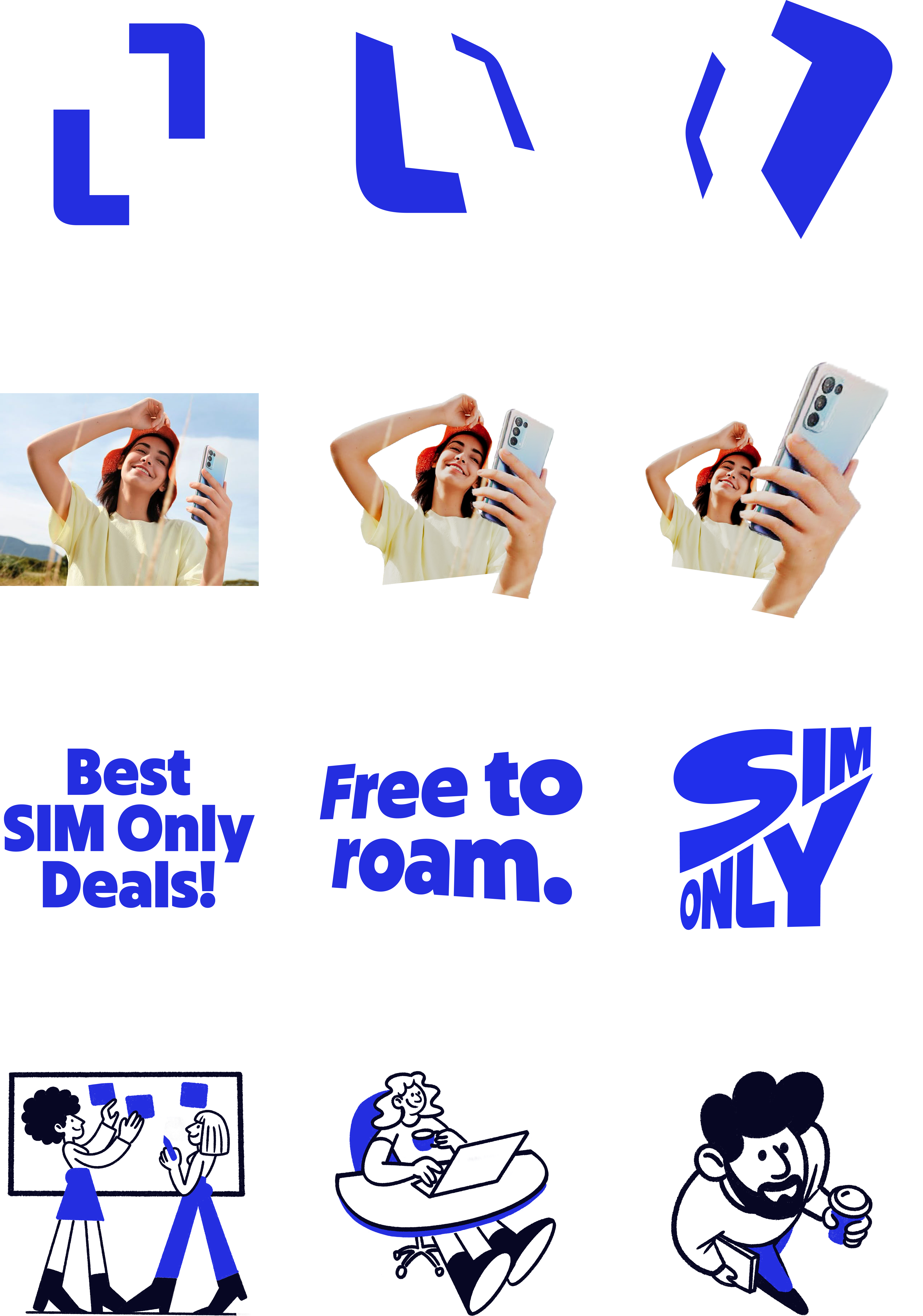
Low volume: calm, frontal, without distortion.
Medium volume: stretched, with emphasis, sentence case typography in perspective.
High volume: all caps, dynamic typography, heavily distorted.
The system gave every market permission to find their register, while keeping the brand coherent from a billboard in a city centre to a button in a mobile app. It meant the identity could speak calmly or loudly – and still sound, look, and feel unmistakably Lebara.
The Volume System can be applied to every element of the branding: from the Smart Frame to illustrations, creating a desired dynamic, or more static and calm feeling of the artwork.

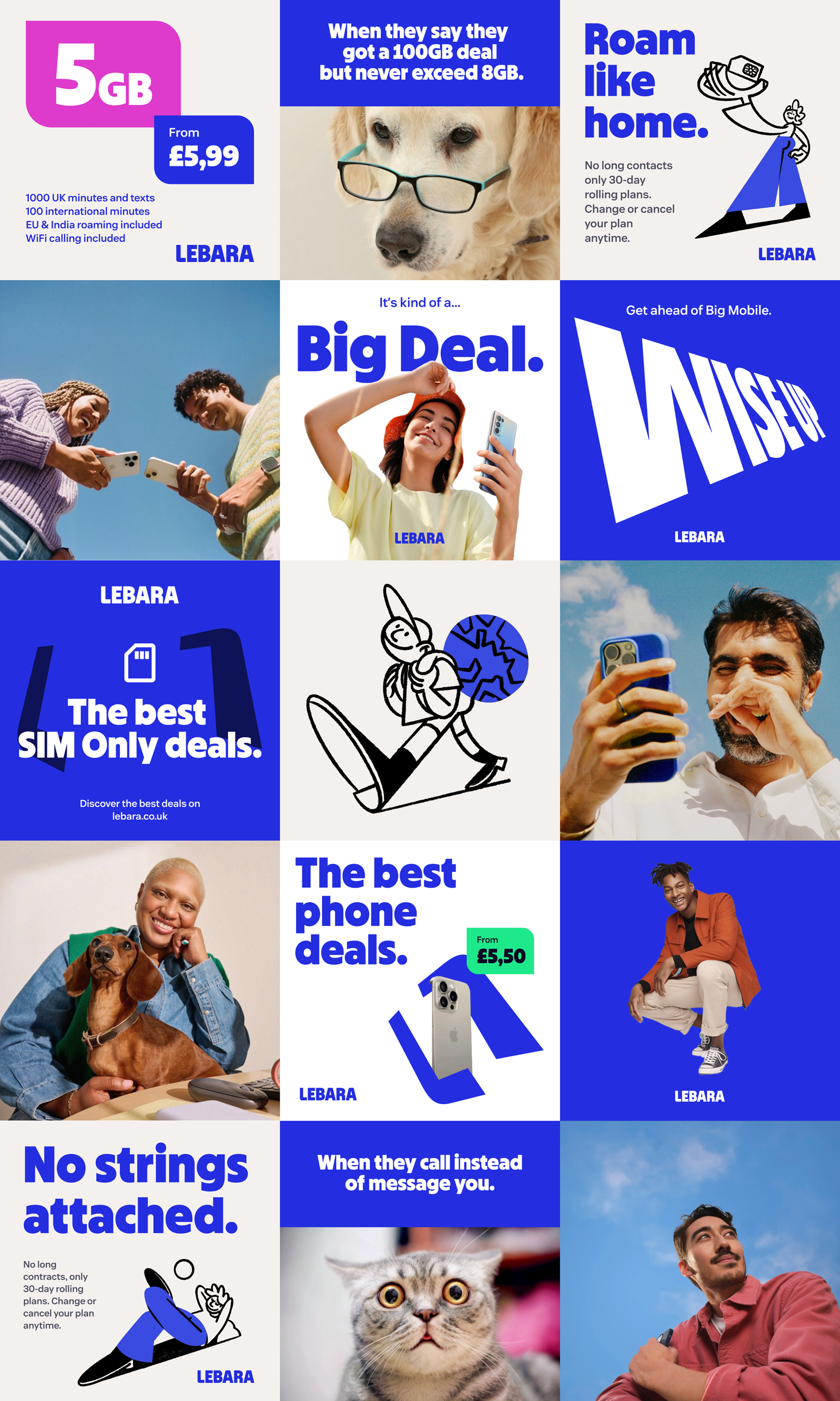
The best part: the system becomes most alive when volumes are mixed!
A high-volume headline paired with a calm, frontal product shot. A loud OOH frame that gives way to a quiet, functional digital interface. The contrast is where the brand's character really shows – not locked into a single register, but moving between them with intention. Across a campaign, across a journey, across markets, the full range creates something richer than any single volume could on its own.
Lebara at its most expressive is Lebara at all its volumes, played together.
Motion
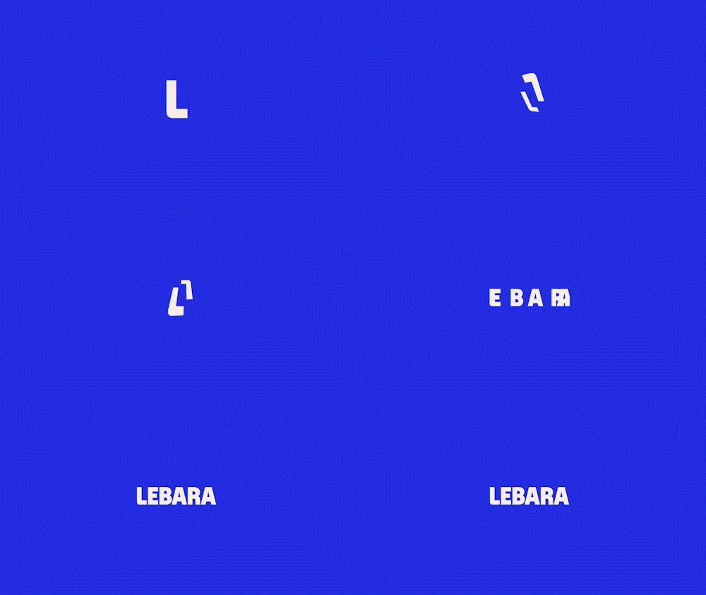
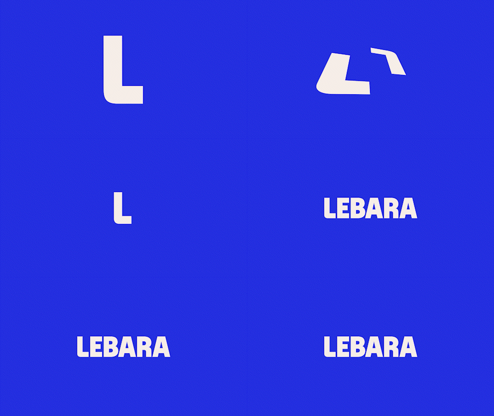
Lebara's motion language is built on the same Smart Perspective rules that define the visual identity. The Smart Frame — two L-shapes that morph, scale, and distort in perspective, always travelling in opposite directions or collapsing into one — becomes the primary vehicle for movement. Text enters with a snappy 3D slide or morphs from calm and balanced into bold, stretched caps.
The easing is deliberate: playful enough to feel alive, controlled enough to stay purposeful. Images within the frame shift subtly, always less dramatically than the shapes around them, keeping the human element grounded while the brand moves with energy around it. The motion identity follows the same logic as the visual system — just animated.
The volume system carries into motion. Animations can run at low register – subtle shifts, gentle perspective changes, restrained easing – or dial all the way up to high, with heavily distorted type, fast cuts, and maximum kinetic energy. The same three levels, the same logic, now in motion.
The next challenge was defining the guidelines for how the new brand moves and sounds – critical dimensions that couldn't live in a static design system.
We created a brand film that served a dual purpose: it was both an expression of the new identity in motion, and a practical reference tool for teams across the five markets. The sonic identity was as deliberate as the visual. We developed a signature sound that felt contemporary but distinctly Lebara, integrated into the film in a way that showed how audio and motion work together.
Animation: Alina Fomin
I brought in an animator, whose style matched the brief, to take over the branding agency and work out how our new visual system behaves in motion. The brief was to make the identity feel alive on screen, and the result set the standard the markets now work back from.







Sub-Brand: Travel eSIM
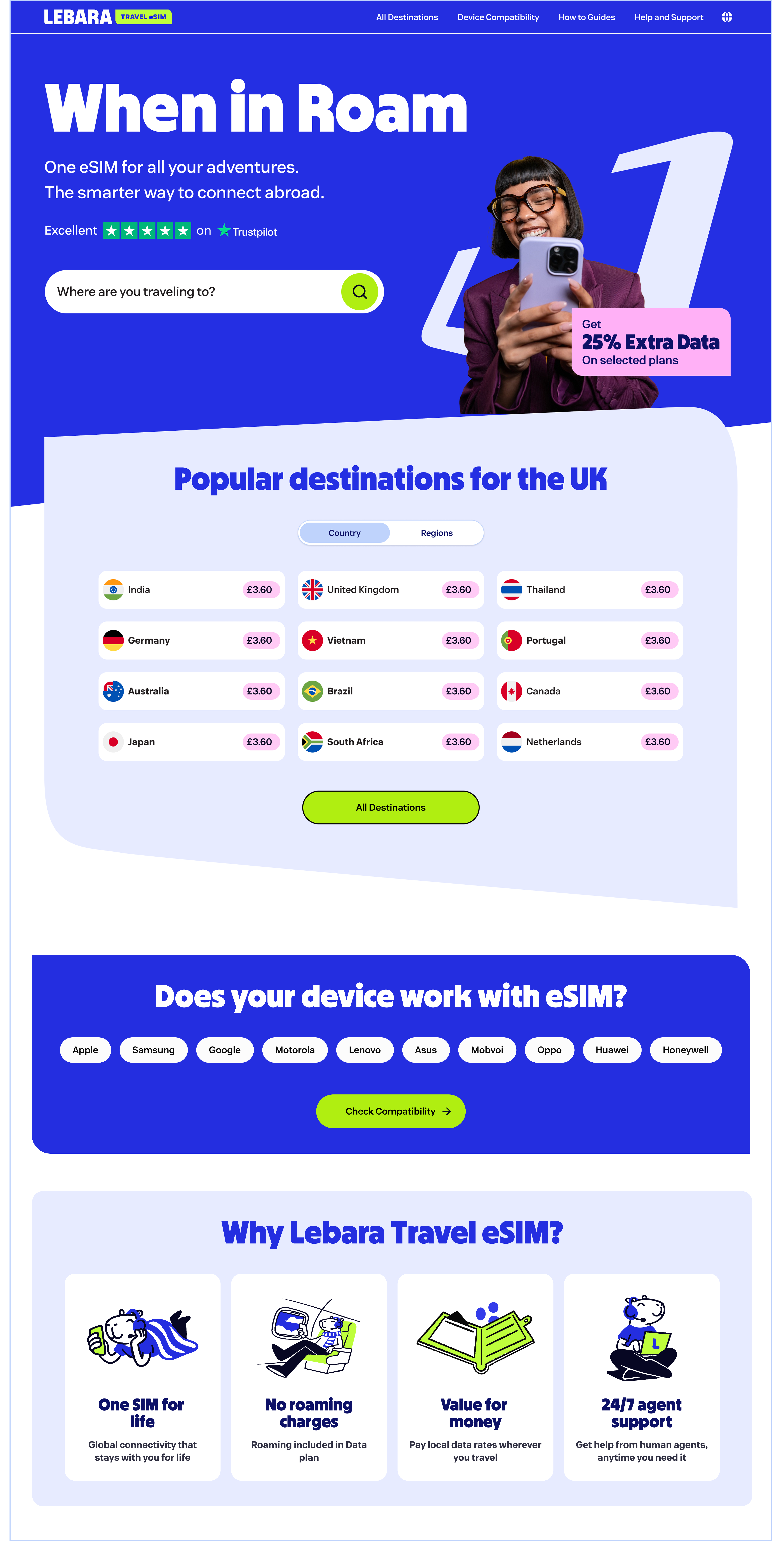
In parallel with the Brand Refresh we were running the launch of an entirely new Lebara digital product: Travel eSIM. Launching it under the old visual identity was never an option – so the decision was made to develop a dedicated sub-brand, built in step with the main refresh and fully consistent with the new Lebara visual language.
This was a valuable opportunity to establish the logic and framework for how Lebara sub-brands are built – a system that could scale as the amount of sub-brands grow. The sub-brand logos follow a clear and replicable construction principle: the master brand leads, with the sub-brand name following in a defined typographic relationship that preserves hierarchy while allowing each product its own identity. Both a short-form and long-form version of the sub-brand name were considered in the system – from Lebara AI to Lebara Voordeelclub (the Dutch sub-brand).
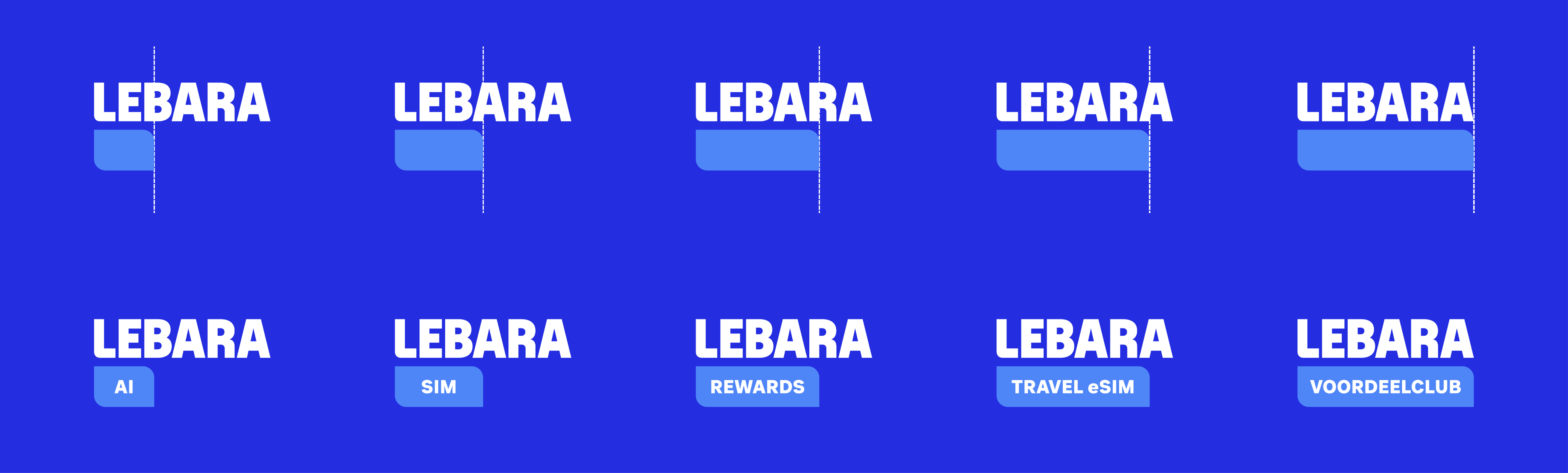
The right edge of the sub-brand container must align with one of the internal vertical axes of the LEBARA logotype — specifically the inner edges of the letter strokes. This is to avoid that the sub-brand containers underline a specific part of the word LEBARA – such as LE, LEBA, LEBAR, etc. – so the containers must always “overflow” onto the next letter. The only exception is the full-width container underlying the whole Lebara logotype.
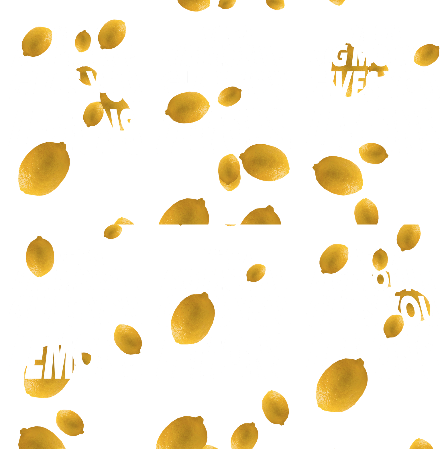
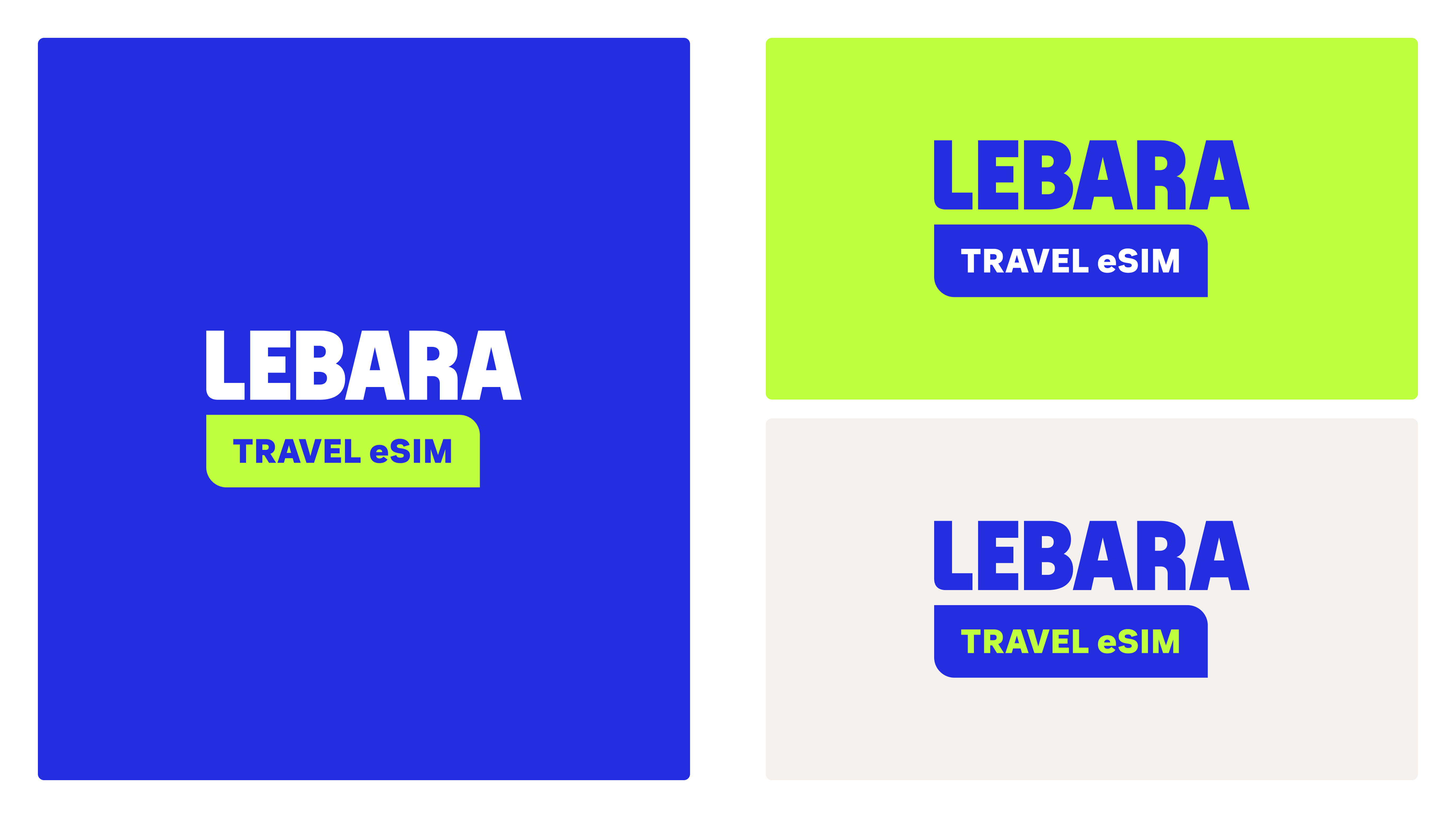
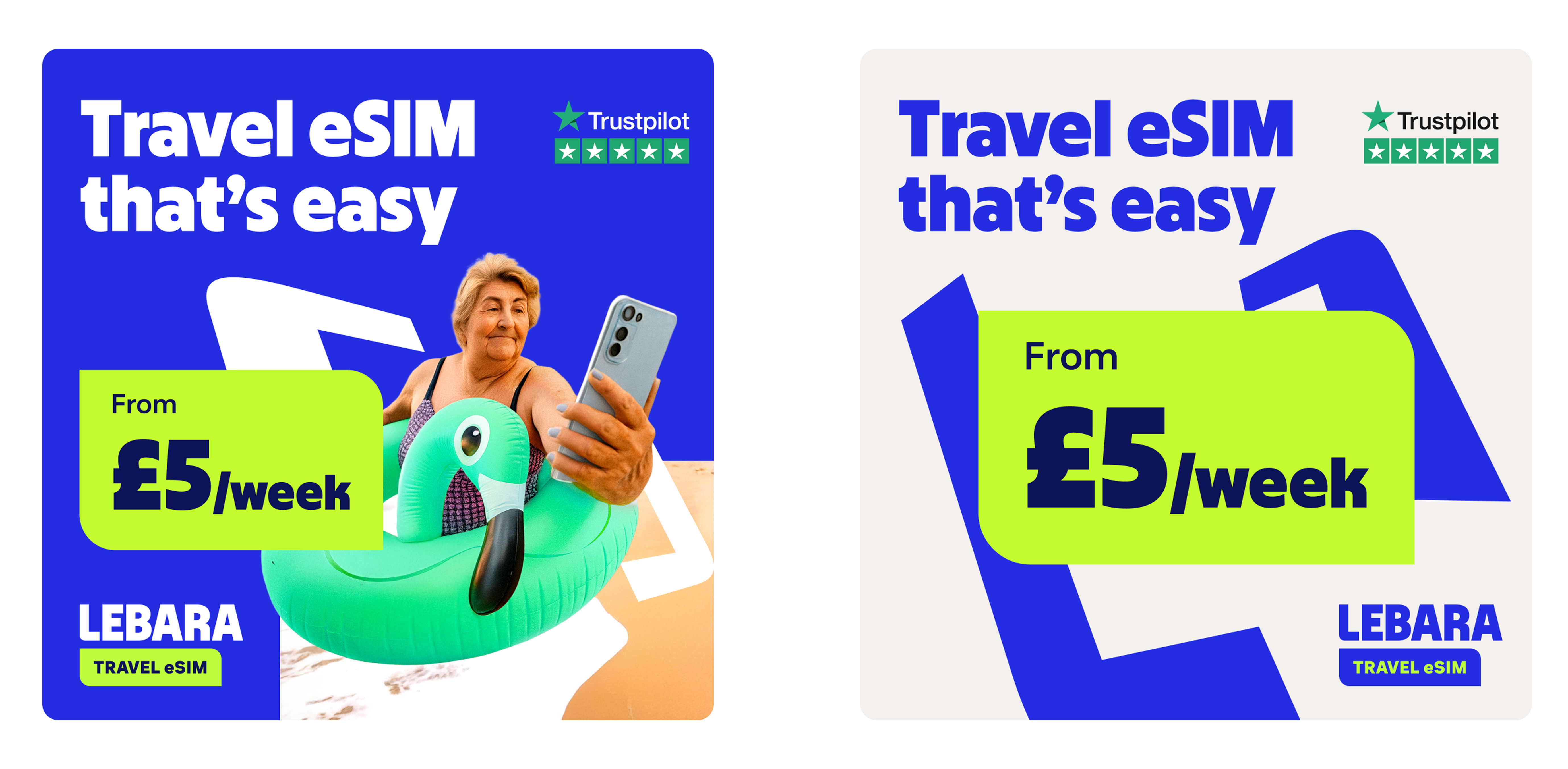
The Travel eSIM sub-brand retains all the core brand foundations – the typography, the structural principles, the smart frame – while introducing a single, deliberate differentiator: Lucid Lime replaces Think Pink as the primary accent colour. The choice was intentional – both instinctive, and tested with users. Where pink signals boldness and kindness, lime green evokes clear skies, sunshine, and the feeling of going somewhere – creating an immediate and unmistakable travel association without a single word of explanation.
One brand family. Two distinct personalities. Both unmistakably Lebara.
Lebara Nigeria: A Vibrant Sub-Identity
Alongside our core five markets, Lebara operates through licensing partners in Nigeria, Australia, Spain, Switzerland, and Saudi Arabia – each one a unique market with its own cultural identity and customer expectations. For the Nigeria launch, we developed a bright, distinctive sub-identity that adapts the master Lebara style for one of the most colourful and creatively expressive markets in our partner network.
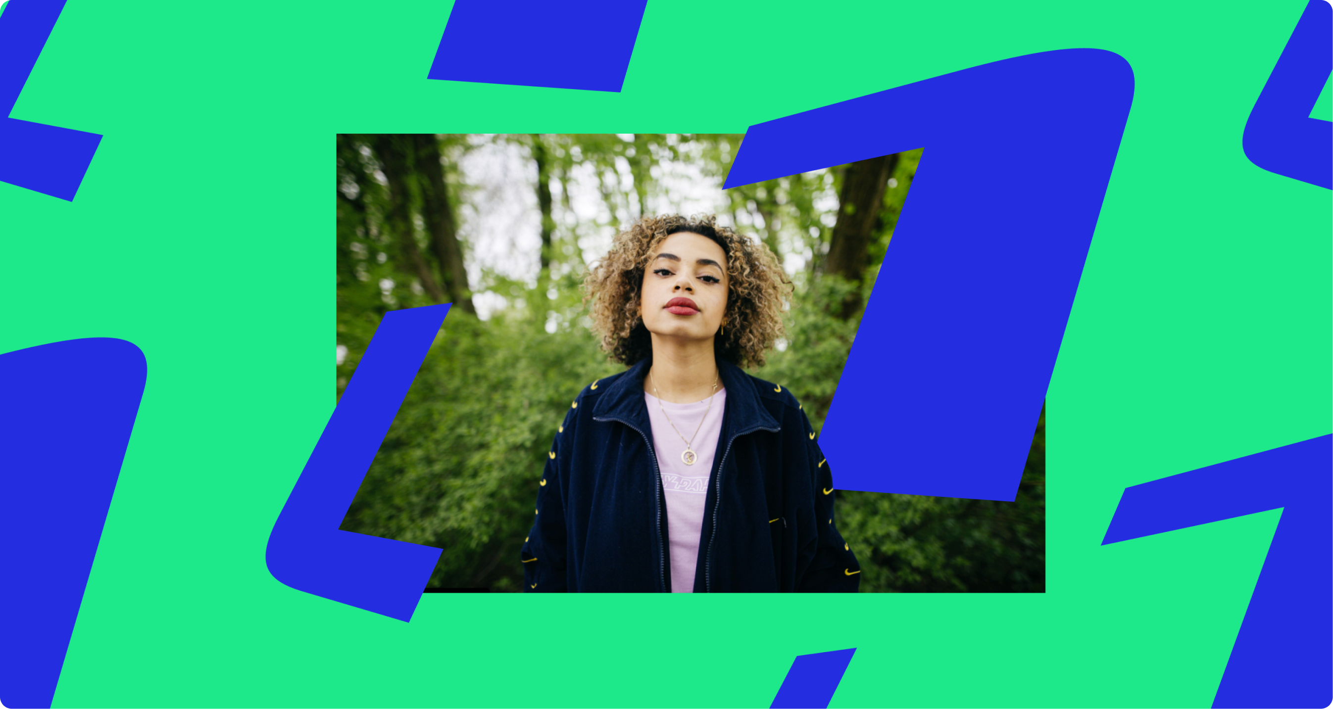
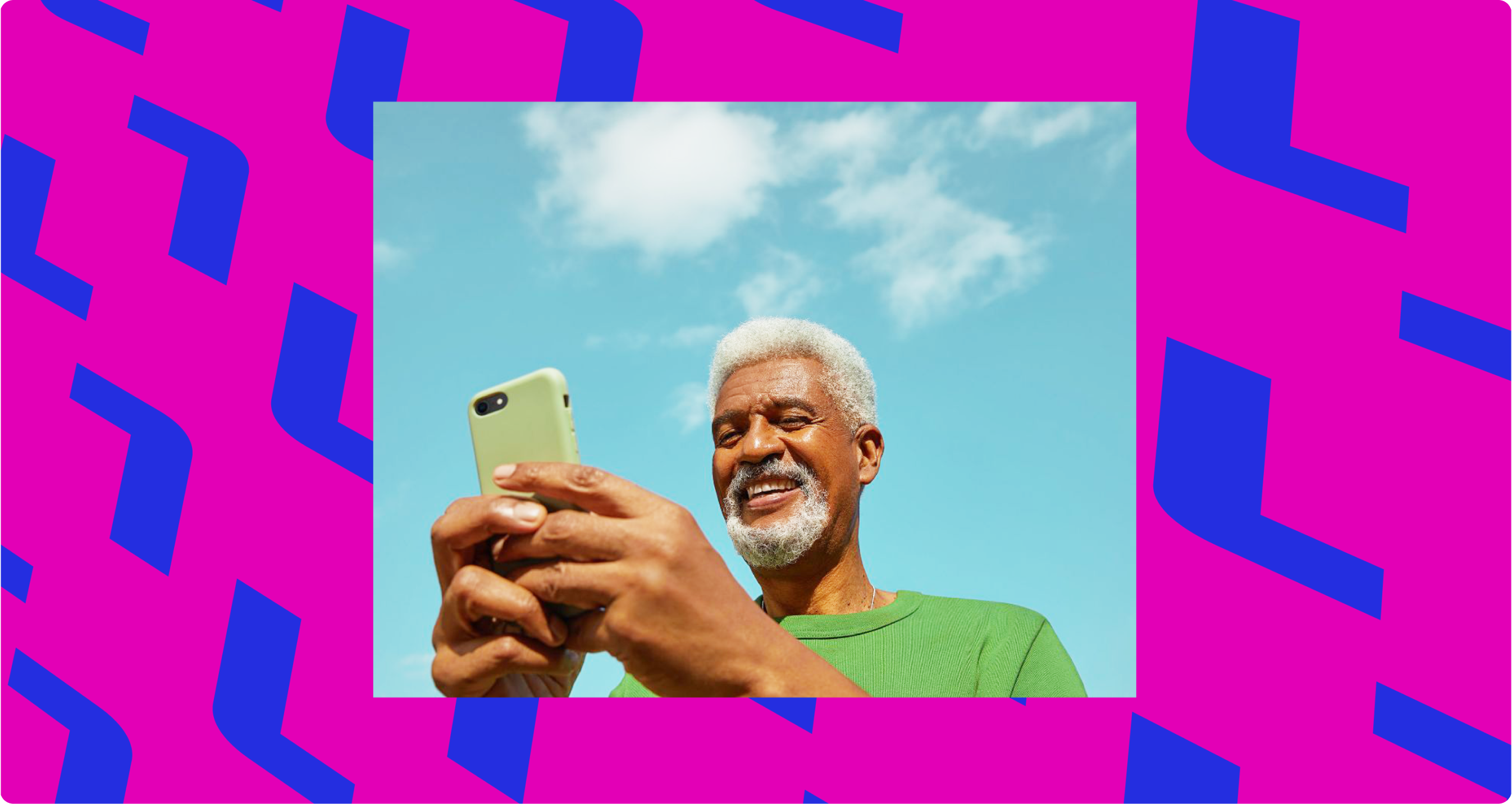
The most distinctive element of the Nigerian sub-identity is the Naija pattern – a custom pattern built from the Smart Frame, designed to echo the rhythm and richness of traditional Nigerian pattern design. Both the master brand patterns and the Naija pattern can be used, with patterns cropped, scaled, and placed within ribbons and banners to create compositions that feel culturally rooted and unmistakably Lebara at the same time.
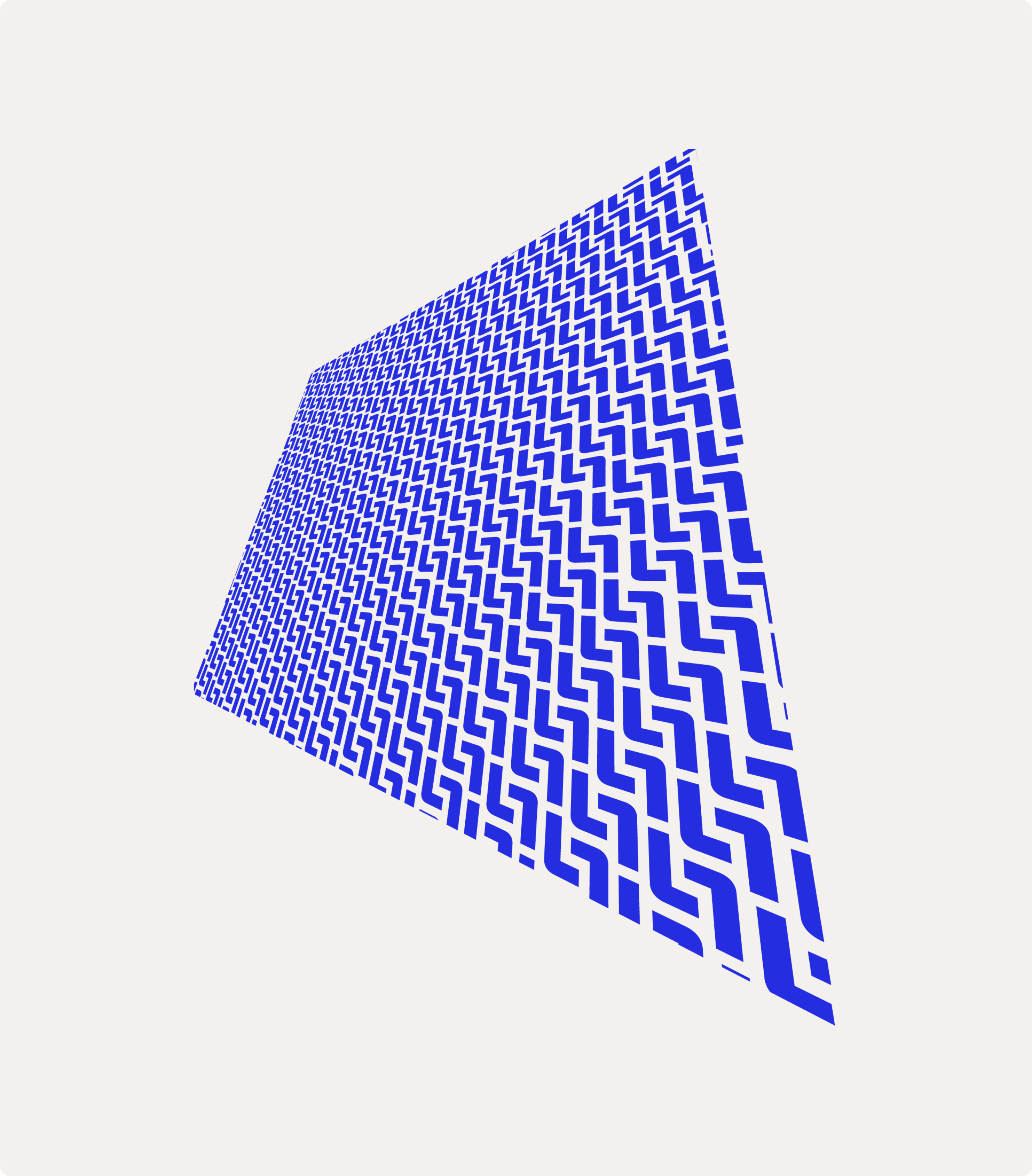
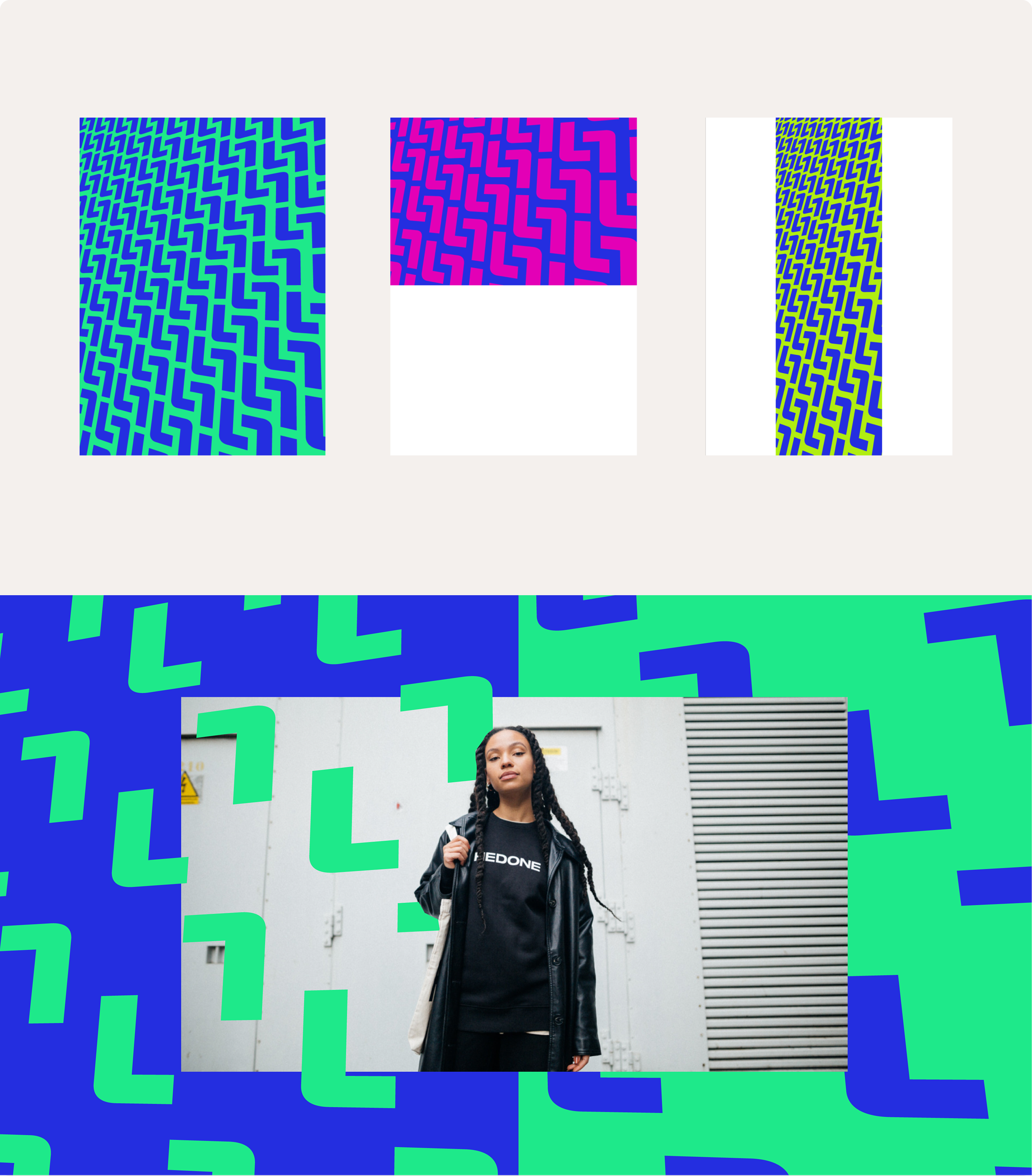
The result is a sub-identity that gives Lebara Nigeria its own voice and visual presence – bold, vibrant, locally resonant – while remaining a clear and confident part of the wider Lebara family.
Digital Compatibility and Accessibility Testing
Throughout the process, my Design team worked in parallel with Verve – translating each evolving element into real digital layouts across web and app, testing how every font, colour, and shape performed in an actual product environment rather than in isolation on a brand board. Every brand decision was validated in context before it was finalised and signed off.
Accessibility testing was built into the process from the start, with every colour combination and typographic choice validated against WCAG standards to meet full European Accessibility Act compliance – ensuring the final identity looks exceptional and performs to the highest digital and regulatory standards.
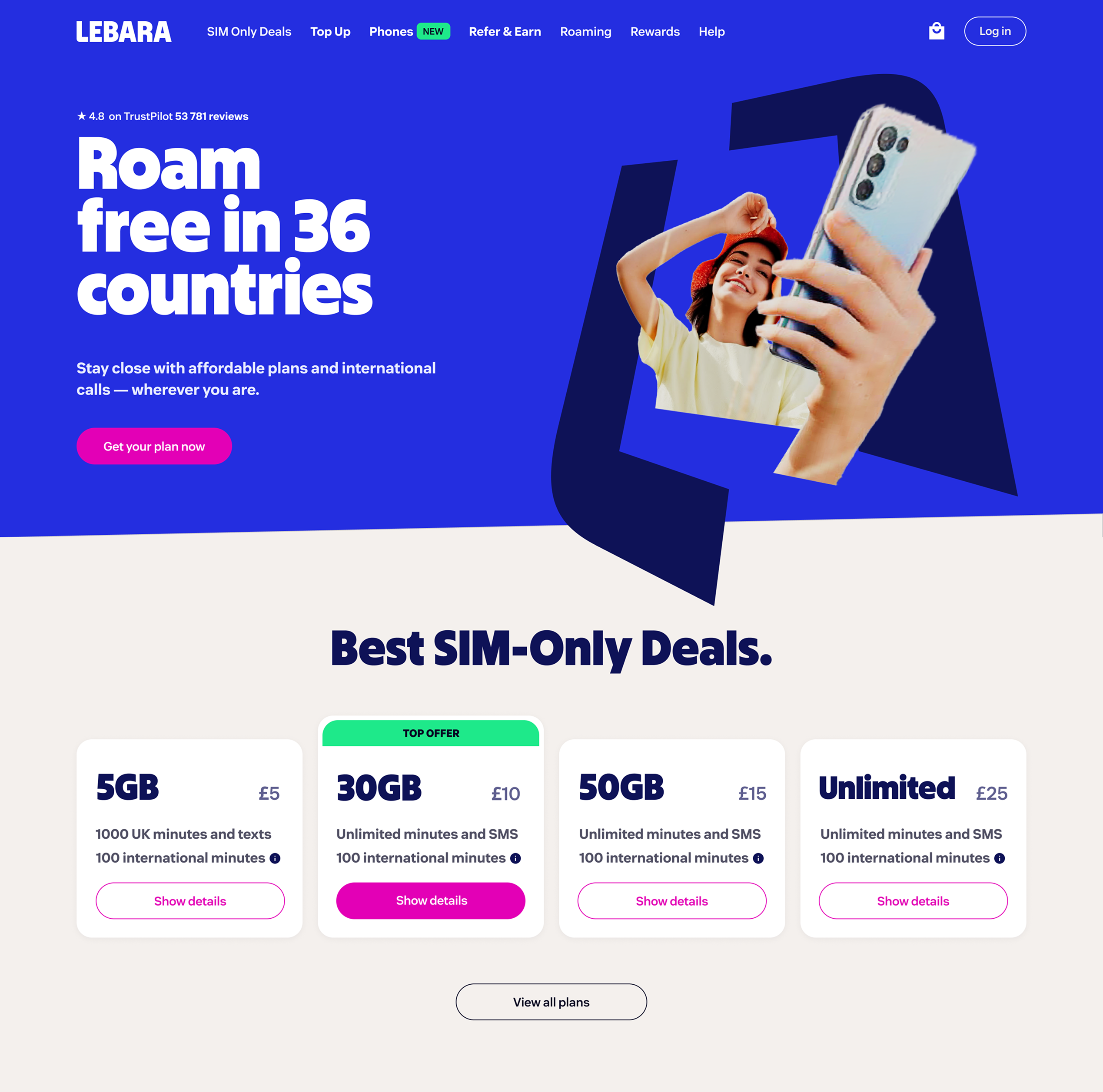
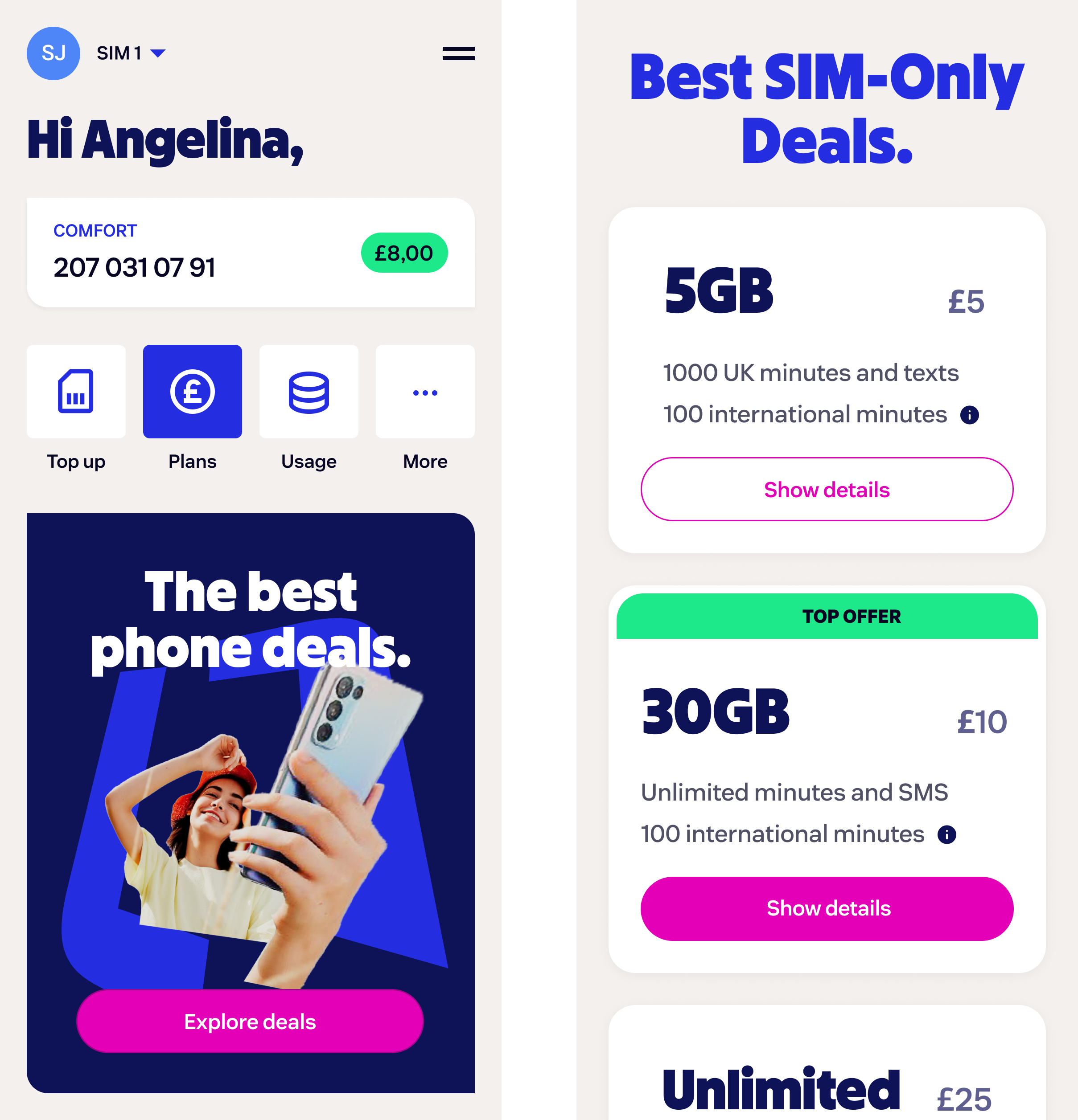
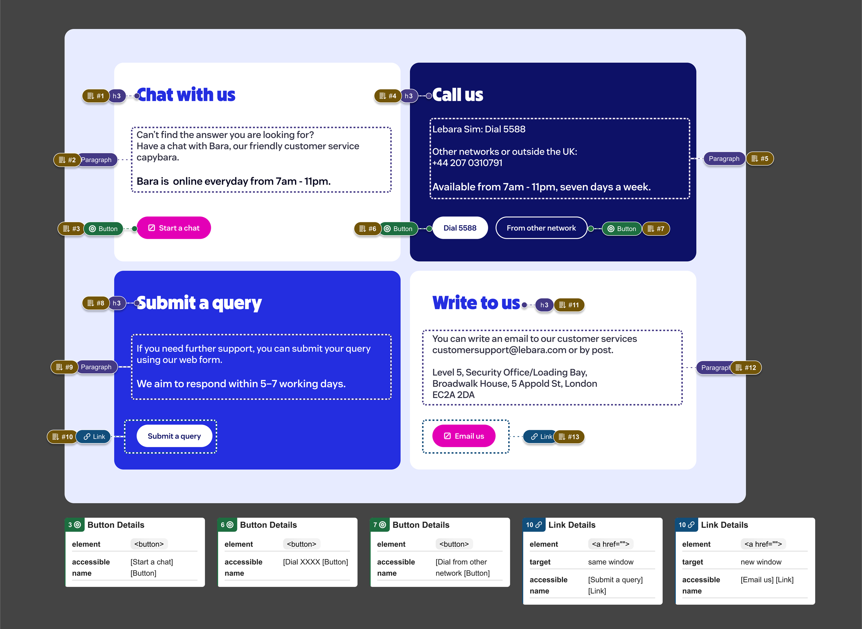
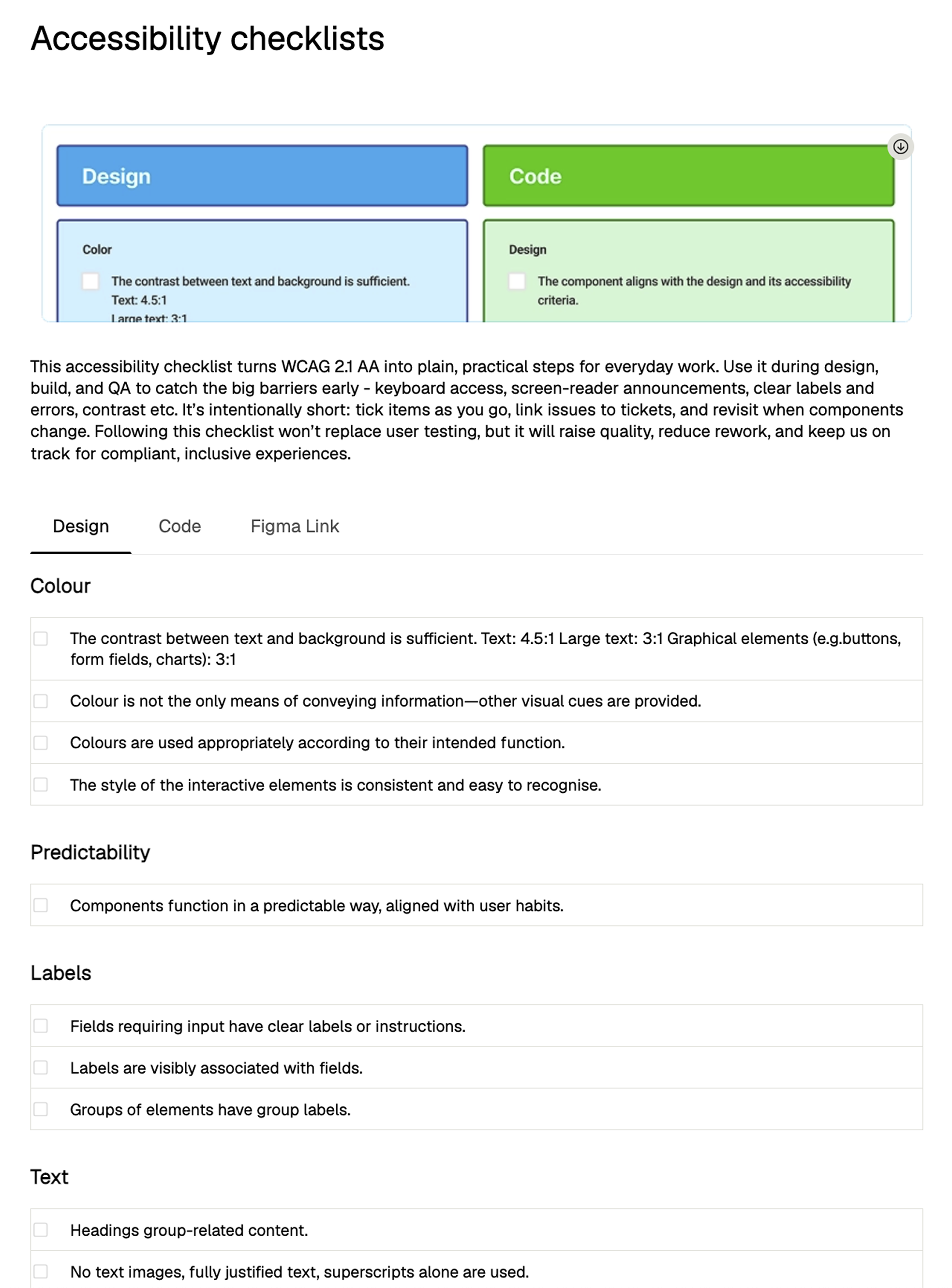
Every component, interaction, and layout was validated against specific European Accessibility Act requirements – covering contrast checks, keyboard navigation, screen reader compatibility, label clarity, and interactive element consistency. A comprehensive accessibility checklist was created for the entire design team, covering both Design and Code criteria, to ensure every future design decision is built to the same inclusive standard from the outset.
London Office Space
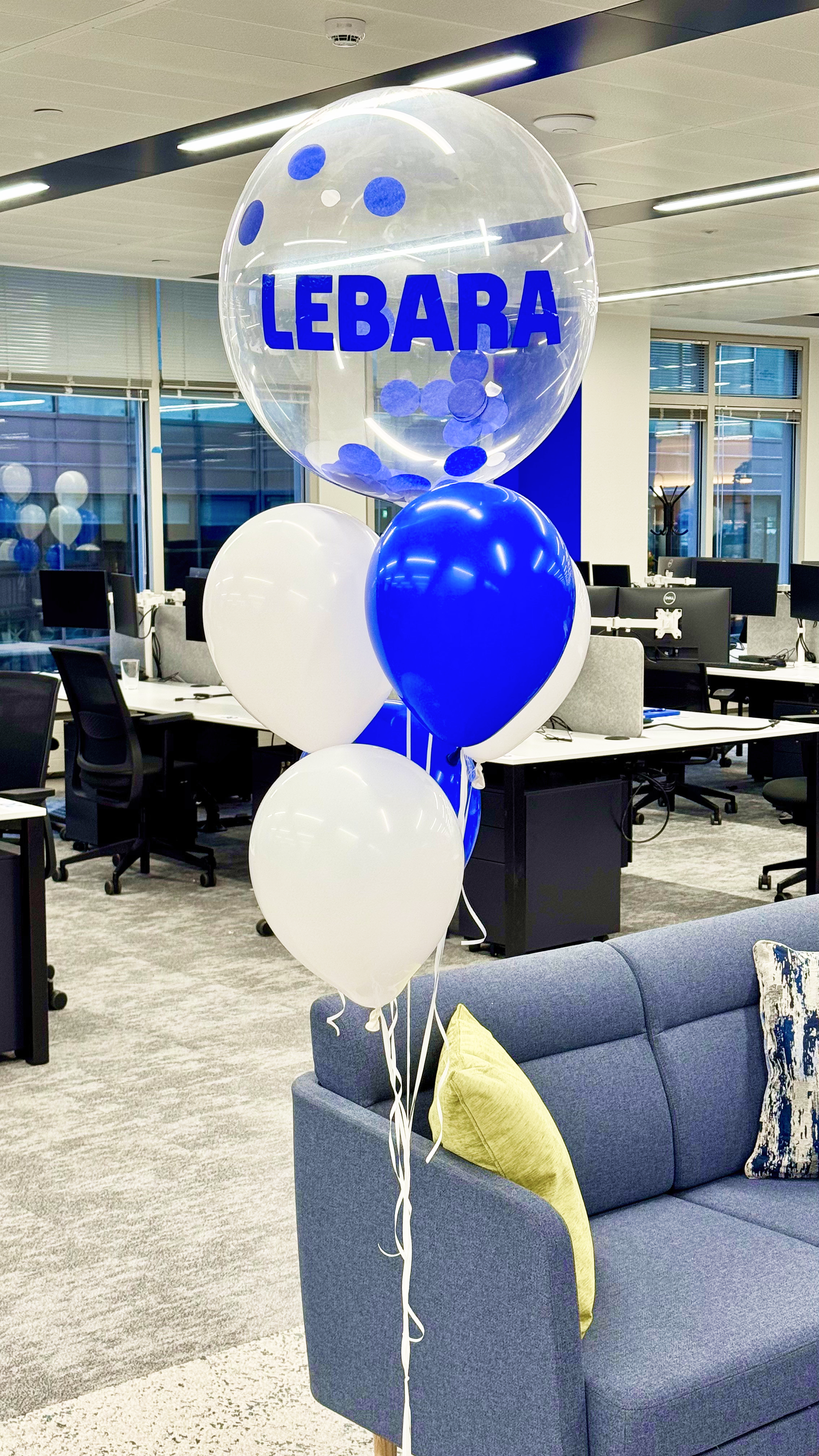
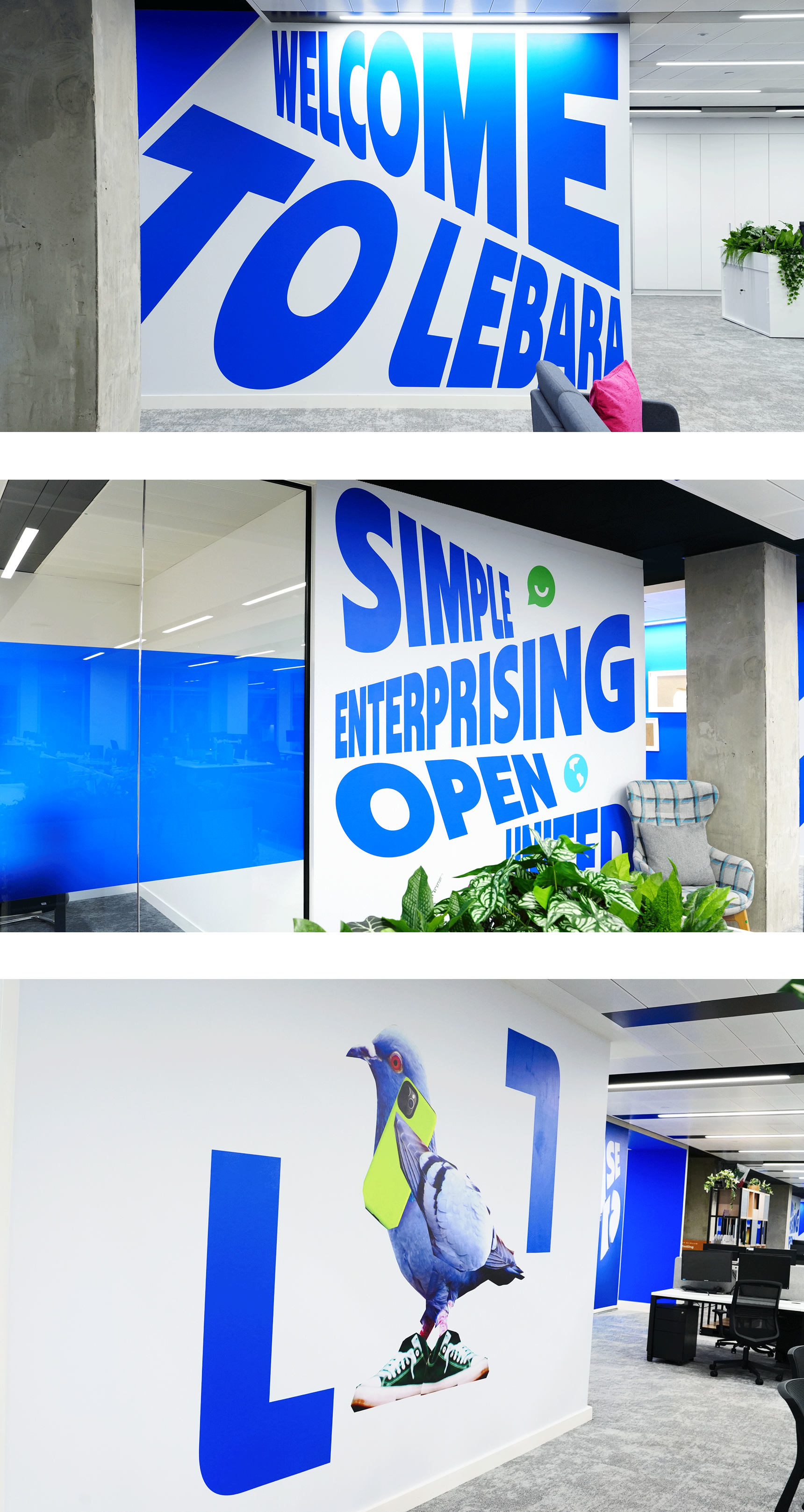
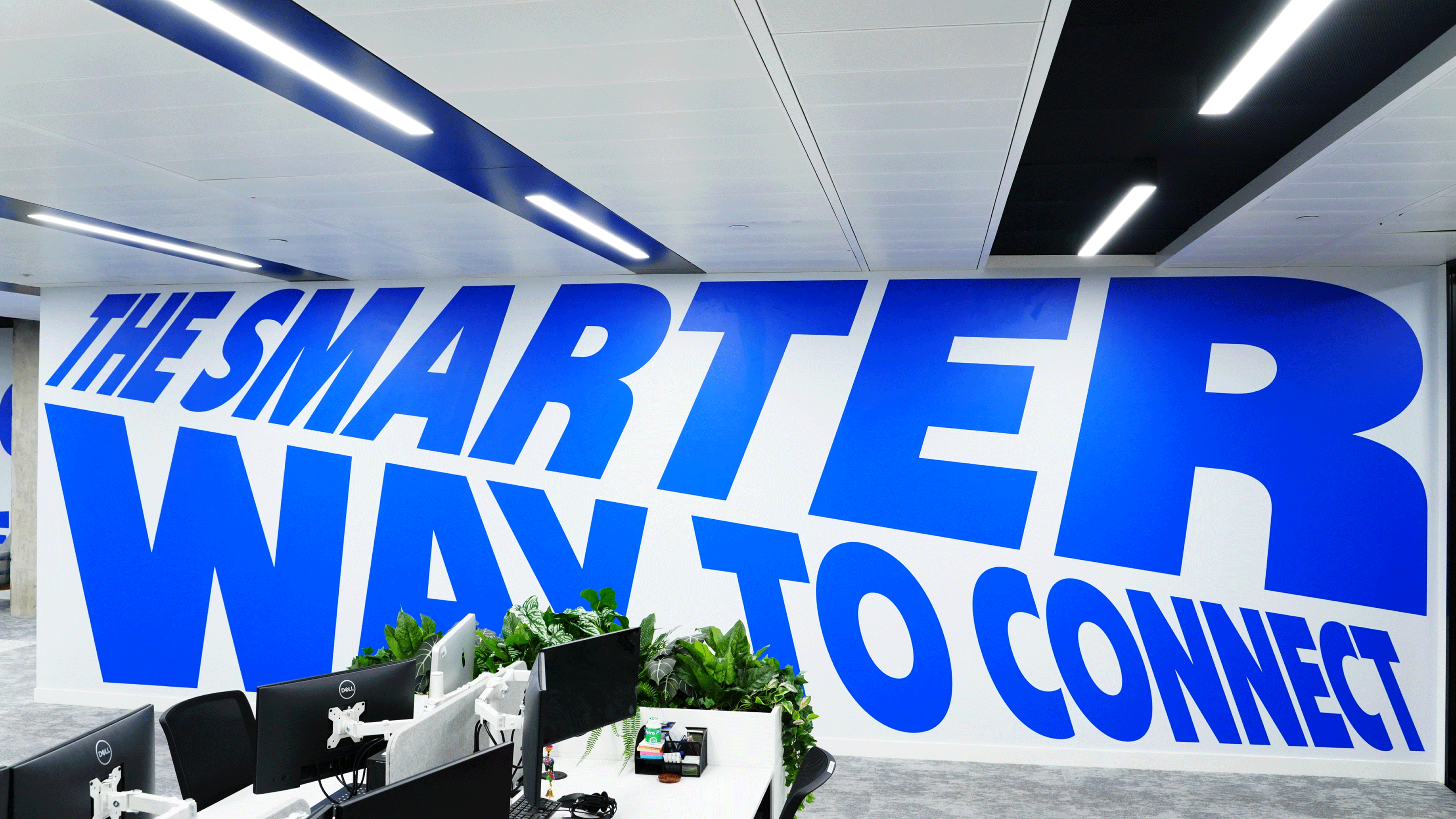
The Brand Design Refresh launch luckily coincided with Lebara moving into a new London office – which turned out to be a perfect, and perfectly timed, opportunity. Rather than applying the brand to an existing space retrospectively, we got to discover it in three dimensions from the start. The same principles – perspective, volume, the Smart Frame – translated into wall graphics, wayfinding, and spatial moments that made the identity physical for the first time. High-volume typography lands differently at room scale. The L-shapes that anchor the visual system take on a new weight when they're architectural.
Walking through the space, the visual language stops being something you look at, and becomes something you experience from the inside.
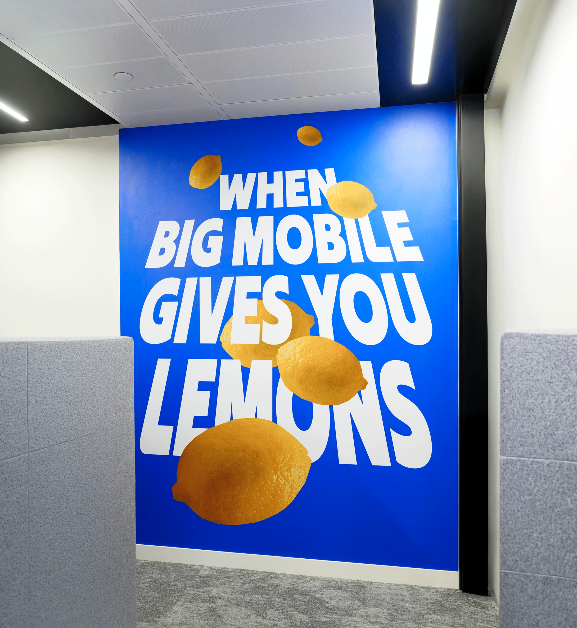
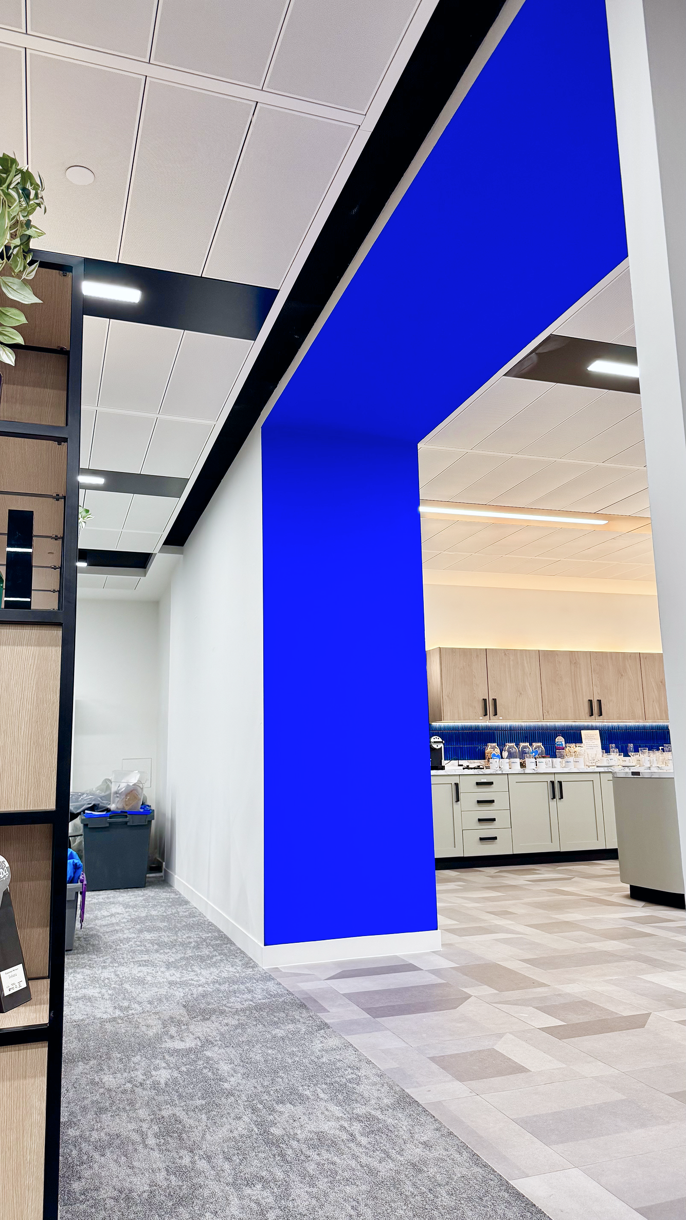
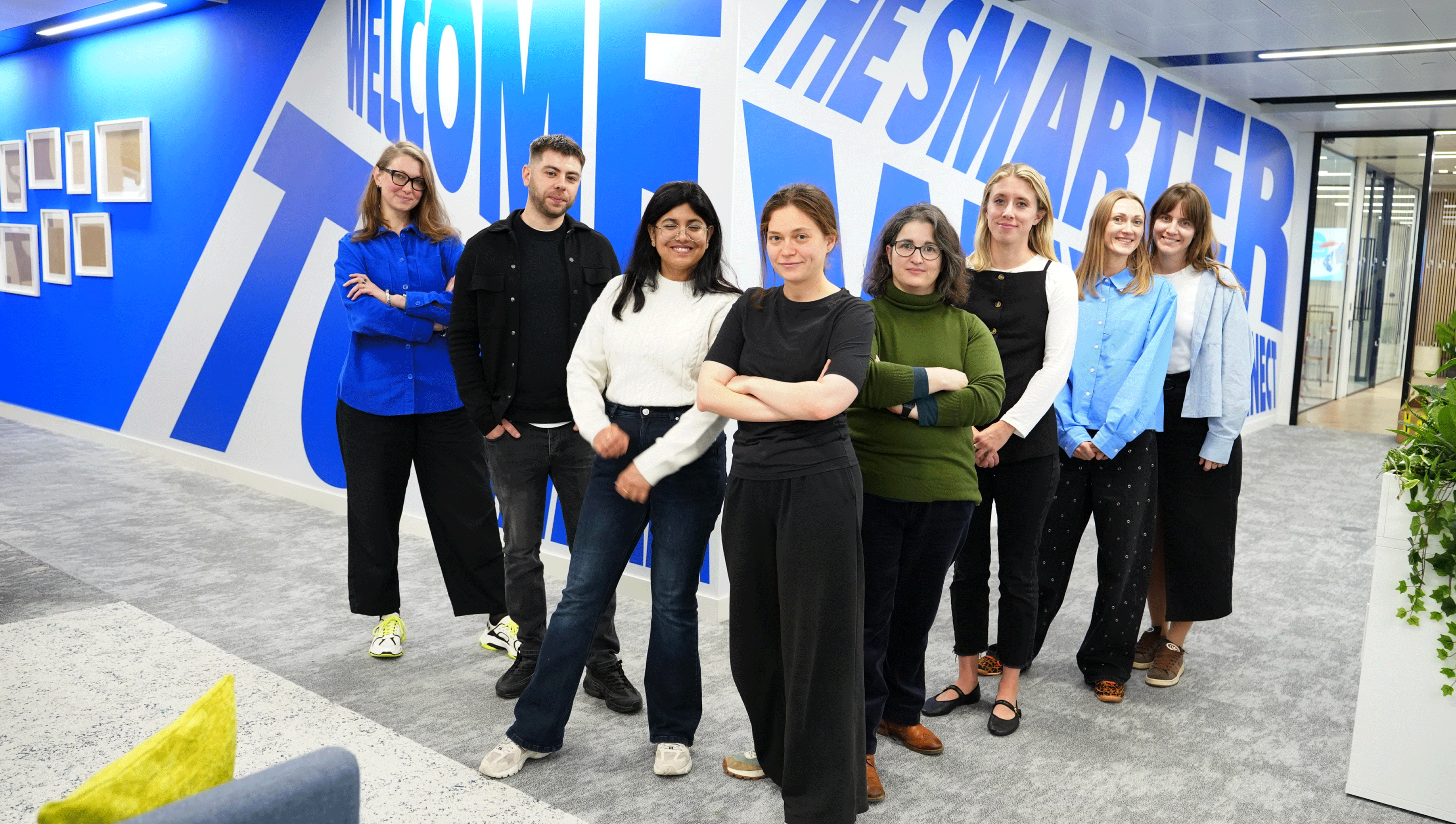
And of course the brilliant Design Team who made all of this happen
Merchandise
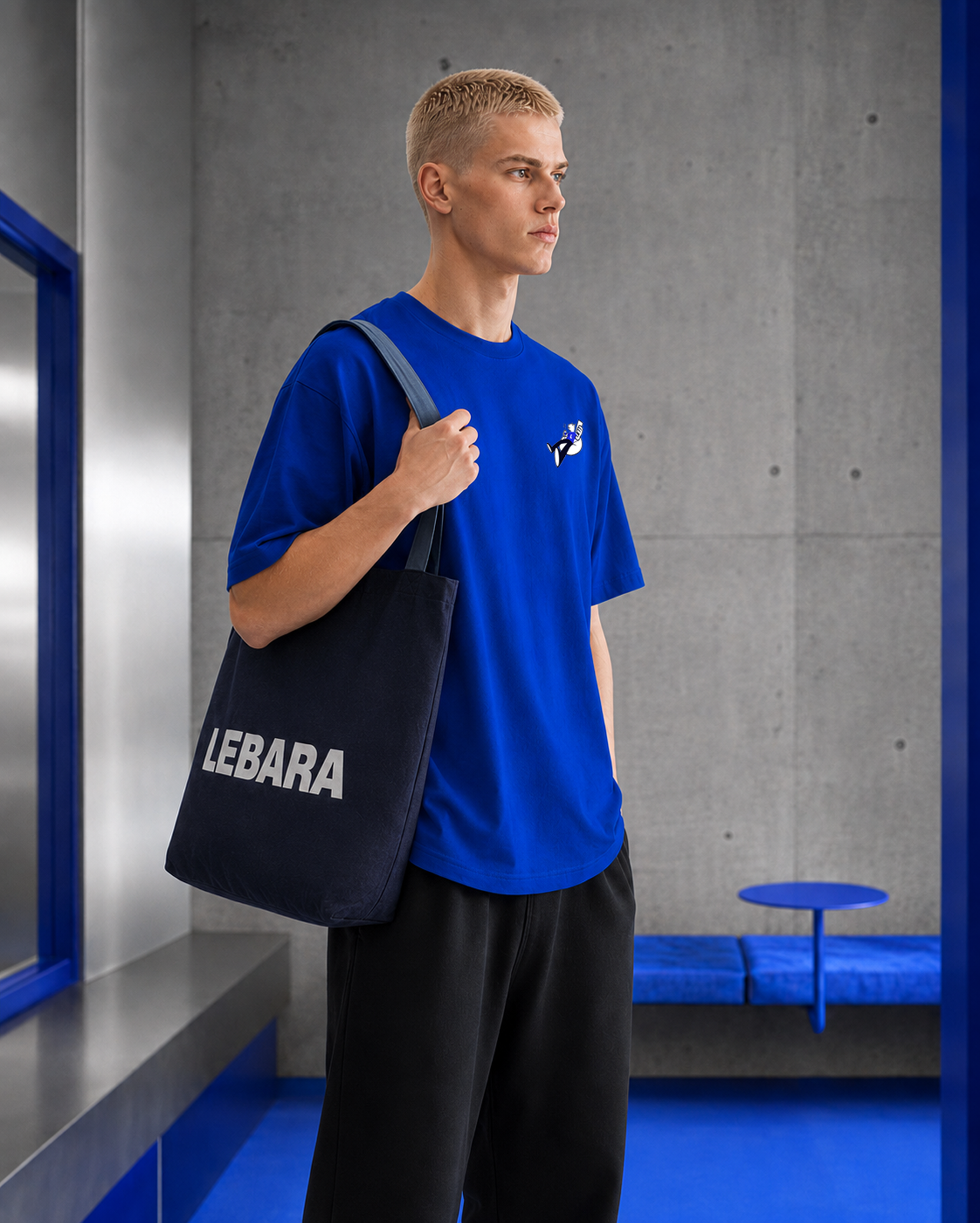
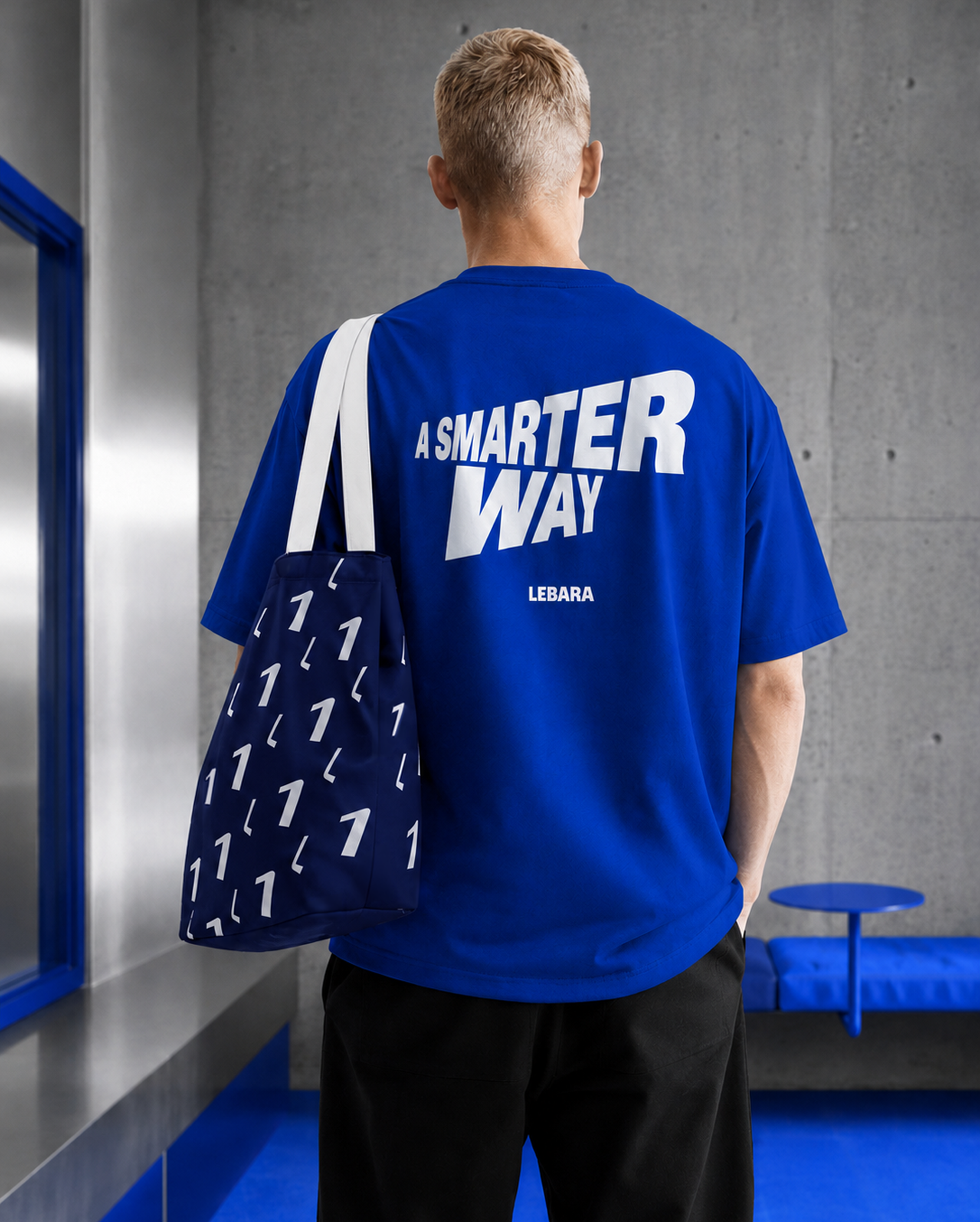
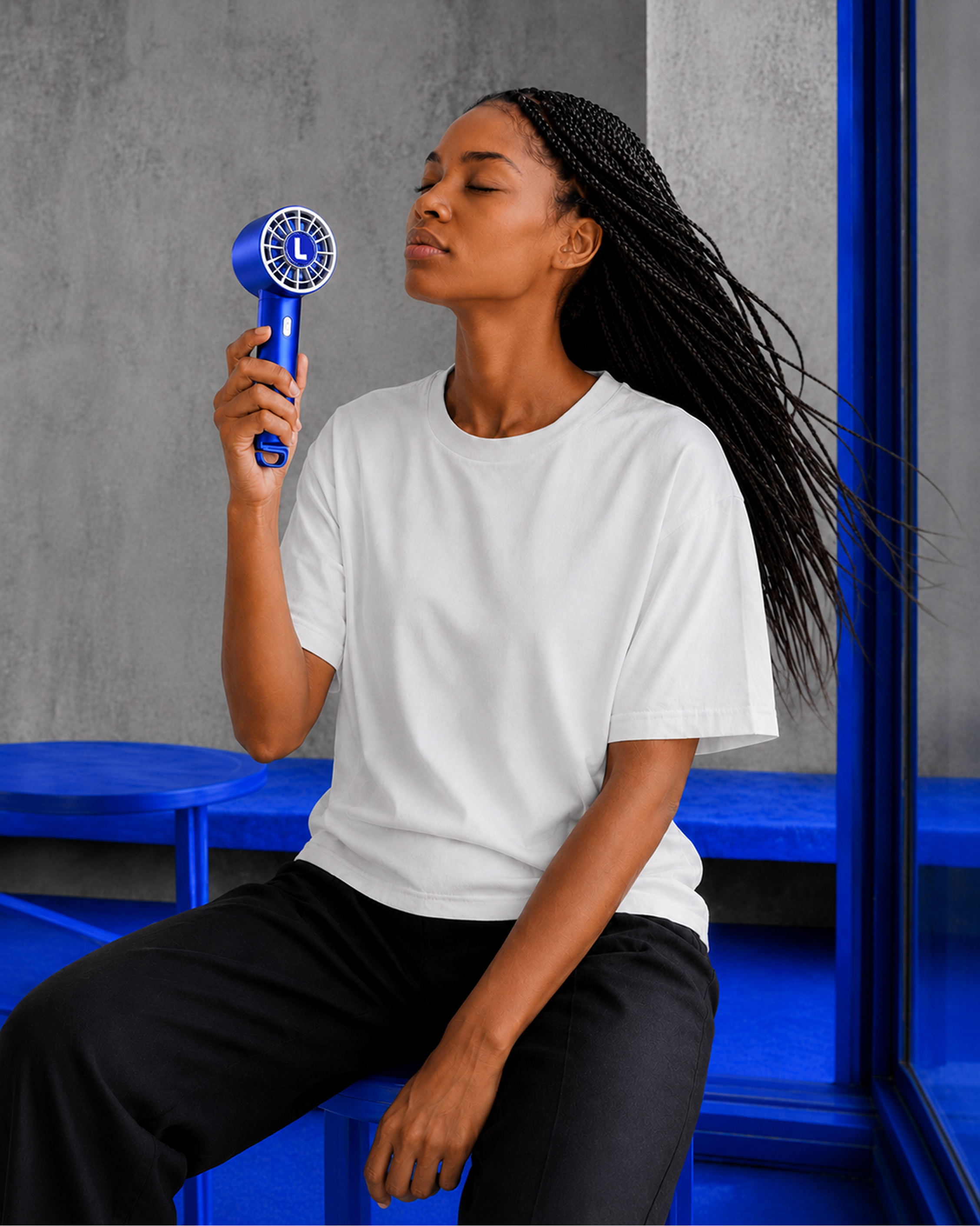
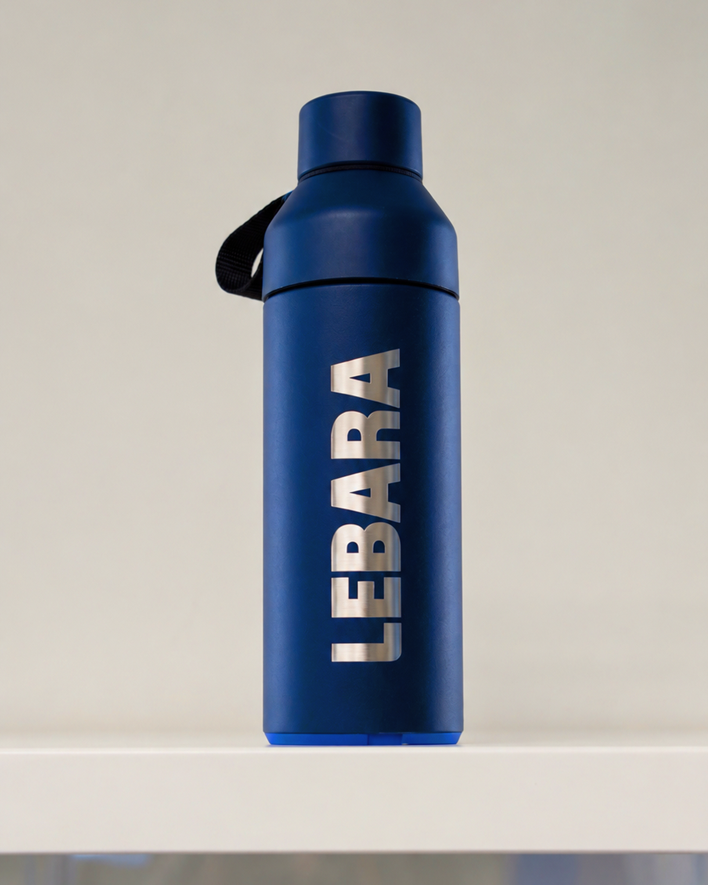
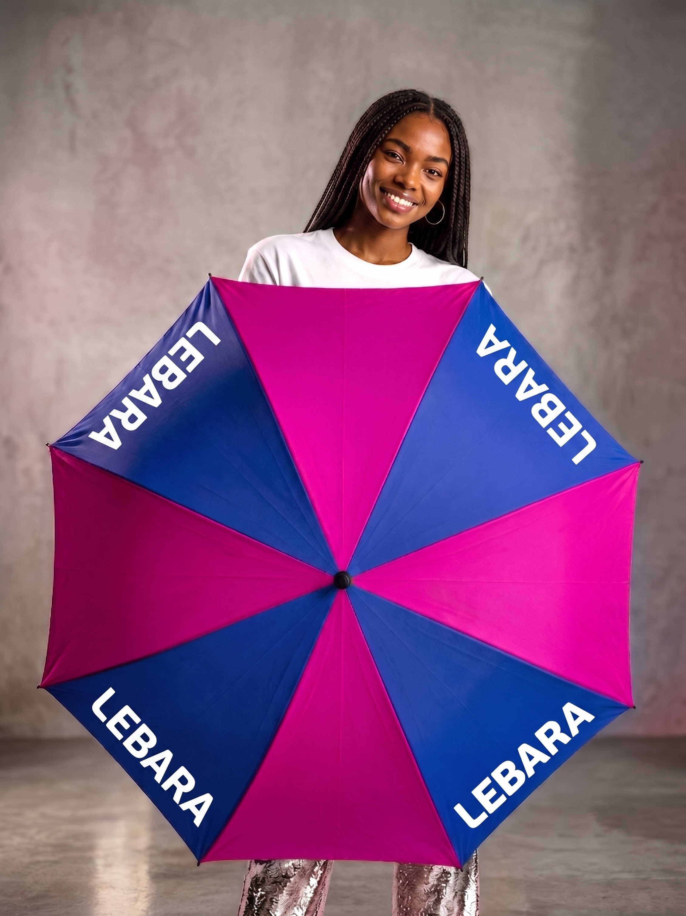
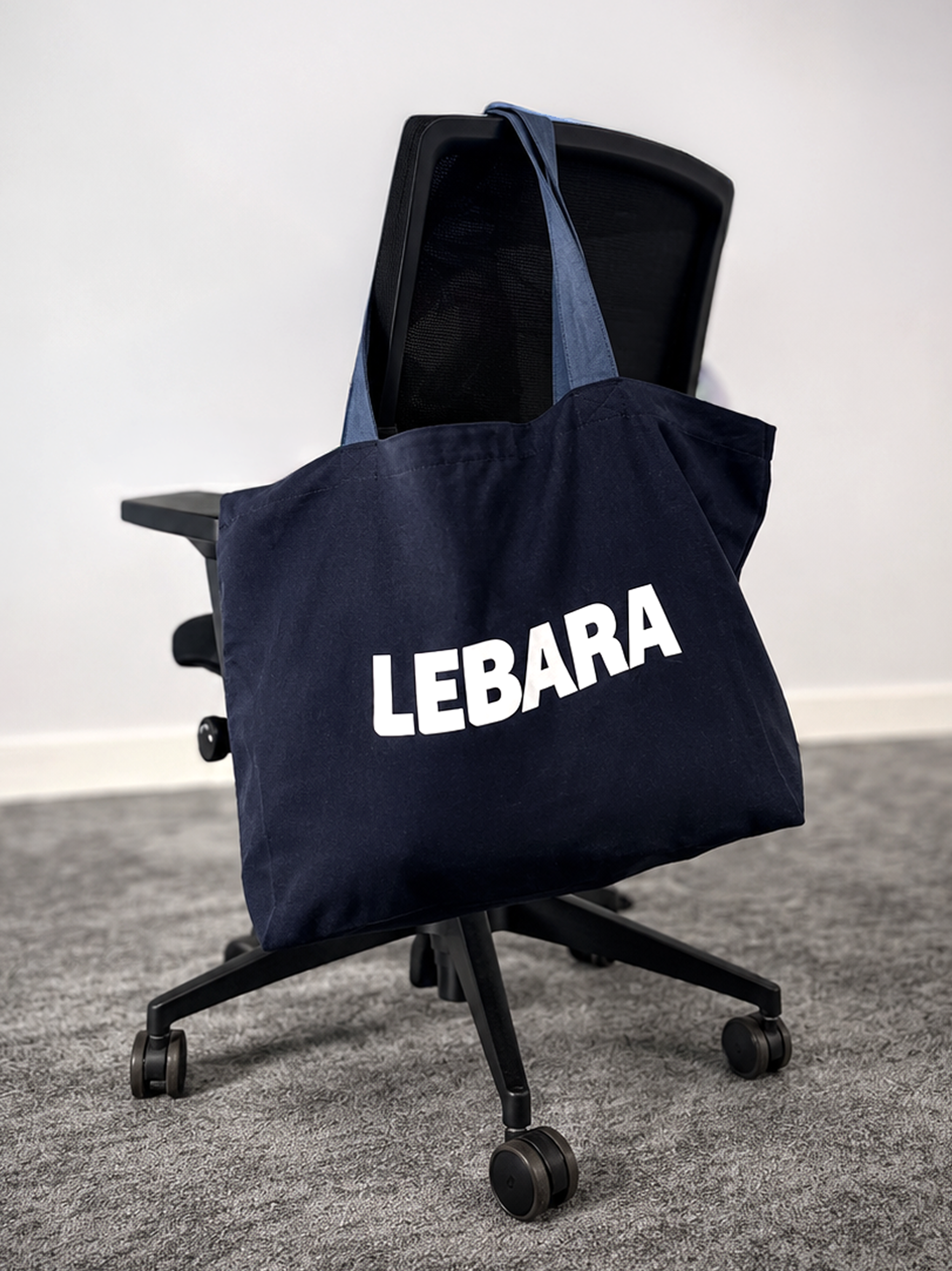
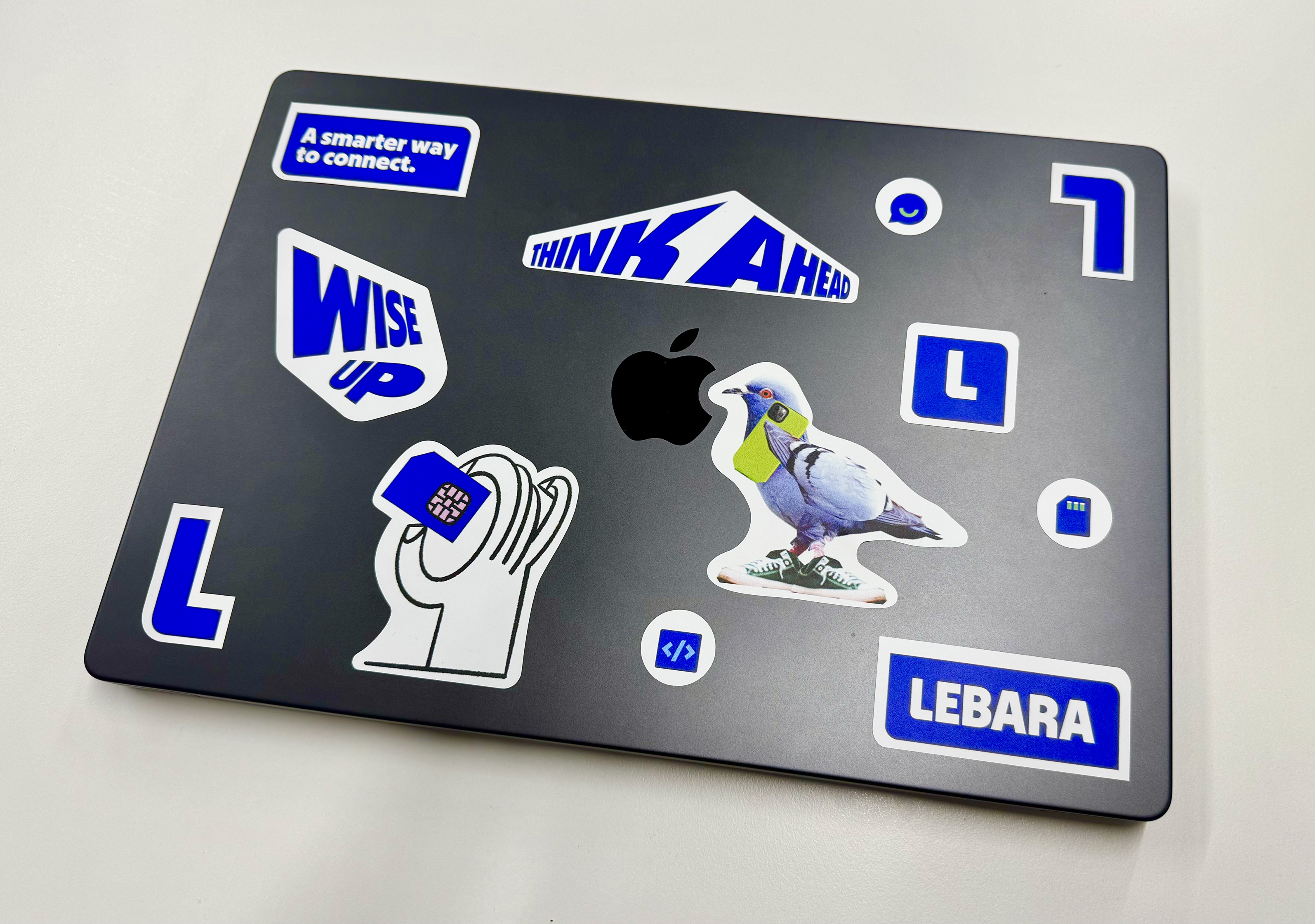
The merchandise extended the work beyond digital and into the everyday – a critical move for both validating the system and embedding the brand across customer touchpoints and internal culture.
For customers across the five markets, this shifted the brand from something they encountered on a screen to something they carried, wore, and used. For the internal team, it made the rebrand tangible in a way that brand guidelines alone never could. Suddenly, the identity wasn't abstract – it was physical, present, and undeniably stronger than what came before. That matters as much for organisational buy-in as it does for customer perception.