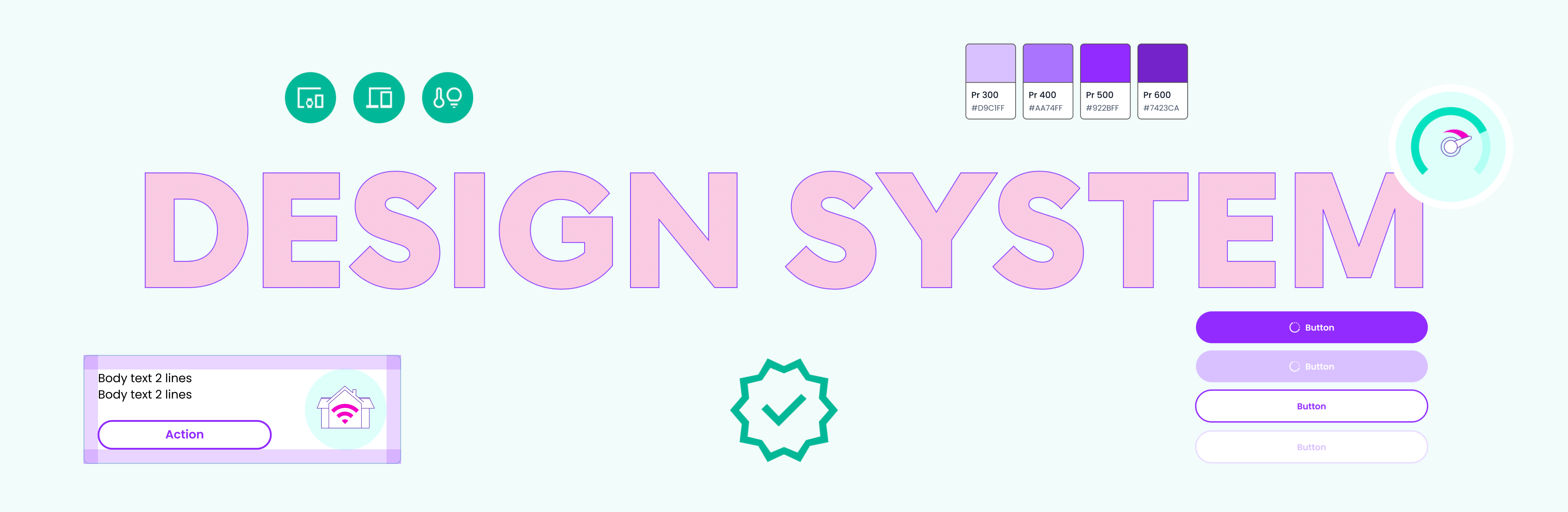
One of the most impactful decisions of my Design Leadership at Gamgee was the strategic investment in a bespoke, white-label Design System – one that would become the backbone of design efficiency and product consistency across the entire platform.
The results were transformative. Design efficiency increased by 500% and visual inconsistencies across digital products were reduced by 70% – freeing the team to focus on higher-value creative and strategic work rather than repetitive production tasks. For a B2B2C product operating across multiple partner ecosystems, this level of consistency was a direct business advantage, ensuring every end-user experience felt coherent, polished, and on-brand regardless of which partner was deploying it.
What made this Design System particularly special was its technical foundation. At the moment Figma released its long-awaited Variables feature, I immediately adopted and integrated this new capability into the architecture of the system – leveraging it to power dynamic theming, scalable tokenisation, and faster partner onboarding. It was a decision that future-proofed the System and placed Gamgee at the leading edge of design tooling at the time.
A 2-minute recorded demo shows how my Design System allows for changes to be made very quickly for numerous elements: colour modes (light and dark), accessibility mode, translations to multiple languages.
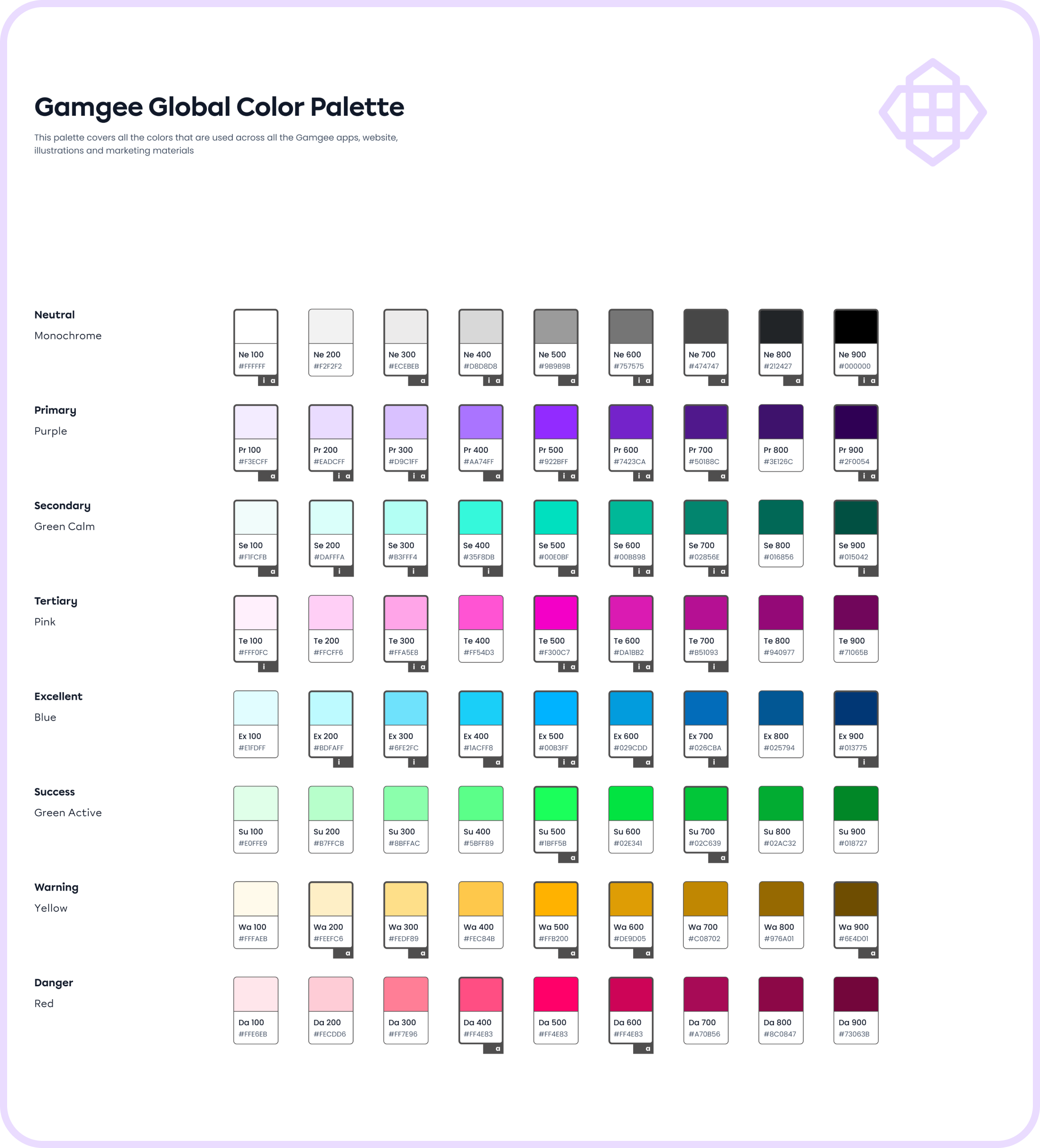
Global Colour palette (Primitives)
One of the first steps of setting up a Design System was to define a functional colour palette (Colour Primitives) that addresses all the brand colours by their semantic names (e.g. Primary, Secondary, Warning, Danger, etc.) instead of their ‘colour’ names such as purple, green, blue, etc. This way I created a shared language between designers and developers, and created modes for colours based on their function in the app.
I labelled all the colours that are currently used for the app functional elements (‘a’) and app illustrations (‘i’) to avoid using just any colour from the palette but try to choose the ones that are already in use, unless it's absolutely needed for UI purposes. My goal was to limit the overall amount of colours in the app, and stick to a more strictly organised colour system to reduce the amount of colours to be stored in the app, and achieve better consistency and user experience with the app interface.
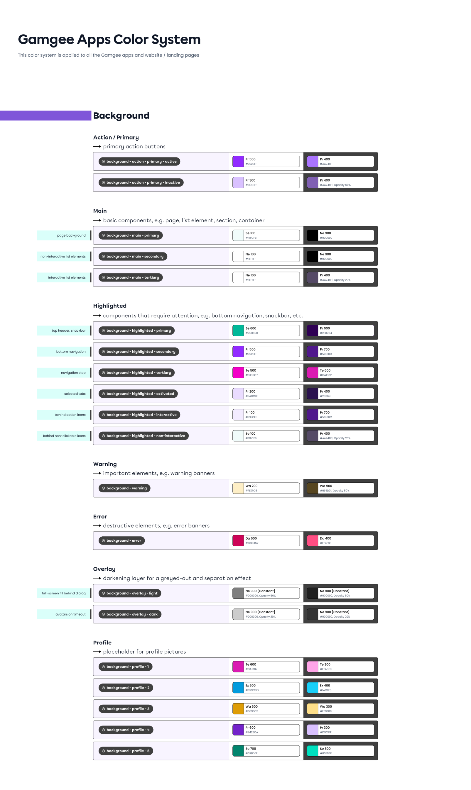
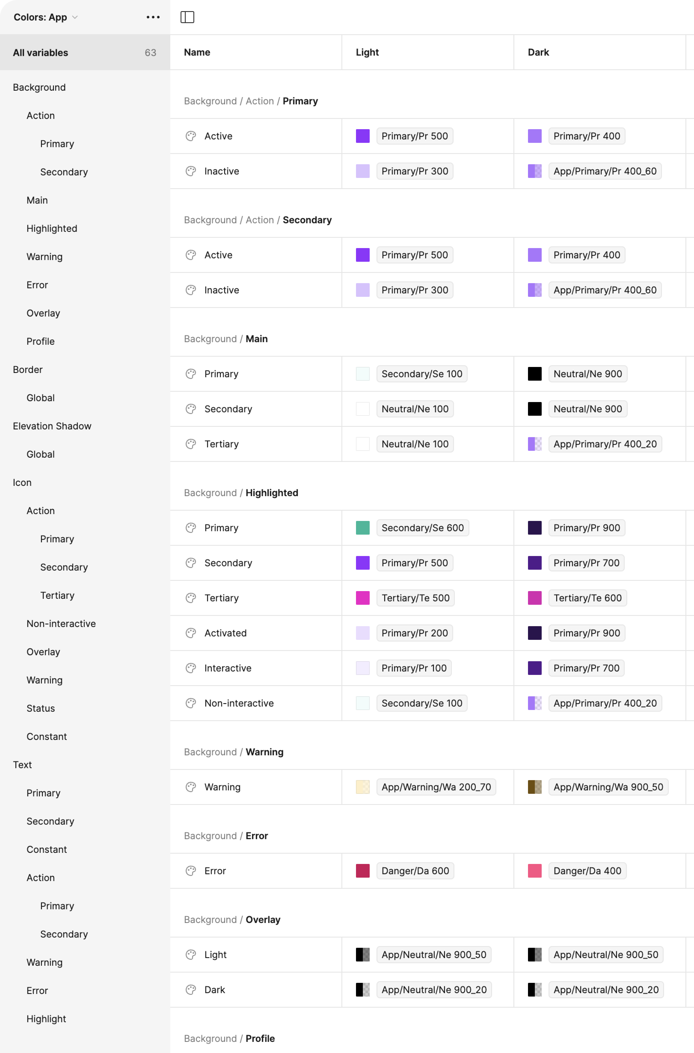
App colour system
This approach allowed me to create a scalable Colour System rooted in Colour Primitives and assigned a second layer of semantic (functional) names such as Action - Primary – Active / Inactive as an example, creating a variable instead of a simple colour value.
The preview shows the example of functional app colours for all types of Backgrounds in the app (Action, Main, Highlighted, etc.), and such tables are also created for Border, Elevation shadow, Icons, Texts, and Illustrations – both for light and dark modes.
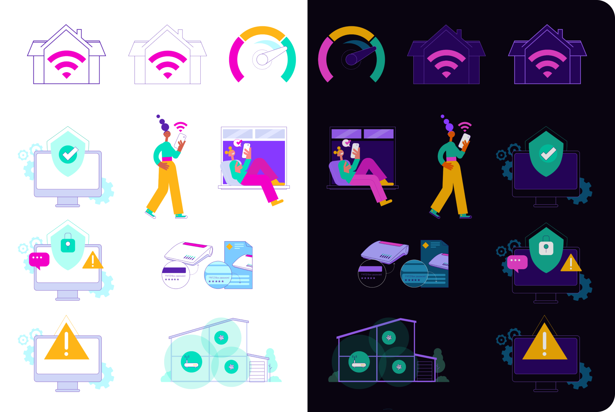
Example of the Colour Variables applied to the in-app illustrations: in one click the mode changes from light to dark
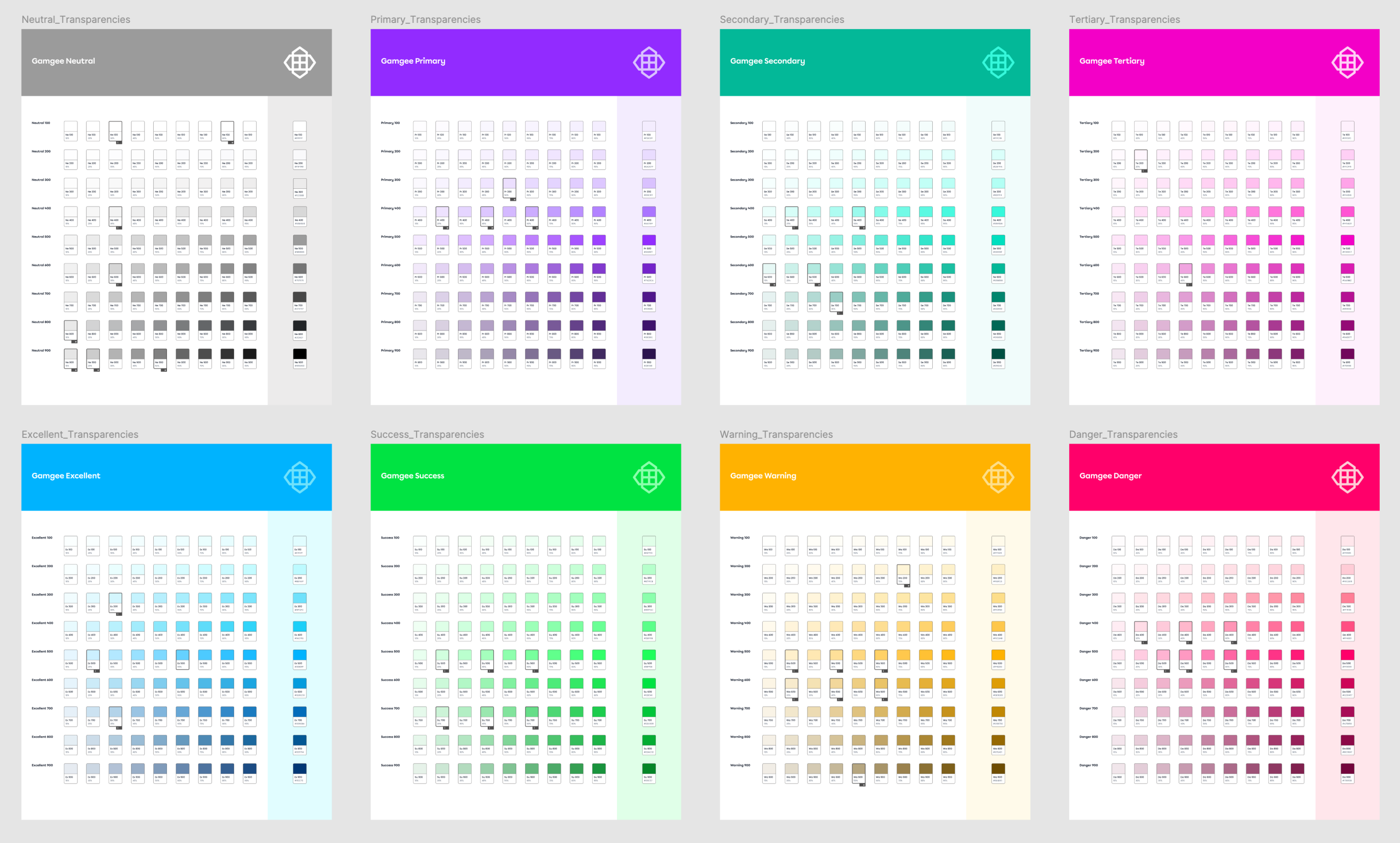
Transparencies palettes for each Primitive Colour from the Global Colour Palette, to achieve more colour variation and effects for UI purposes
Colour variables
I implemented the Colour Variables Table in Figma, which is a powerful tool that allows designers to manage and apply colour schemes across an entire app with remarkable efficiency. By defining a set of colour variables – such as primary, secondary, background, and text colours – designers in my team could easily control and update the app's colour scheme. When a colour variable is adjusted in the table, every element linked to that variable is automatically updated throughout the entire design, ensuring consistency across all screens and components.
This setup was especially beneficial for the Gamgee apps as it has multiple modes, like light and dark themes, and it's a white label solution where brand colours need to be quickly swapped to match different ISPs. With just a few clicks, designers could switch between colour schemes or update modes for the entire app, drastically reducing the time and effort required to implement brand-specific adjustments.
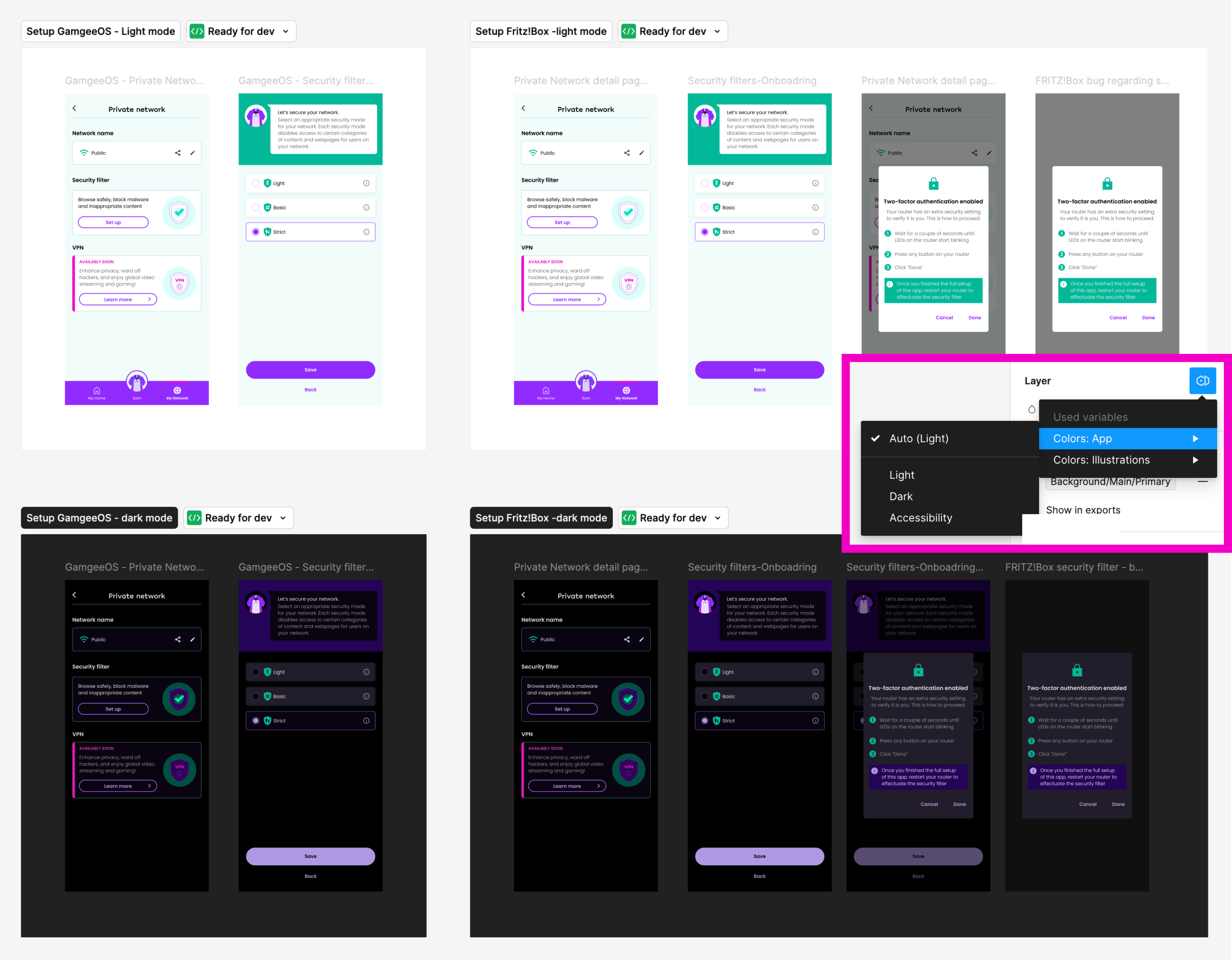
Preview of the app flow in light and dark modes – the dark mode preview was created in seconds using the Mode Switch made possible with the variables table
Spacing variables
Another key component of the Design System was Spacing, which plays a crucial role in maintaining a consistent and harmonious look across the app. Understanding the importance of maintaining logical relationships between elements, I set up these spacing values as variables, which allowed for easy adaptation across different screen sizes – whether mobile, tablet, or desktop. This approach ensured design consistency, and streamlined the process of adjusting layouts for various modes. By defining spacing as variables, I enabled our team to make quick, uniform changes, preserving the design's integrity and enhancing the overall user experience across all devices.
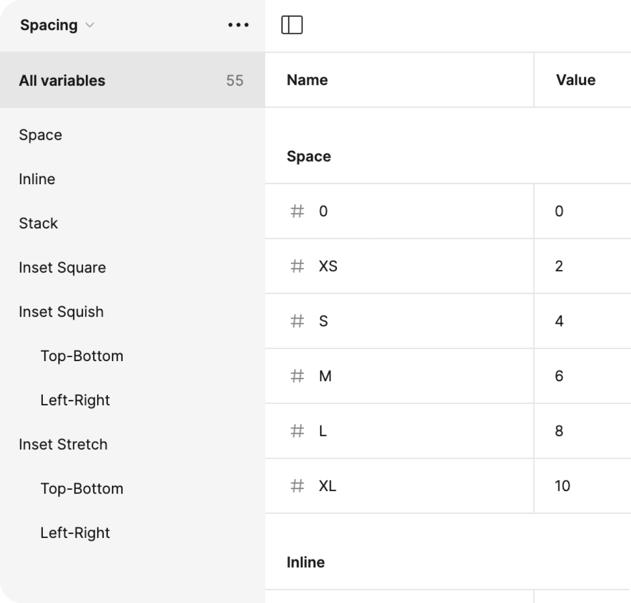
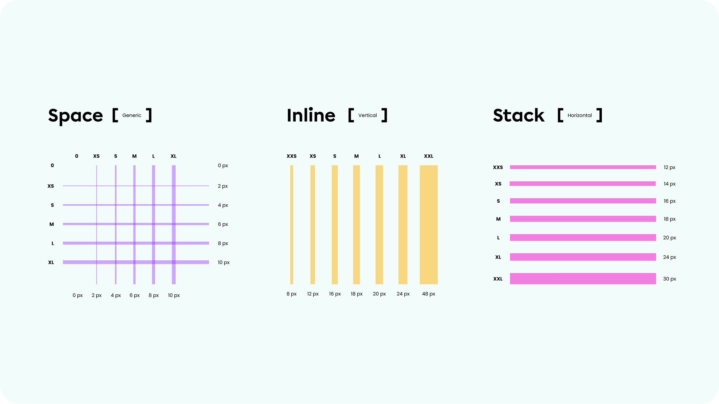
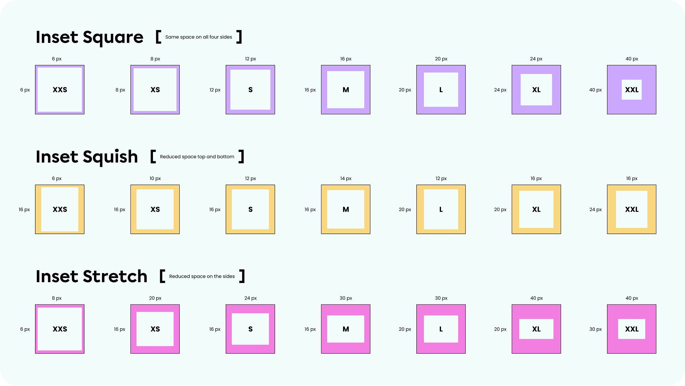
I put together visual guides and clear, illustrative examples to help the team quickly grasp the concept of spacing variables. My goal was to make it easy for everyone to start using and implementing them right away.
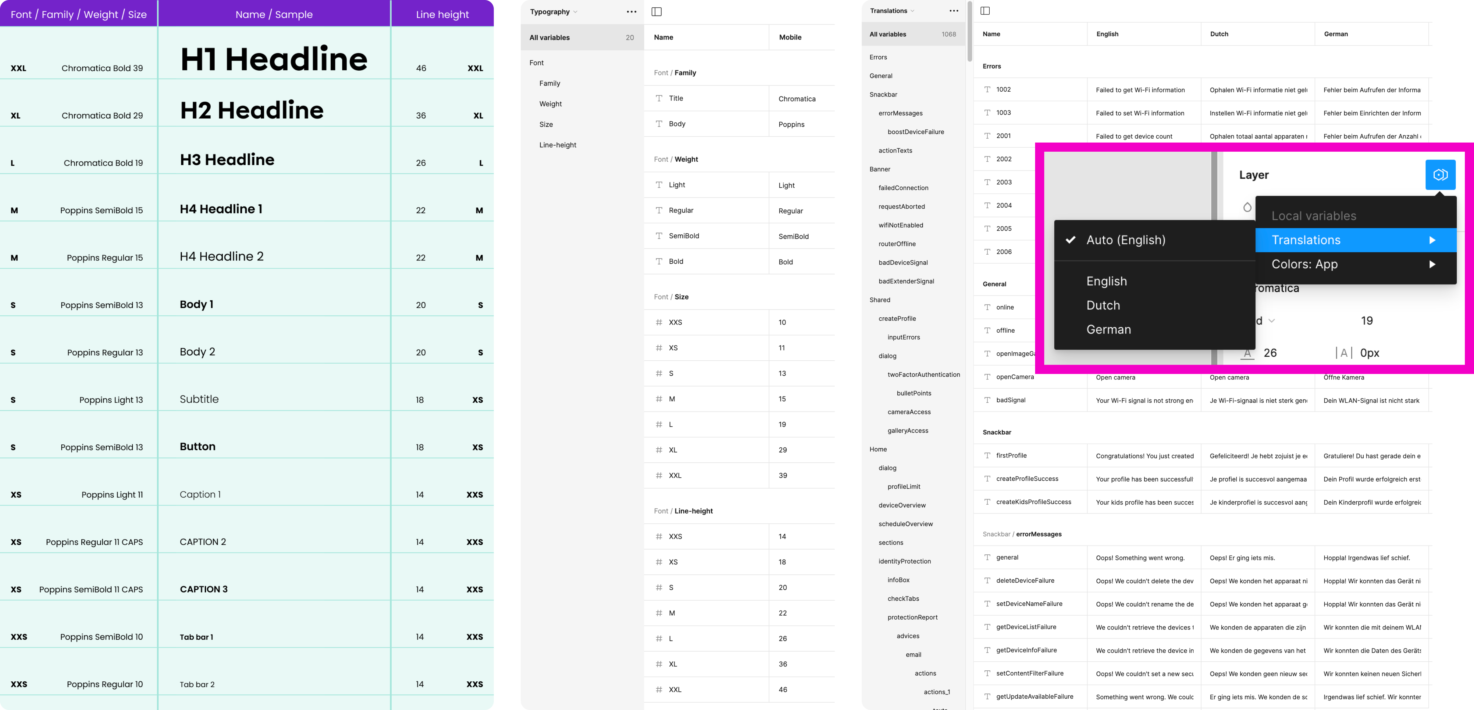
Typography variables
I set up Typography Variables to give our team the flexibility to quickly change font families and specific fonts across the entire app, which is essential for a white-label solution that needs to meet diverse brand guidelines. By defining font properties as variables, we could easily adjust typography for all screens at once, ensuring consistency and allowing for rapid updates when needed. Additionally, I created different modes with font sizes and line heights tailored to various devices, ensuring that text is always legible and well-proportioned.
Translations variables
To accommodate multiple languages seamlessly, I implemented Translations Variables within our Design System. These variables allowed us to preview and implement the app in different languages with just a few clicks, ensuring that text elements are correctly adapted for various languages and cultural contexts. This setup makes it easy to switch between language modes, providing a smooth and efficient way to localise the app for diverse markets without compromising on design quality or user experience.
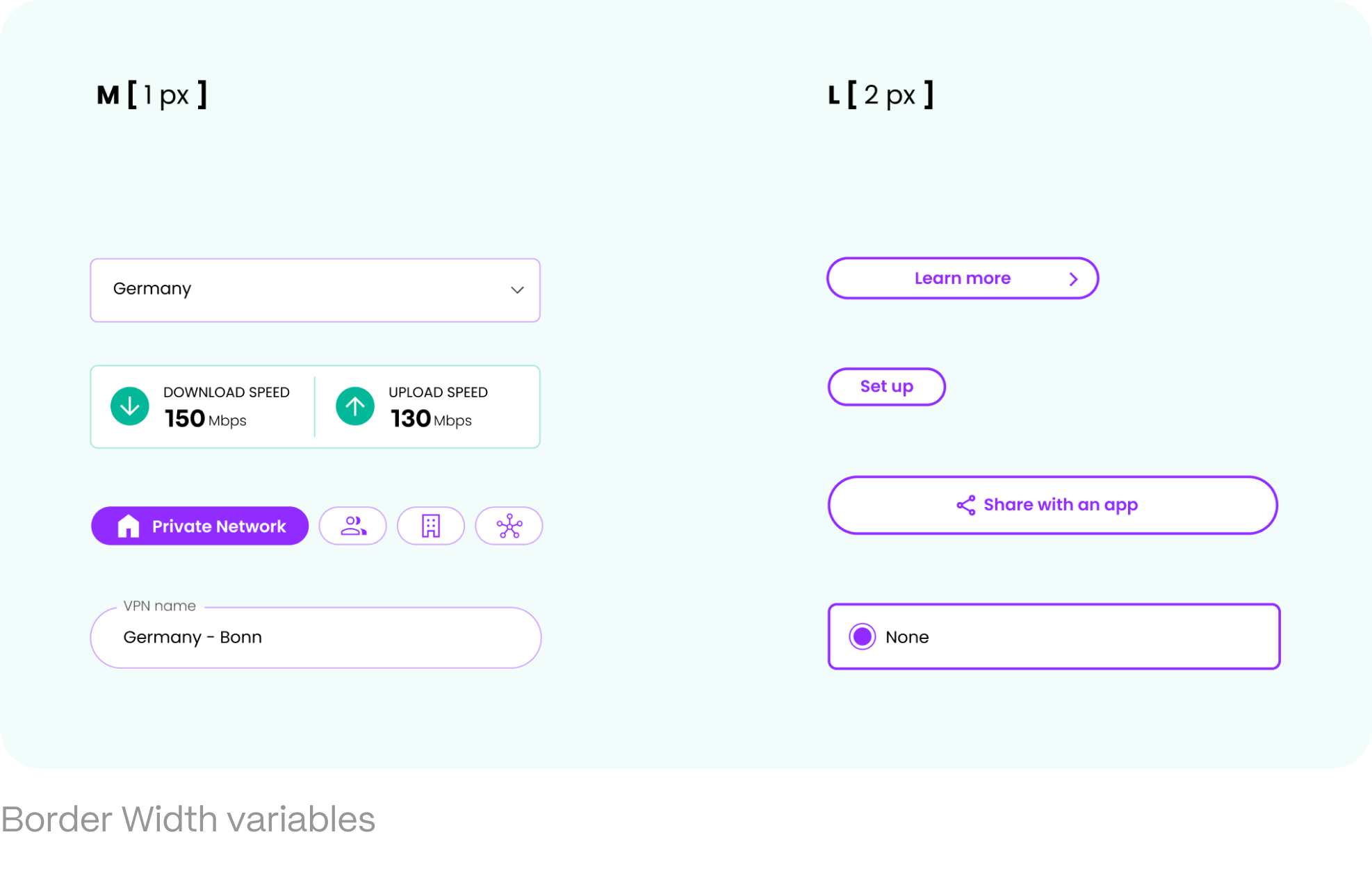
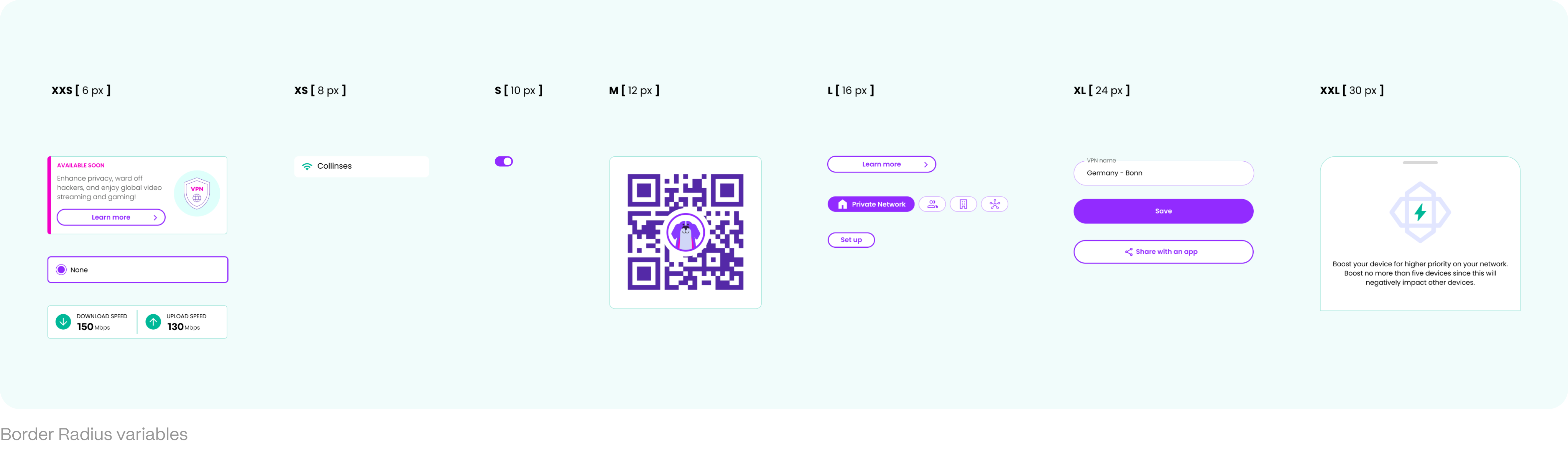
Border radius & Border width variables
To accommodate the diverse brand guidelines and visual styles required for a white-label solution, I established Border Width and Border Radius as variables within our Design System. By defining these properties as variables, the team could quickly and easily adjust the thickness and curvature of borders across the entire app to match different brands' aesthetic preferences. This way we could adapt to various visual styles with minimal effort. Whether it's a sleek, minimalistic look or a more rounded, approachable design, the use of border variables ensures that changes are implemented swiftly and uniformly, enhancing both versatility, and the efficiency of our design process.
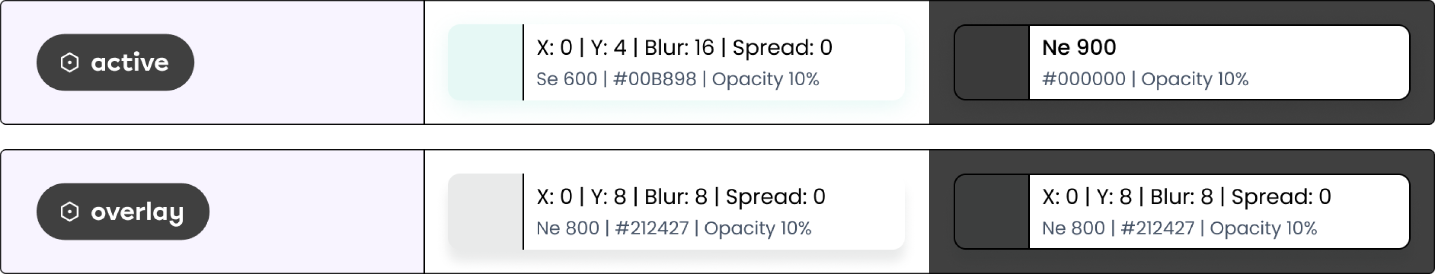
Effects as variables
Defining elevation shadows as variables brought significant benefits by ensuring both flexibility and design consistency. Even in dark mode, where elevation shadows might not be even visible, they still need to be present to maintain the integrity of the design system. With shadow properties like colour, blur, spread, opacity, etc. set as variables, we could quickly fine-tune the depth and dimensionality of elements throughout the app, ensuring a uniform visual style across all screens and modes. Whether the design calls for subtle or dramatic effects, having elevation shadows as variables simplifies the design process and empowers the team to create visually cohesive and polished interfaces with ease.
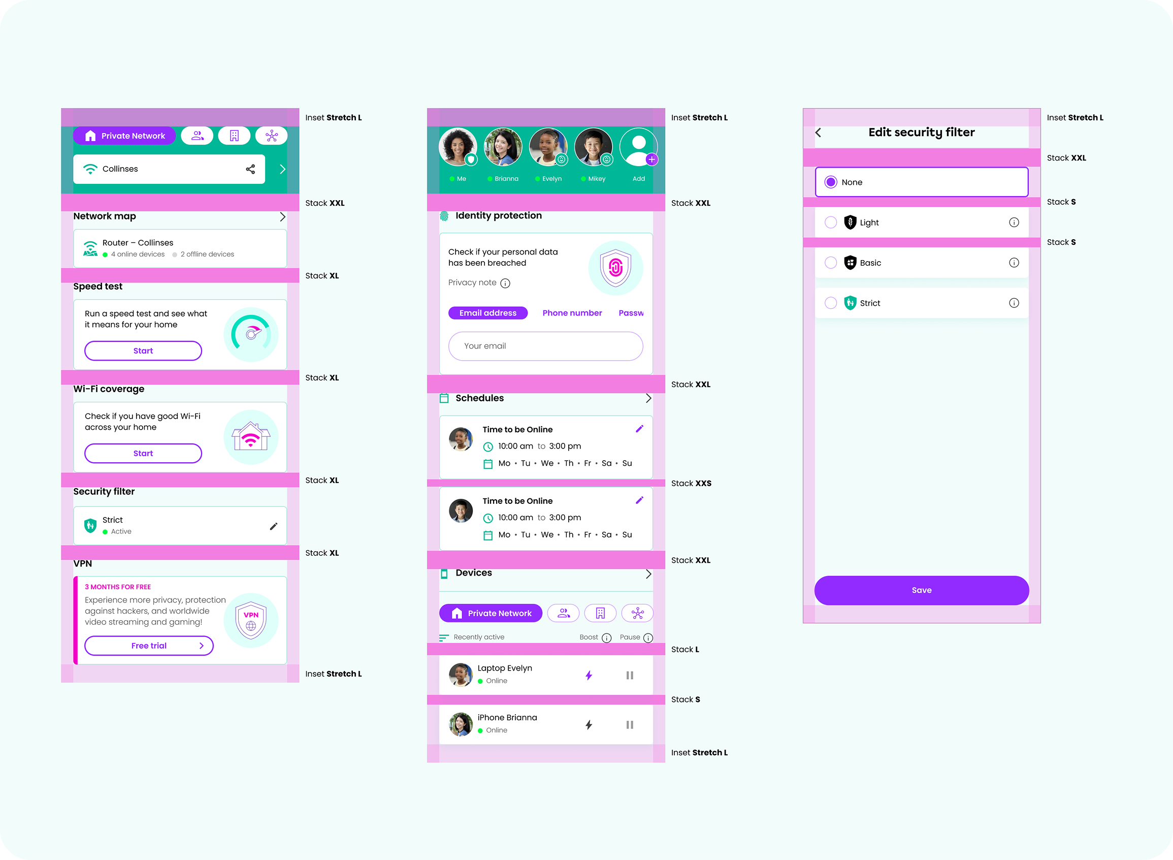
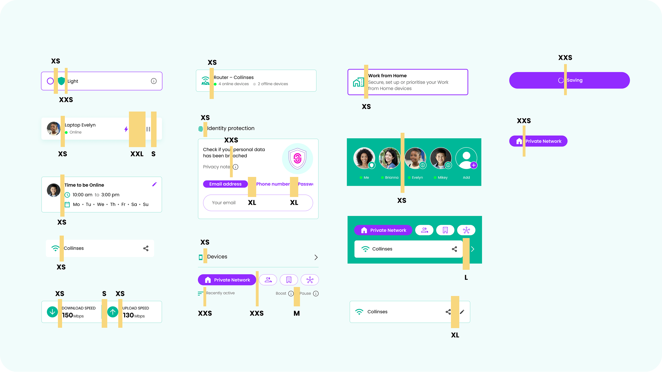
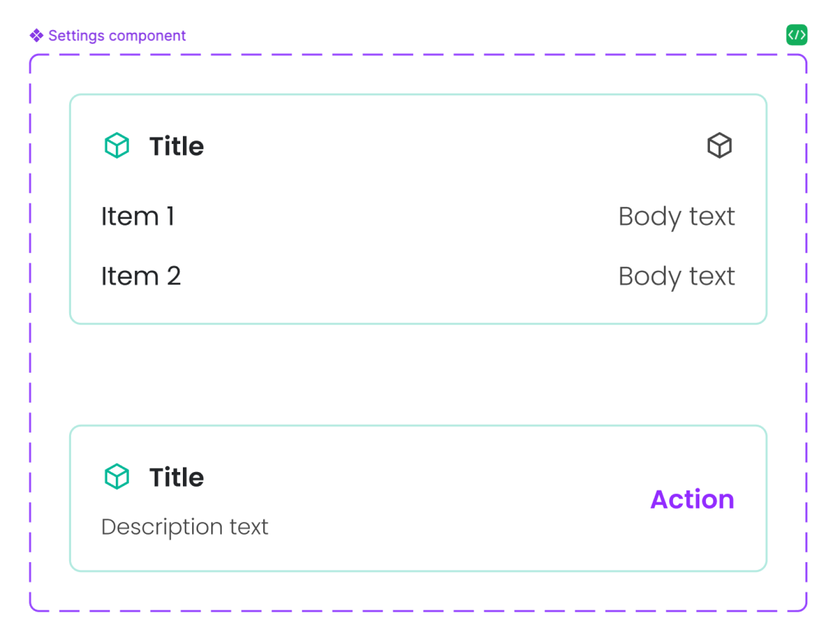
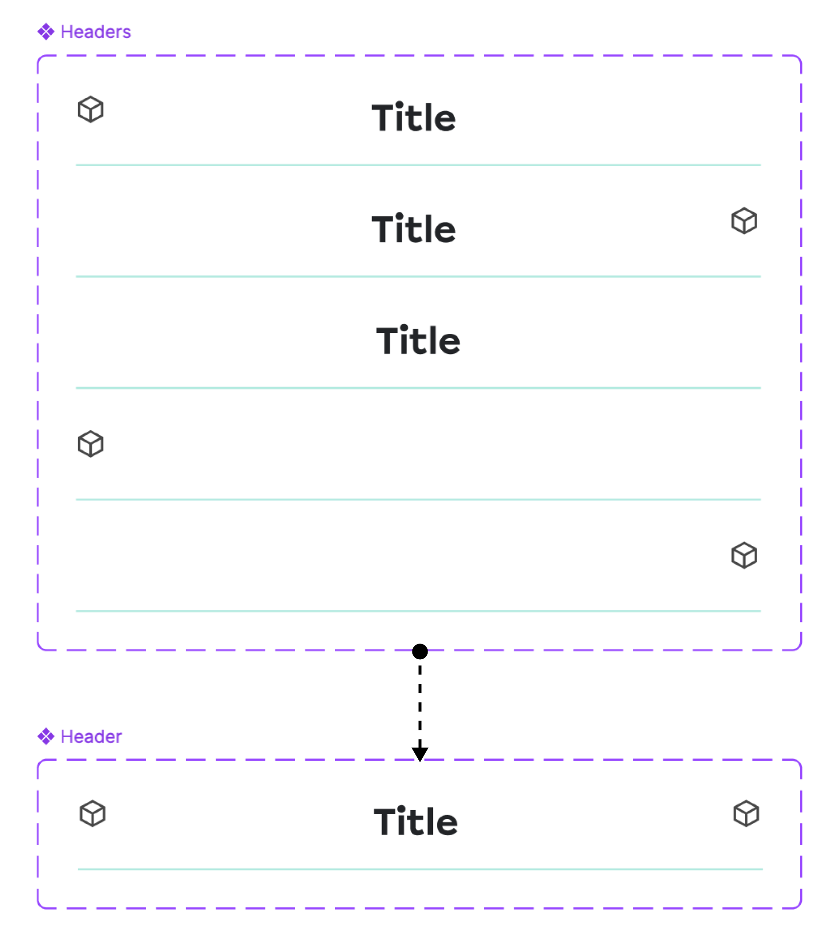
Component library
Together with one of the UX/UI designers in my team, I developed a comprehensive Component Library with variables integrated into every element, making the app's design as modular and adaptable as possible. This library functions like a digital constructor, where the app is built piece by piece using pre-defined components. By embedding variables into each component, any changes or adjustments – whether in colour, spacing, typography, or other design elements – can be implemented in seconds and automatically applied across the entire app. It ensures consistency and significantly accelerates the design and development process, allowing for rapid updates and seamless scalability.
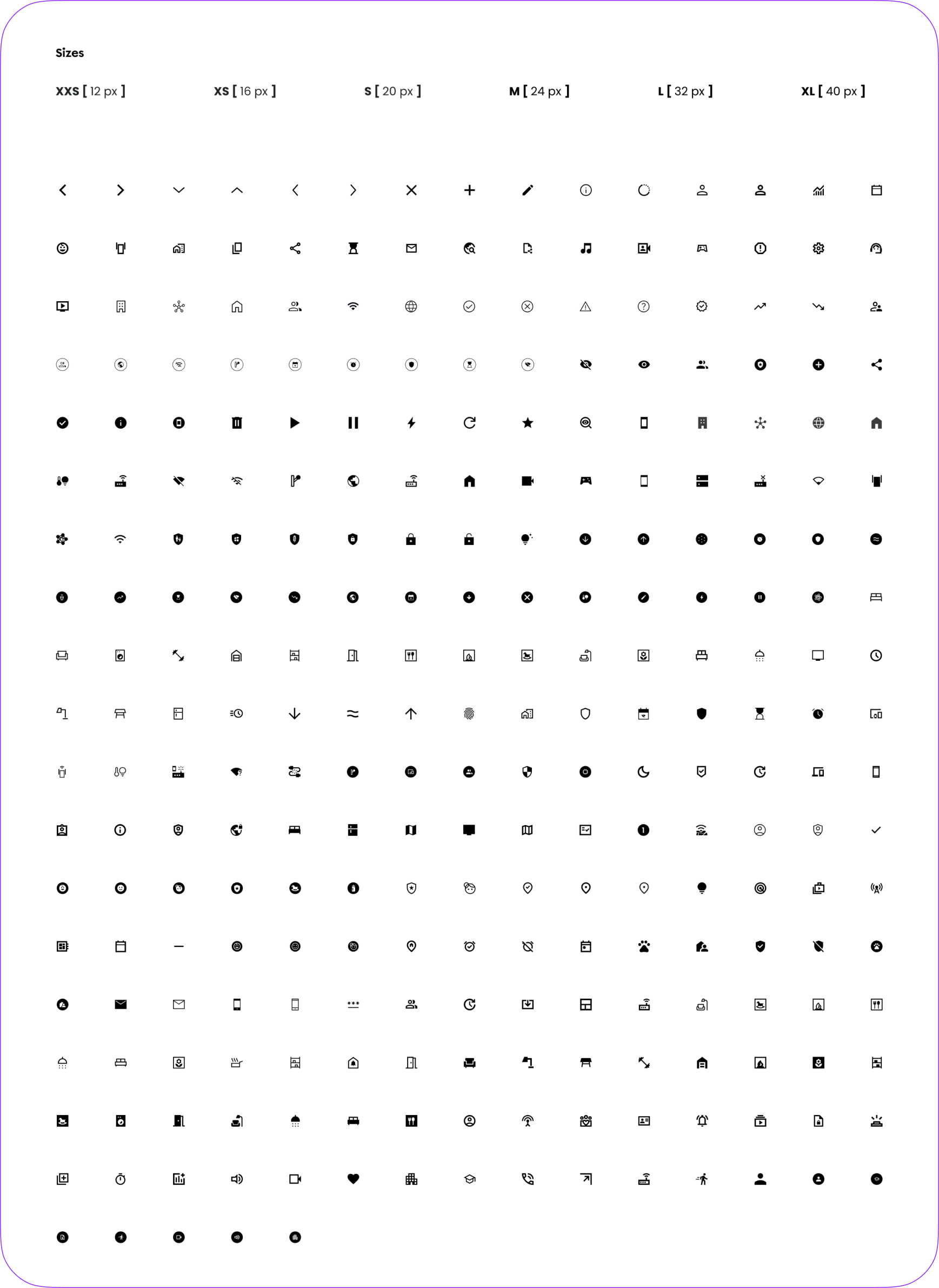
Scalability
We created a scalable Elements Library where all the ‘atom’ elements (icons, illustrations, etc.) are stored in a standardised size, making them easily findable and organised for efficient use. Despite the uniform storage size, I also established clear guidelines for their suggested sizes in actual application, ensuring that each element is used appropriately across different screen sizes and contexts. It allowed the team to quickly locate and implement the right elements, while the size guidelines ensure that the design remains consistent, flexible, and visually balanced throughout the app.
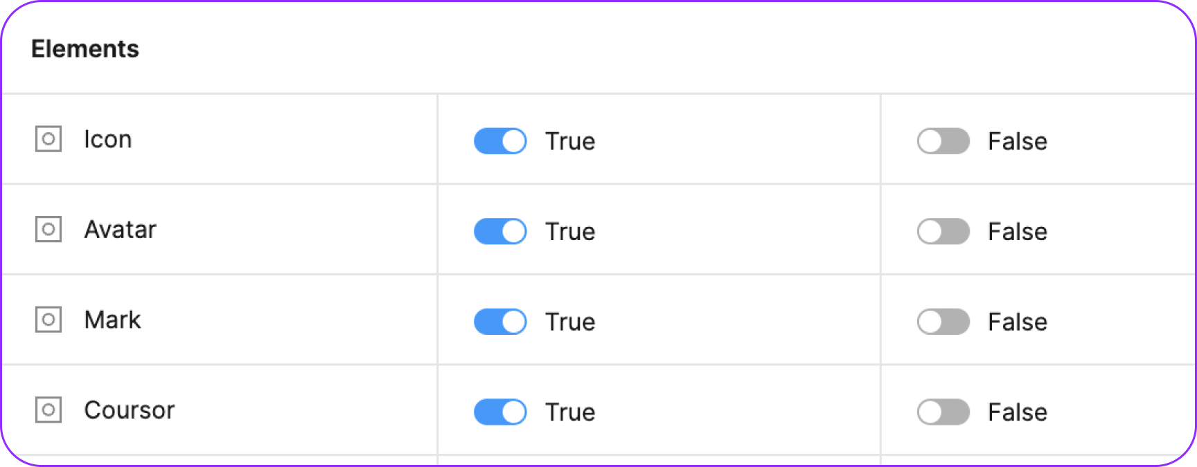
Boolean variables
We implemented Boolean Variables in Figma to create a single ‘source’ component for every component in the app, that would contain all the possible functional elements inside. Instead of designing multiple component variants for different scenarios, we could now use true or false statements to control which elements are visible or hidden within that main component. It greatly simplified the design workflow, as designers could easily toggle elements on or off and save their choice as a separate mode – to be able to choose between different functionalities, all within the same element. The result is a more efficient, flexible Component Library with less variants of the same components, which reduces redundancy and ensures consistency across the app while giving designers the freedom to customise components quickly and easily.

Establishing an effective Design System was crucial for creating a cohesive, scalable, and efficient product. It ensured consistency across all aspects of the Design – from typography and colour schemes to spacing and component behaviour, while streamlining collaboration between designers and developers.
As the Design Lead and advocate for this project, my role was to champion the creation of a robust Design System that not only met the complex needs of a white-label solution but also empowered the team to work more efficiently. By integrating variables, creating a comprehensive Component Library, and implementing scalable solutions like Figma Variables, I helped transform our design process into one that is adaptable, organised, and capable of delivering high-quality results quickly and consistently.
This approach elevated the product's design, and set a strong foundation for future product growth and innovation.